This post is from our User Experience (UX) Checklist Series:
- Landing Page Design
- Form Design
- Button Design
- Navigation Design
- Accessible Design
- Ecommerce Design
- Display Ad Design
What is Accessible Design?
As designers, we have the power to make choices that make our digital experiences better for everyone. When we make accessible design choices, our designs not only become more usable for those with disabilities but more usable for everyone.
Accessible design means designing to meet the needs of people with disabilities. It’s design that’s inclusive of all users, including users who have physical or cognitive disabilities that are permanent or temporary.
How might a person who experiences color blindness interact with your design differently than a user who experiences hearing loss? Or low vision? What about physical disabilities? Dyslexia? Mobility impairments? Blindness? Users interacting through screen readers or keyboard-only navigation?
Who else’s needs are excluded from the traditional design process? Accessible design takes all of these experiences into consideration, and proactively provides design solutions that are usable for everyone.
What’s the Difference Between Universal Design and Accessible Design?
Universal design, inclusive design, and accessible design are often used interchangeably; so what’s the difference?
While these terms all have roots in increasing usability for a wider set of users, there are a few slight nuances to their definitions:
- Universal design is the broadest of the bunch. This refers to designing for everyone in a way that’s the most usable as possible. A commonly used example of universal design is the creation of the sidewalk ramp because it increases usability for everyone crossing a street, not just those in wheelchairs.
- Inclusive design is very much related but considers the full range of human diversity. Inclusive design challenges us to consider our own biases and look at who’s being excluded. An example of inclusive design would be providing options for both common and custom responses when asking for gender information on a form.
- Accessible design is specifically designing for those experiencing disabilities, yet it often results in a better user experience for everyone. Accessible design meets the needs of those with permanent or temporary disabilities, but will often meet the needs of those with situational limitations. For example, closed captions provide a better experience for people with hearing loss, yet they also come in handy for those quietly watching a movie with a sleeping baby in the next room.
Designing for Accessibility and Inclusion
As UX designers, it’s our role to think about how different users with different needs might interact with our designs. We may think we’re considering a large majority of the population while we design, but we’re often overlooking the one in four adults experiencing disabilities. That’s 25% of the population, which grows to around 40% for adults 65 or older.
As public awareness for accessibility increases, it’s important we start actively thinking beyond our own biases and abilities while we design. Besides just being on the wrong side of morality and ethics, ignoring accessibility in design can negatively affect your brand’s reputation, and even lead to expensive lawsuits and legal battles. Not to mention, it makes it really hard (if not impossible) for 25% of your customers to use your product or service.
The following checklist walks through a list of design tips to help you get started. While this does not (and should not) replace a full accessibility audit, it can be used for some quick wins to make your designs a bit more inclusive.
When we design for accessibility, we improve the experience for everyone.
UX Accessibility Checklist & Guidelines
Color
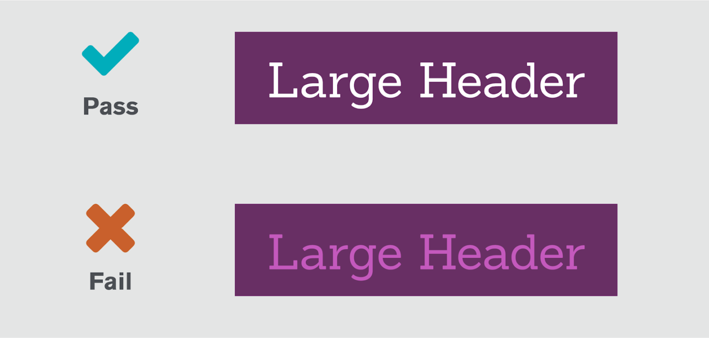
- Text Color & Contrast: Use a contrast checker, such as WebAIM’s online tool, to ensure the color of your text is readable against the background color. The smaller your text, the higher the contrast needs to be for the color combination to pass accessibility standards. In my experience, color contrast is a pretty common accessibility offender and can be a great way to introduce accessibility best practices to your clients.
- Messaging: Don’t rely solely on color to convey a message. Consider using color, shape, and text to further emphasize your message. For example, try including iconography with your error messaging when visually communicating form field errors, rather than just color alone.
- Links: Link colors should be visually different from your body text. However, similar to the above, don’t rely on color alone to style your links. Jakob’s Law also tells us that people like design patterns that are familiar to them. Underlining your links improves general usability by using a familiar design pattern, but also improves accessibility for users with low vision or color blindness.
Text
- Text Size: Make sure your text is large enough for people to read without straining or squinting. According to Smashing Magazine, 16-pixels (or larger) is the size you want your body copy. Secondary or tertiary text can be smaller, but keep your main content large and readable.
- Enlargeable Text: Let people adjust and increase the text size themselves. This goes for important icons as well! If your button has a “download” icon, but that icon doesn’t increase in size with your button label, people may miss important context.
- Clarity: Your page titles should be clear, descriptive, and to the point. Additionally, use the active voice and be direct in your communication to lighten the cognitive load on your users. For example, “Denise wrote a blog” is open to less interpretation than, “A blog was written.”
- Scannability: Use bullets whenever possible to organize your text into smaller, digestible chunks. Avoid large and overwhelming walls of text by breaking up longer content sections into smaller paragraphs with descriptive subheaders to help increase scannability.
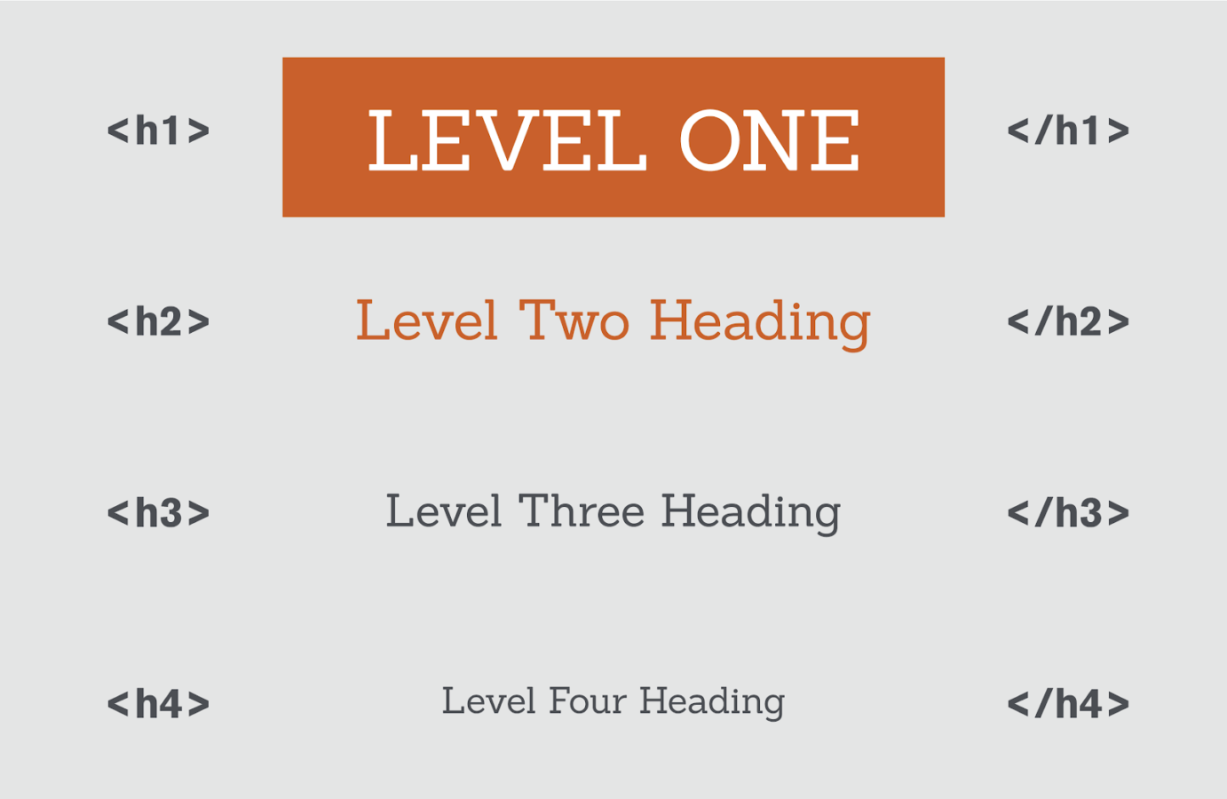
- Structure: Use HTML and heading tags (H1, H2, H3, etc.) to establish a page structure that makes sense to screen readers. Fun fact: a clear page structure will also make more sense to search engines. So besides improving the experience for your users, a solid structure can also have a positive effect on your technical SEO!
- Alignment & Length: Left-aligning your text can help improve the readability for people with cognitive disabilities. Avoid centering or right-aligning your text, especially when your text block wraps onto multiple lines. Speaking of wrapping, line length is also important to consider. Baymard Institute recommends 50-60 characters per line (including spaces!). Lines that are too wide are hard to follow, while lines that are too short can cause fatigue and stress your reader out.
Navigation
- Breadcrumbs: Breadcrumbs can be used as important navigational tools. Adding breadcrumbs can provide much-needed context and help orient your users.
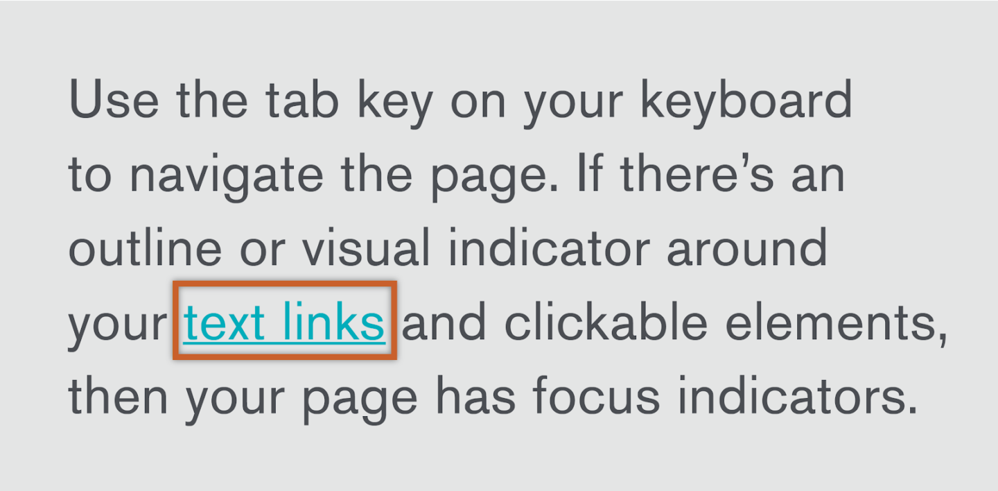
- Keyboard Navigation: Make sure your page is accessible by screen readers and can be navigated by speech or keyboard-only.
- Focus Indicators: Taking that one step further, people using their keyboard to navigate rely on focus outlines on buttons, links, and other elements to know where they are on the page. You can add some styling to your focus indicator to align with your design styles, but NEVER remove these!
Links, Buttons, and Labels
- Link descriptions: Links are are typically navigational, so your link text should be descriptive and explain where the link will take you. For example, “Read more about accessible design” is more helpful than, “Read more.”
- Button labels: Similar to text links, your button labels should set proper expectations by describing the action your button will trigger. “Contact our team” primes us for what we can expect better than, “Click here.”
- Spacing: Anything that can be tapped or clicked should have plenty of space around it. Don’t demand precision or cram buttons closely together. It’s no fun (for anyone) to try to click a tiny link next to three other tiny links with accuracy. For mobile, we try to stick to a minimum tap target of 44 x 44-pixels as a rule of thumb for anything that can be tapped.
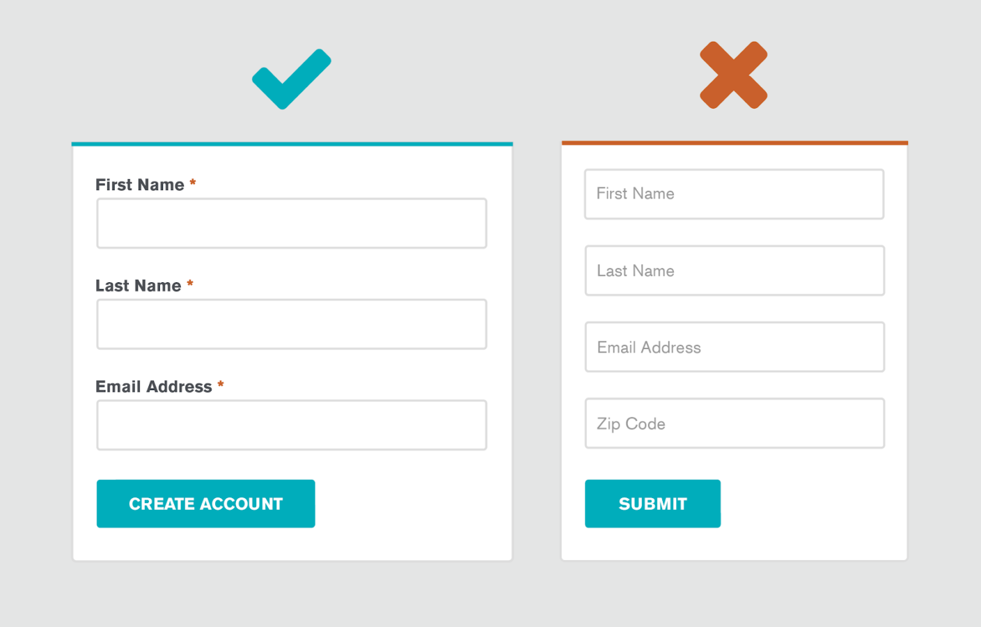
- Form Labels: To help reduce cognitive load on your forms, make sure your form field labels are clear, descriptive, and always visible. Your field labels should never be replaced by placeholder text, or disappear when the user starts typing.
Images & Video
- Alt Descriptions: Always add descriptive alt tags to your images, video, and other media. Remember, not everyone will be able to see your images so try to make your descriptions as detailed as possible. In addition to improving accessibility, alt tags have important SEO benefits as well.
- Communication: Use imagery to support your text, but never use imagery in place of text. Images are great to support complex or complicated concepts, but those concepts should always be described in plain text.
- Video Transcripts: Videos are awesome and engaging forms of media content, but don’t bury important concepts in your videos. If you are using video, make sure you include subtitles or video transcripts for users unable to watch.
- Clarity: Icons are great for scannability, but not all icons are intuitive. For additional clarity, pair your icons with descriptive labels.
- Overlays: Similar to color accessibility, text on top of images can be problematic as far as readability. If you choose to layer text on your images, consider adding a color overlay that helps your text meet color contrast standards with the background.
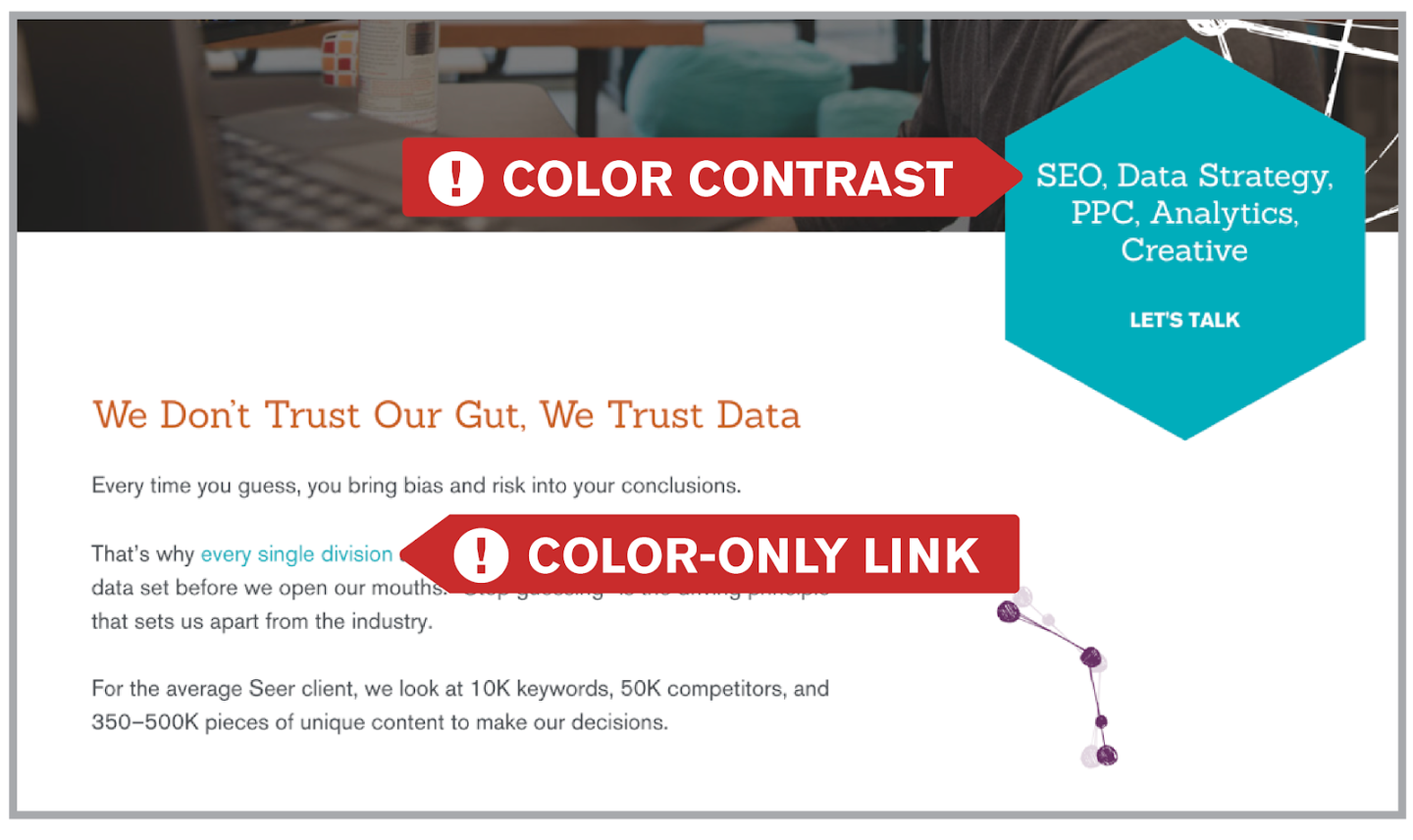
When it Comes to Accessible Design, We Practice What We Preach
While putting this checklist together, we did a quick accessibility audit on our own site. And as you may have noticed, there are some issues right on our very own homepage:
As with any project, design and development updates require time and resources. You’ll need buy-in from your leadership, but it doesn’t have to feel like an uphill battle. Here are the steps we plan to take to address our own accessibility issues:
- Identify the problem: Use a checklist like the one above audit your site and document your known issues. Doing this can help you understand the level of effort needed to fix the issues.
- Educate through Empathy: Advocate for accessibility and explain why this matters to your team! Build empathy for your users with the necessary stakeholders. Fortunately for us, empathy is already at the heart of Seer’s values.
- Log issues and treat them like bugs: How would your team go about addressing other bugs on your website? Accessibility issues are usability bugs at their very core. People can’t read your button labels? That’s a critical usability issue! Treat it like one and prioritize accordingly.
- Create a plan for on-going optimizations: Websites are living things with many moving parts, and scheduling periodic accessibility audits can help you keep tabs on any new issues. Better yet, as awareness for accessibility grows on your team, use that momentum to make accessibility a part of your design process from the very start.
Note: The information provided in this blog post does not, and is not intended to, constitute legal advice with respect to ADA-compliance or otherwise, and should not be acted upon as such.
Looking for dedicated Creative & Design support?
Check out Seer's capabilities, work samples, etc. and get in touch.

For more UX best practices and digital marketing tips and tricks, make sure to subscribe to our newsletter!


.png)