This post is from our User Experience (UX) Checklist Series:
- Landing Page Design
- Form Design
- Button Design
- Navigation Design
- Accessible Design
- Ecommerce Design
- Display Ad Design
If you put a notebook down at your desk and walk away, you expect it will be in the same place when you return. When you walk into your living room, you expect your couch will be in the same place it was last. Similarly, when we visit a website, we have an expectation that certain elements, for example, a navigation bar, will be consistent across different sites.
According to Jakob’s Law:
Users spend most of their time on other sites. This means that users prefer your site to work the same way as all the other sites they already know.
If a user can’t find what they’re looking for due to a cluttered or unclear navigation, then it doesn’t matter how “pretty” or innovative a site is--you need a new solution. Users who can’t find what they need will quickly leave your site to find a more user-friendly alternative. A well-designed nav bar helps both new and returning users understand where they are on your site as well as how to quickly and easily get to where they need to be.
According to CrazyEgg:
A site’s navigation structure should allow a user to find what they need within three clicks.
At Seer, when we conduct UX Audits, we’re constantly flagging cluttered nav bars--they create friction and confusion for the user. However, if you have a ton of content, this doesn’t necessarily mean you need less pages on your site.

If you have dozens of pages, they should be categorized and prioritized based on The Magical Number Seven, Plus or Minus Two. Short-term memory can hold about seven items at a time, plus or minus two. So if a user hovers over a dropdown on your nav with a list of 15 items, you’re oversaturating them with content that they most likely aren’t looking for, and they’ll leave your site to fulfill their needs elsewhere.
A good navigation should:
- Boost the number of clicks per page listed
- Increase organic traffic
- Give your site more credibility
How can you ensure you’re accomplishing all three? Read on!
Types of Navigation
While a nav bar covers a variety of shapes and sizes, in efforts to maintain consistency for the user, we suggest using a common navigation structure, or combination of structures, for your site.
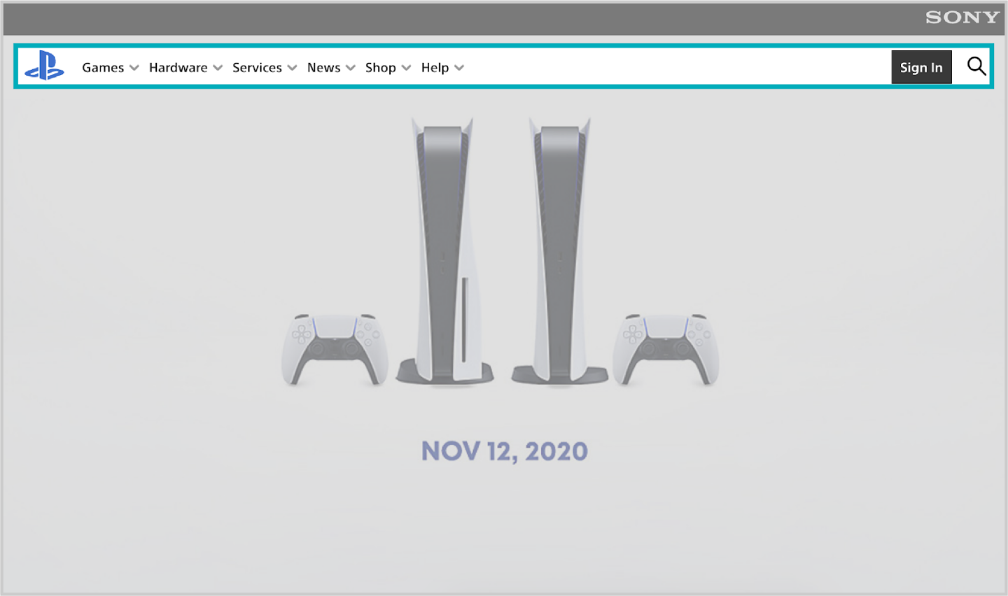
- Top/main header: This format is ideal for primary navigation, as users will intuitively look here first.
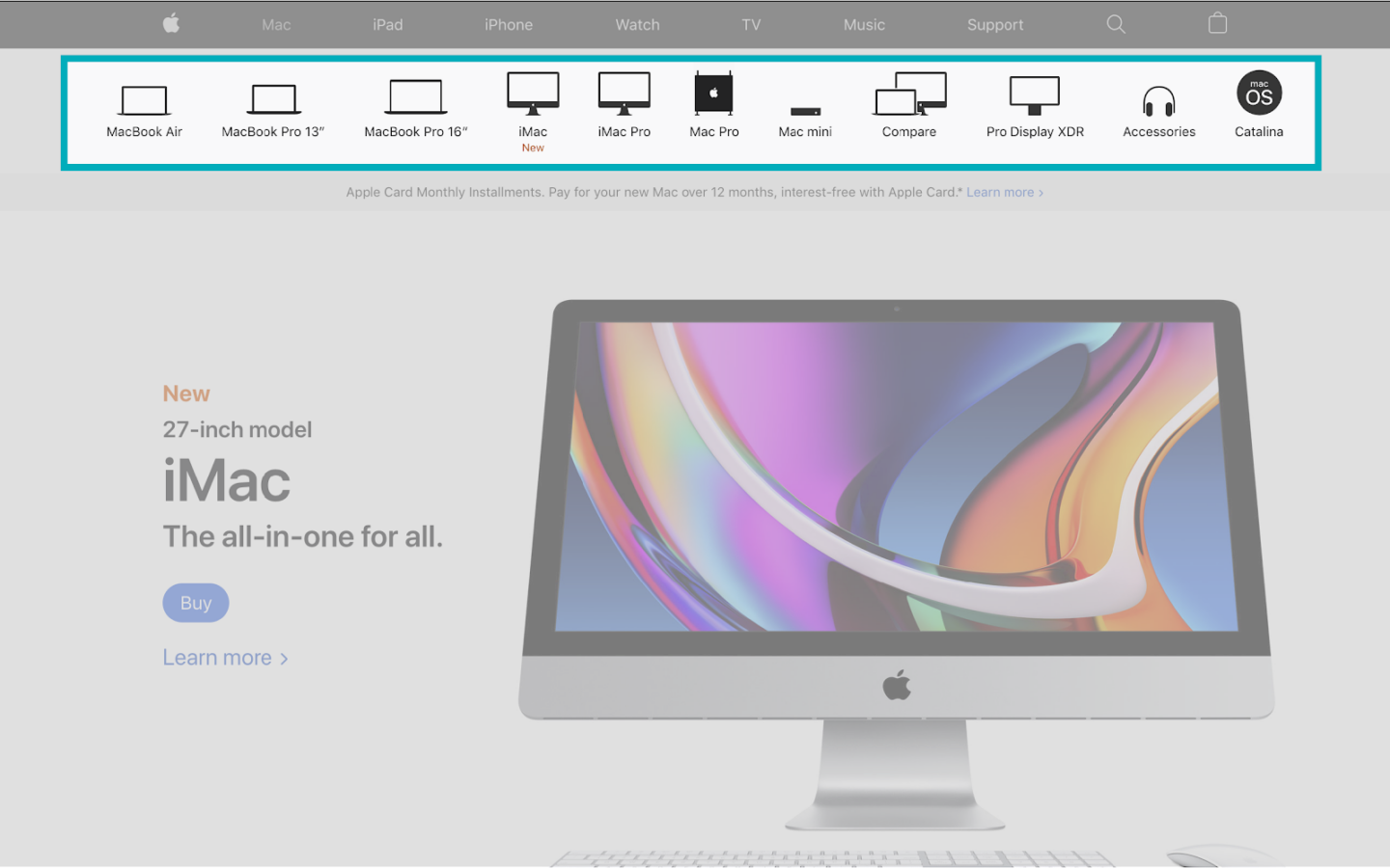
- Subnavigation: Typically, this is a secondary list of links under the main navigation. Often, the subnav is made to look less prominent than the main nav to avoid overwhelming the user.
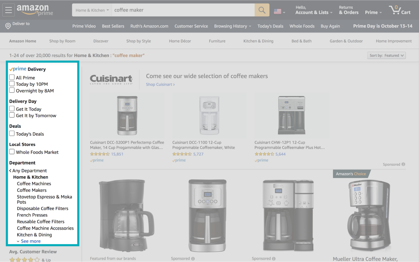
- Side navigation: This is a vertical structure that runs along the left- or right-hand side of your page, and supports scrolling. Side navs are often present on mobile sites, but can also be used in conjunction with a primary navigation on desktop.
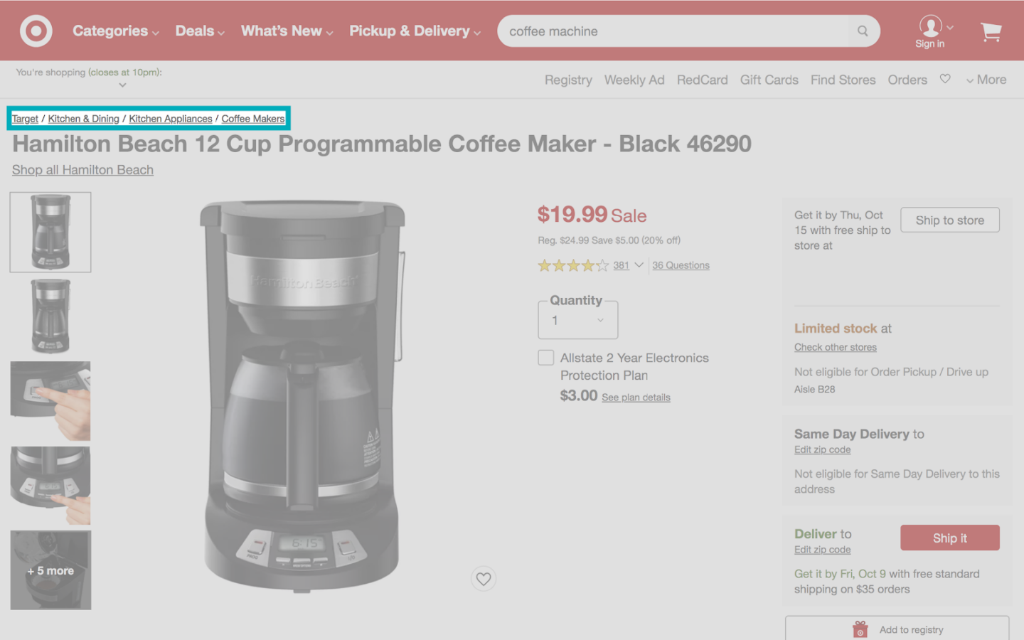
- Breadcrumbs: Often used in sites organizes in a hierarchical manner, these are simple text links typically separated by the “greater than” symbol (>) or “forward slash” (/)
These navigation structures can be used in conjunction (it’s recommended to use no more than three levels of navigation) for content-heavy sites, given that you maintain structural hierarchy and keep visual clutter to a minimum.
Navigation on Mobile
3.7 billion people access the internet via a mobile device, so if your site isn’t optimized for mobile users, you’re missing out on a large chunk of your audience.
While hidden or dropdown menus can almost cut discoverability rates in half on desktop, navigation on mobile is typically accessed via the hamburger menu, as many mobile screens are only 720-828 pixels wide in portrait mode.
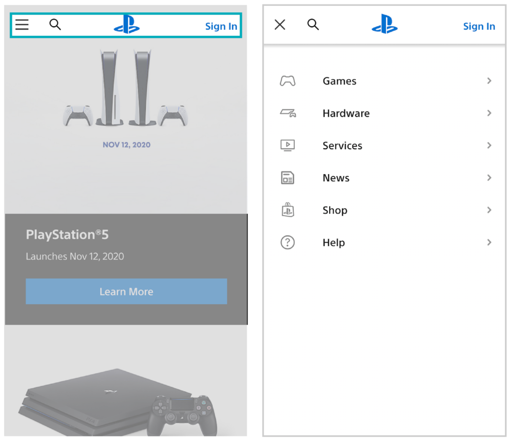
Hamburger menu on mobile (left), expanded hamburger menu on mobile (right)
Navigation labels should be clear and easy to read, and should be large enough to be easily tapped (to learn more about link & button sizing, check out UX Checklist Series: Button Design).
Structuring Your Navigation
The goal is always to find the sweet spot between over-complicated and too simplistic. How can this be achieved? To start, your nav should be intentionally designed--everything but the kitchen sink should not be living in your main navigation.
The Magical Number Seven, Plus or Minus Two, is a psychological theory that dates back to the 1950’s, but remains applicable today. Our short-term memory typically holds about seven items, plus or minus two.
Therefore, you want to ensure that only the most important pages for your business are linked in your main navigation, otherwise you risk confusing users.
You can pair this theory with the Serial Position Effect, which states that a person often recalls only the first and last items most clearly in a series.
To add some additional visual punch, navigation bars may have a CTA such as “shop now”, “sign up”, etc. on the far right side of the screen, stylized as a button for emphasis. This is a great tactic to use sparingly to highlight the most important action a user can take.

In addition, avoid generic words like “articles” or “resources”, as they lack the context that a user may be searching for. For example, a pet shop may offer links to “Caring For Your New Pet”, rather than a blanket “resources” category.
Next Steps
The bottom line is: navigation layout and design should be intentional.
Whether on desktop or mobile, the navigation bar is one of the first things a user sees, and is their go-to for finding content on your site. It should contain your most important content -- supplemental links can live in sub-navigations or elsewhere on the site.
If you visit your site right now, can you find what your target demographic is looking for in three clicks?
- Want more help with navigation layout and UX best practices? Contact our Creative Team to learn more. We’re here to help!
- Looking for more design best practices? Keep reading our Creative & UX Checklist Series.
Sign up for our newsletter for more posts like this - delivered straight to your inbox!


.png)
.png)