This post is from our User Experience (UX) Checklist Series:
- Landing Page Design
- Form Design
- Button Design
- Navigation Design
- Accessible Design
- Ecommerce Design
- Display Ad Design
From lead generation to online purchases, web forms are everywhere. Unfortunately, nobody ever really wants to fill out a form, despite them being such a basic part of our online experience.
A well-designed form helps reduce any friction between the user and what the user wants. On the flipside, a poorly-designed form can have major implications on your conversion and revenue numbers. Forms may not be the most fun and exciting things to design, but they can still have good UX!
All forms are different, and depend on their audience, industry, and product/service. However, there are some data-informed best practices that can be used as guidelines for any form design. Use our list below to identify some quick wins to improve the usability of your forms.
Form Design & UX Best Practices Checklist:
- Pay Attention to Structure & Flow
- Optimize Your Data Inputs
- Design Clear Action Buttons
- Use Validation & Error Messaging
- Consider Form Accessibility
- Do Not Forget About Inclusive Content
- Assess and Audit Your Form UX

1. Pay Attention to Structure & Flow
All web forms have an “interaction cost,” which is the amount of physical and cognitive effort users need to put in to achieve their goal. If your form looks long and complicated, people will avoid them.
Baymard Institute found that form length and complexity were the top reasons for abandonment. Further usability testing showed that most forms have an average of 14.88 fields, but 20-60% of those fields were not actually critical to the experience. When in doubt, cut down on the number of fields.
- Remember that less is more If you want users to complete your form, then less is usually more. Which form fields are critical to your experience, and which can you cut? To simplify your form even more, consider keeping rarely used form fields like Address 2, Discounts, and Company Name hidden behind a text link until it's needed.
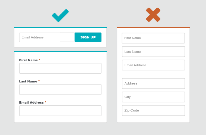
- Clarity is key Is there a clear purpose that’s obvious in a few seconds? If users don’t understand the value of your form, they're not going to spend the time to fill it out.
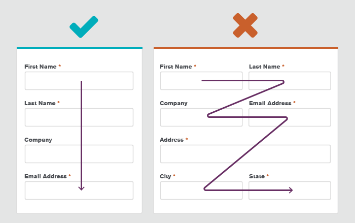
- Use a single-column structure An eye-tracking study conducted by CXL Institute found that single-column forms are better for usability because the information can be understood quicker. Single-columns help move the eyes in a more natural direction down the screen, rather than zig-zagging around.
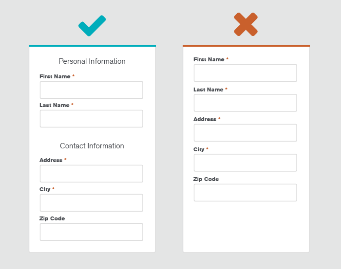
- Break up your content Organizing your content into groups can make your form appear less overwhelming. If your form is super complex with a lot of data inputs, consider breaking it up across multiple screens. Make sure to include a clear progress indicator so users can quickly estimate the time and effort needed to complete the form.
- Only show what’s relevant Personalize your forms (and shorten them!) with conditional logic. This can help reduce frustration because your users won't be asked follow-up questions on topics they’ve already said aren’t relevant to them.
2. Optimize Your Data Input Fields
Data inputs are all the pieces you use to gather data on your form: text fields, password fields, radio buttons, date-selectors, checkboxes, sliders, etc.
- Make sure your form labels are clear If your labels aren’t clear, people will have a hard time figuring out what they need to enter.
- Keep your form labels listed above the fields If you’re only asking for one or two items (such as in a newsletter email signup or a login form), you can use the placeholder text as your label to save space. But remember, that placeholder text disappears as soon as the user clicks within the field and people tend to lose track of what they're doing. Listing your form labels above the fields makes sure they’re always visible, and is generally better for responsive design.
- Consider form field length The length of your text form fields should match the length of the answer. This helps provide a hint to the type of answer you’re looking for, and avoids any confusion from fields that are too short or way too long.
- Indicate required formatting If your text fields need a certain type of formatting, you have to clearly show what you're looking for. Use placeholder text or tooltips to show how the text should be formatted for things like dates, times, or phone numbers.
- Ensure that required fields are clear If you're using required and optional fields, make sure the required fields are clear. This is especially important if you’re asking for sensitive information that's actually only optional.
- Reduce the number of clicks When choosing the type of data input you’re using, pick a type that reduces the number of clicks to complete the task. Whether you’re using radio buttons, dropdowns, checkboxes, or text fields, make sure the type you pick is intuitive and easy to use.
- Take advantage of white space White space makes things feel less complicated and gives things room to breathe. Cramming everything in without enough white space will make your forms look more complicated than they really are, causing potential abandonment.
- Responsive design Unless your form is desktop-only, make sure it is optimized for mobile. Things need to be large enough for fingers to click. As a general rule of thumb, don’t make anything tappable smaller than 44 x 44 pixels.
3. Design Clear Action Buttons
Action buttons trigger an action once they’re clicked. This can include submit, previous, next, continue, proceed, or cancel buttons.
- Make sure labels are clear Like any CTA, make sure your labels clearly describe the action that will happen.
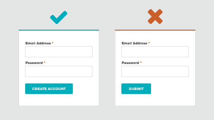
- Buttons should look like buttons Jakob’s Law states that users like using familiar design patterns. Make sure your buttons look like buttons. Otherwise, they may blend into your design, or your user may not understand they will trigger an action.
- Emphasize your buttons Important things, like your buttons, should be visibly different than other elements. Use size and color to make your buttons stand out.
- Differentiate between primary & secondary buttons If your form has multiple actions, make sure you are using primary and secondary buttons to highlight the intended action, while also giving an alternative.
4. Use Validation & Error Messaging
Positive and negative messaging should be used to communicate when a user has completed a task successfully, or has made an error or mistake. Use visual cues and descriptive language to make sure your messaging is as clear as possible.
- Provide submission confirmation Avoid having user accidentally click "Submit" multiple times by giving a visual confirmation that the button was clicked & processed successfully.
- Give real-time inline validation People make mistakes, so form validation is important. Minimize friction by giving real-time validation for each of your form fields. This allows the user to see when and where they’ve made errors without having to wait until they go to submit the form. It also helps avoid the frustrating task of scrolling through an entire form afterwards to try to find the error.
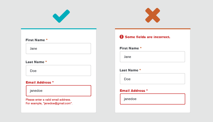
- Deliver clear error messaging Make sure your error messaging is clear and descriptive. When someone makes a mistake, make sure you tell them why. Did they leave a required field blank? Is their formatting wrong? If your form is complex, you can even explore having 4-10 adaptive error messages on the backend that will match different scenarios.
- Leverage autocompletion Autocompletion lightens the load by cutting down on typing, and can help reduce errors. This can be especially helpful with address text fields, where geolocation can reduce the friction of manually typing in multiple address-related fields.
5. Consider Form Accessibility
From online banking to medical appointments, everything is moving online. As designers, it’s our job to make sure those experiences are usable and accessible to everyone, forms included!
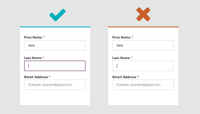
- Not everyone uses a mouse. Make sure your form can be navigated with a keyboard.
- Auto-focusing the selected form field is also really important for keyboard (or mouse) navigation, so users can clearly see which field they are on. If you really want to encourage people to start your form, add a default setting that auto-focuses your first input field.
- Buttons, check boxes, drop-downs, & text fields should have descriptive HTML tags for screen readers.
- Use a color contrast tool to make sure your colors pass accessibility standards.
- 16px may feel a little big & clunky at first, but it’s a good benchmark for legibility.
- For questions that are a bit complex, use tool tips to help explain what you're asking for and why.
6. Do Not Forget About Inclusive Content
Inclusive design helps us design for a wide range of people. Not everyone is the same, and your copy should take other perspectives into account. Since forms tend to ask for personal information, it’s important to use language that speak to as many people as possible.
- Always ask: “Who are your centering? / Who are you leaving out?” Think about the history and context.
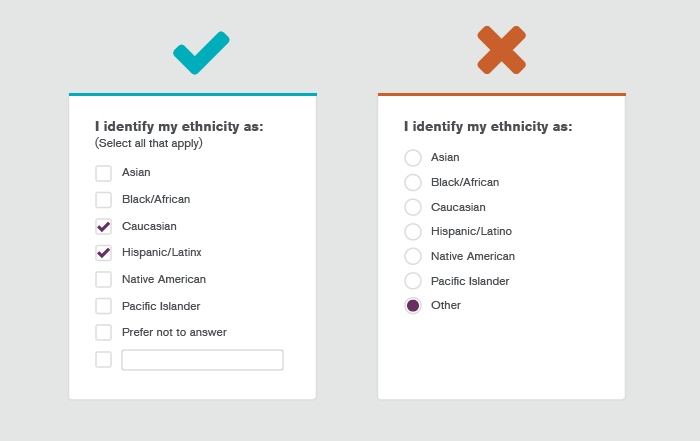
- Many users have privacy concerns around date of birth, phone number, ethnicity & gender. If these are not crucial to your form, make them optional. Or, just remove them! But if you do need to include them, make sure you are including an explanation as to why these are required items.
- Gender/ethnicity should be handled with consideration. For more info, check out this awesome resource on the respectful collection of demographic information.
- When in doubt, allow for self-identification with open fields and/or multiple choice. For example, a user who is both Latino and Asian should be able to select both if they want.
7. Assess and Audit Your Form UX
Your form design hit some of the checkboxes, but not all of them. So, now what?
Form length is always a good place to start. However, if you’re looking for a more systematic way to prioritize things, try using a 5-point ranking system to rate the level of usability and revenue impact:
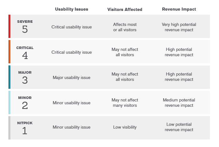
- 5 = Severe; this is a critical usability issue affecting most visitors, or has a high potential revenue impact.
- 4 = Critical; this is a critical usability issue that may not affect all visitors, or has a lesser potential revenue impact.
- 3 = Major; this is a major usability issue that may not affect all visitors, or has a high potential revenue impact.
- 2 = Minor; this is a minor usability issue that may not affect many visitors, or has a lesser potential revenue impact.
- 1 = Nitpick; this is a minor usability issue with low visibility or has a low potential revenue impact, but is still worth fixing.
Interested in more UX best practices?
Check out our UX Checklist Blog Series:
Want more help with your forms?
Contact our Creative Team to learn more. We’re here to help!


.png)