This post is from our User Experience (UX) Checklist Series:
- Landing Page Design
- Form Design
- Button Design
- Navigation Design
- Accessible Design
- Ecommerce Design
- Display Ad Design
How to Improve Landing Page Experience
Landing pages are important lead generation tools that have two main goals: 1) provide users with the critical information needed to make a decision, and 2) provide a clear path to act.
While the success of a landing page is greatly dependent on the audience, product or service, industry, and vertical -- there are some universal guidelines that can improve the UX of any landing page.
To help you get started, we’ve broken things down into four main categories that are critical to both usability and conversion:
💡 Review our checklist below to see how your landing page measures up:
1. Clarity
Clarity is possibly the most important topic. If you want people to act, they first need to understand what you’re offering. Ideally, your page should be easy enough to understand that any visitor would be able to explain what you offer to another person.
General Clarity
Communicate your value proposition
Users should immediately be able to figure out what the page is about, how it’s useful to them, and how and why they should act.
Make information as scannable as possible
79% of users scan content, while only 16% read every word. A good rule of thumb is to make no paragraph longer than 3-4 lines, with descriptive subheads after every 2 paragraphs. In fact, the Nielsen Norman Group found that concise, scannable, and objective copywriting led to a 124% increase in usability.
Create attention-grabbing headlines
Your headline is the first thing users see when they land on your page. It should be clear, relevant, and touch on the key benefit of your offer. It should also meet your users’ expectations: if they came to your landing page from an ad, make sure the messaging is consistent.
Don’t underestimate the power of subheads either. For example, instead of just “Our Process”, try incorporating a benefit with it: “Our Process - Saves You X for Less Y and More Z.”
Clearly list supporting details
Bulleted lists are easier to consume and remember than paragraphs. Use lists for key benefits and features, or any other supporting information important to the value prop.
Use language anyone can understand
Jargon, superlatives, hype, or any other meaningless phrases should be avoided. Not only are they hard to understand, but they come across as gimmicky and untrustworthy. When it doubt, keep it simple and direct!
Provide complete information
All critical pieces of information needed to make a decision should be addressed. This can include doubts or hesitations about things like pricing, shipping, return policy information, or guarantees.
Design Clarity
Make a positive first impression
People are quick to judge, and process visuals much quicker than written content. This means your design is critical to your reputation! Your design should look professional, trustworthy, and not spammy.
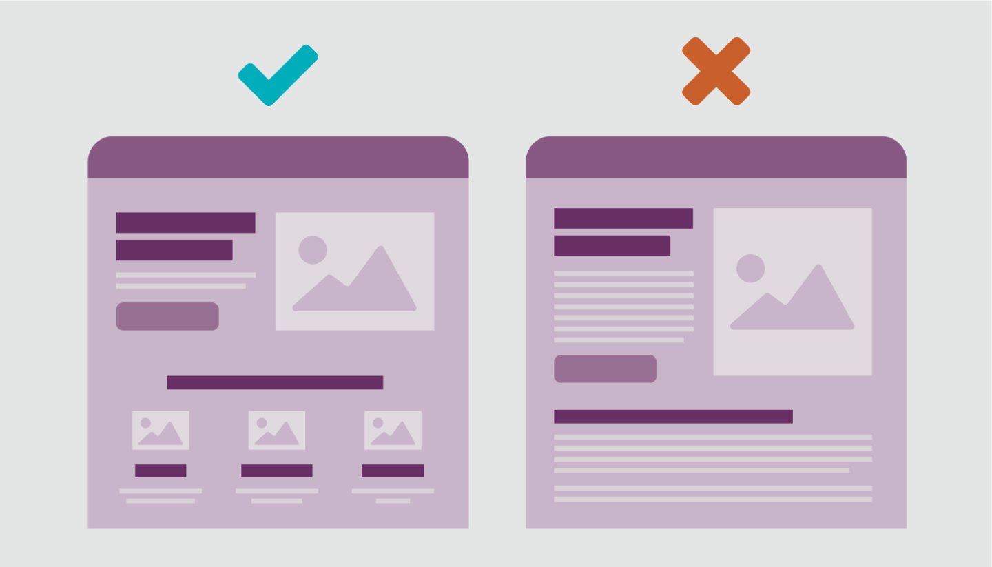
Establish a strong visual hierarchy
Is the largest and/or most prominent thing on your page the most important? Your offer and your call to action should rank high in your visual hierarchy. Consider size, placement, color, and position above or below the fold.
Avoid false bottoms
False bottoms happen when there’s an illusion that the page is complete, despite there being more content below. Be mindful of areas on your page that feel like a logical end, and add visual cues. While it’s true that almost everyone scrolls, we want to make sure to motivate them to keep scrolling.

Utilize high quality images, videos, etc.
Larger than life photographs capture human attention, but we want to make sure they communicate the right story. Make sure your images and videos are high quality to create a positive first impression and a feeling of professionalism.
2. Incentives
Incentives are the motivators that encourage people to act here and now rather than later. Make your offering seem irresistible by incorporating persuasion techniques relevant to your value prop.
Focus on the user, not your product
Clearly show the benefits your user will get to help them understand why they should take action. For example, “Get in shape in 4 weeks” is a stronger incentive than “We specialize in cardio training.”
Educate on both features and benefits
Features (tech specs, details, materials, composition, facts) are important for context and decision-making, but should be translated into Benefits (value props, sales pitches, testimonials) in order to drive your offer.
In other words, Features tell while Benefits sell. Educate on both, but strike a balance based on which will resonate best with your target audience.
Be persuasive enough
- Urgency: Used to give people a nudge to act now. Ex: “Limited time offer” or “5 days left to join!”
- Social proof: This is any third party claim from outside of the company that’s used to rationalize decisions. Social proof is most effective when it’s used in context to alleviate a friction or pain point. Ex: Testimonials, ratings and reviews, case studies, security icons, stats, data, etc.
- Scarcity: Similar to urgency, but refers to an amount rather than time. People are drawn to things that appear exclusive or unique. Ex: “2 items left in stock” or “Booked 17 times in the last 6 hours!”
- Authority: Trustworthy figures go a long way, which is why so many companies use doctors, celebrities or famous chefs to endorse their products. Ex: “9 out of 10 doctors recommend…”
- Reciprocity: People are more inclined to buy if you give them a freebie. Ex: Free shipping, giveaways, coupons/discounts, special deals, etc.

3. Friction Points
Friction manifests as the obstacles, fears, anxieties, or doubts a user may face before completing a task or conversion (e.g. anything from technical bugs to inconsistent messaging). Identifying and addressing these issues can go a long way to improve usability and conversions.
Don't reinvent the wheel
People like low visual complexity (keep it simple) and high prototypicality (keep the layout familiar)!
Ensure contextual relevancy
- Does your headline match the page content?
- Do the CTAs match the value they’re getting?
- Are the images or videos relevant to your content?
- Where did your user come from? If they came from a display ad promoting a “Free Trial”, then “Free Trial” better be promoted on your page.
Meet technical standards
In the age of the mobile phone, your page must be responsive and work across multiple devices.
Furthermore, it must also work across multiple browsers, and load quickly. Make sure you’re thorough with your QA, or conduct a walkthrough of your page on multiple devices and browsers to spot bugs or technical issues.
Simplify forms
Make sure your form only asks for the necessary questions. If you’re asking for sensitive information and people have doubts about their privacy or security -- they’re not going to submit that form. Confirmation messages, clear error validation, and intuitive labels and microcopy are also important.

Address doubts and anxieties up front
Make sure you address any fears or concerns your user might have to complete the task. For example, are you selling a product, but don’t offer any information about a return policy or guarantees? Tackling these friction points and leaving no question unanswered helps to alleviate doubts and fears in your user.
Avoid unnecessary distractions
- Are blinking banners or automatic sliders stealing attention?
- Do you have lots of information unrelated to the offer?
- Are there any elements not contributing to the desired action?
If the answer is yes to any of the questions above -- chances are, you should consider making some cuts.
Mitigate accessibility issues
- Use a contrast checker on text and background colors
- Avoid using color as the only way to convey information
- Enable navigation with only a keyboard / without using a mouse
- Make clickable items large enough (44x44 px is a good benchmark)
- Provide Alt attributes for any non-text element, such as images and maps
- Add captions and transcripts for audio and video
4. Action
Ensure the path to act is extremely clear
Make sure your CTAs are large with enough white space and visual contrast around them so that they stand out on the page. Relevant icons can also help draw attention to your CTAs.
Create secondary paths to act
Consider adding secondary paths to act for visitors in different stages (research, evaluation, etc.), but don’t forget about your visual hierarchy. Secondary paths to act should look secondary.
Label buttons as effectively as possible
As a good rule of thumb, your labels should finish the statement, “I want to…” You can also use keyword research, user testing, and surveys to identify a trigger word to include in your CTA. If your users are looking for “pricing” then the trigger would be “pricing.” It’s also best to avoid using “Submit”. The expectations are vague, and very few people are eager to “Submit”.
Optimize the conversion journey
Incorporate “click triggers” like the incentives mentioned above to add motivation or alleviate a fear or concern. For example, “No credit card required” or “Cancel anytime” can go a long way to alleviate anxiety, while “Limited time offer” or “Only 1 left in stock” adds a sense of urgency.

How to Prioritize Landing Page Updates
💡 Your landing page hit some checkboxes, but not all of them. Now what?
Clarity and friction are two great categories to start with that have high potential for return. If you’re looking for a more systematic way to prioritize things, try using this 5-point ranking system:

5 = Severe; this is a critical usability issue affecting most visitors, or has a high potential revenue impact.
4 = Critical; this is a critical usability issue that may not affect all visitors, or has a lesser potential revenue impact.
3 = Major; this is a major usability issue that may not affect all visitors, or has a high potential revenue impact.
2 = Minor; this is a minor usability issue that may not affect many visitors, or has a lesser potential revenue impact.
1 = Nitpick; this is a minor usability issue with low visibility or has a low potential revenue impact, but is still worth fixing.
Next Steps
Whether you’re creating new landing pages or optimizing old ones, we're here to help:
- Want more best practices? Keep reading our UX checklist series
- Seeking an agency partner? Contact our Creative Team
Sign up for our newsletter for more posts like this in your inbox:


.png)
.png)