Seerfest 2022 Session Recap

Seer’s Director of CRO, Rafael Damasceno, defined Conversion Rate Optimization (CRO) in his Seerfest 2022 talk as the “data-driven process to improve interfaces to increase conversion rates.”
In other words, it’s the process of using data to identify areas on your website that can be changed or improved to get more people to act.
The CRO process uses A/B testing to make sure that whatever change is being made is validated by actual user behavior before it’s officially implemented and rolled out to all users. Anytime you visit Google or Amazon or log into your Netflix account, there’s a good chance you’re interacting with an in-progress A/B test.
There’s also a big reason why these companies have embraced experimentation so wholeheartedly—testing is a relatively low risk way to try out small or even sweeping changes that can result in big rewards.
So, how can you get started with CRO? When you’re looking to make changes on your website, there are five key levers to explore that can help you make the most of your tests. Learn about those levers below, as well as some practical tips to help kickstart your CRO testing strategy.
1. Match the Motivation
Don’t underestimate the importance of a good first impression! Users landing on your page will quickly try to guess if their needs will be met, often in a matter of seconds. If users don’t see something that resonates with them, they’ll bounce. This is where the power of a clear and concise hero section comes into play.
Your headline is the first thing people see when they land on your page. If your headline clearly answers, “What’s in it for me?” you’ll have a much better chance at capturing your audience.
💡 Ensure your headline clearly answers, “What’s in it for me?”
To craft an effective headline, think about the mindset and intentions of the person landing on your page:
- What are they trying to accomplish?
- What motivated them to start taking action?
- How can your service or product help them?
- Where are your users coming from?
If you’re driving to the page from a paid social campaign, for example, the headline of your landing page should match the messaging on your ads.
If you’re optimizing an organic landing page, Google is an excellent resource for better understanding user motivation. Try Googling keywords related to your page content and check out what kind of SERPs appear. Does Google return general answers? Local content? Educational video tutorials? SERPs can provide really helpful insights into user motivation that can be leveraged in your headline and hero creative.
💡 Google SERPs can provide helpful insights into user motivation.
2. Present a Value Proposition
Taking the concept of a strong and value-driven headline one step further, the messaging on your page should clearly state the unique value proposition of your product or service and answer, “Why should I buy?”.
💡 Make your value prop a unique one that’s specific to your business.
Amazon’s Kindle is up against some stiff competition like Apple’s iPad and other tablet devices. However, when crafting the messaging in the example below, Amazon zeroed in on what the Kindle offers customers that other tablets don’t.
They even spun the fact that the Kindle has less features than its competitors into a unique advantage -- it's “distraction-free” so you can focus on purposeful reading.

When optimizing the supporting content for your value proposition, always keep the user in mind. Focus more on the benefits, rather than the features of your product or service to show value and resonate better with your audience.
An “8-core CPU” sounds pretty cool I guess, but an “8-core CPU that lets me tackle professional-quality editing up to 3.5x faster” sounds much more compelling.

💡 Focus on benefits vs features to show the value for your target audience.
3. Reduce Friction
A helpful tool when digging into friction areas on your page or website is the hierarchy of conversion pyramid. The pyramid is made up of five levels: Functional, Accessible, Usable, Intuitive, and Persuasive.
The success of each level relies on the strength of the level below it, with functional serving as the most basic foundational level to achieve. Basically, if your website isn’t functional, it doesn’t matter how persuasive your copy is.

Source: Instapage
Identifying friction points on your website can be a great place to start when improving conversion rates. One of the easiest ways to do this is to test out your entire customer journey *yourself* on desktop, iOS, and android. Start with your homepage and work all the way through your final lead form or shopping cart to find any low-hanging fruit, such as functional issues.
You’ll also likely start identifying other pain points higher up in the hierarchy of conversion that can be optimized, such as usability issues or messaging that could be more persuasive. Your end product will be a short list (or perhaps a long list) of quick fixes and potential testing opportunities to dig into more.
Look to Google Analytics, heat mapping tools, and/or audience research to support & validate your findings with actual data points. This can also help you get quicker buy-in from stakeholders for tackling optimizations.
💡 Test your entire customer journey to identify low-hanging fruit and uncover other areas of opportunity.
4. Increase Trust
Incorporating social proof has become a best practice in many marketing efforts. It’s based on the idea that people like to adapt their behaviors based on what other people say or do. Case studies, reviews, and testimonials are some of the most common examples of social proof you’ll see on marketing pages.
However, the more commonplace these design patterns become, the more likely people are to glaze over them.
Putting social proof on your page can be effective, but it will be the most effective when it’s woven into the narrative of your page. The next time you add social proof to your page, get creative! Are there ways to strategically incorporate a customer review or data point to help with your persuasive narrative? Can you add testimonials in a unique way that will catch people’s attention?
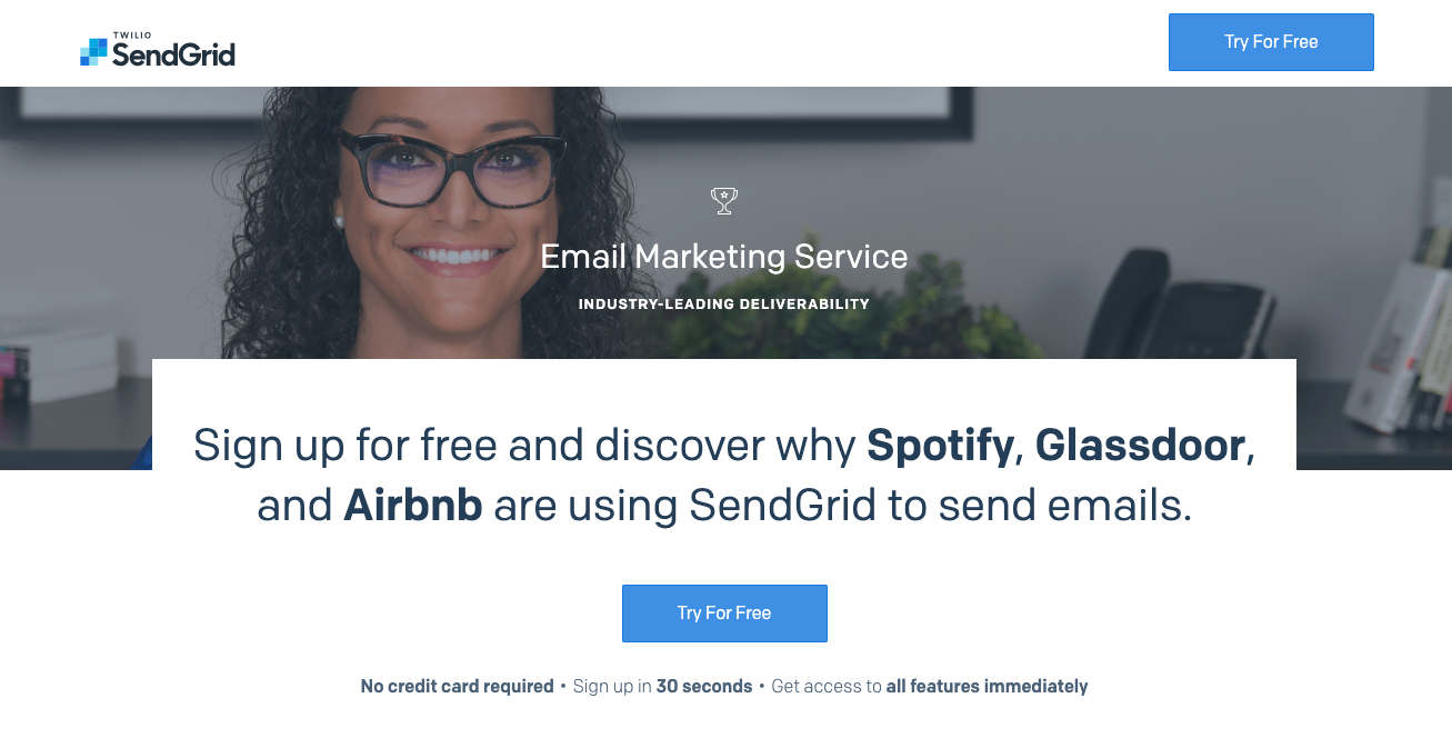
In the example below from Sendgrid, the idea of trust badges was taken one step further and incorporated directly into the page’s headline. Rather than just showing a row of company logos of current “satisfied” customers without much context, these trust icons were featured in a critical part of the page experience: the headline.
💡 Social proof will be most effective when it’s strategically incorporated into the narrative of your page.
5. Add Urgency
Urgency is another common marketing tactic that uses Cialdini’s persuasion principle of scarcity to nudge users to act immediately and take advantage of a limited product, service, or deal.
However, there’s a fine line between using urgency effectively (and in the interest of the user) and using it in a manipulative way, also known as a dark pattern. Misusing or overusing urgency can have more of a negative effect and lead to distrust.
One way to reduce the risk of dark patterns is to leverage contextualized urgency within the content of the page. This can help make sure whatever is being claimed feels specific and important to the user. It can also help avoid making any sweeping claims that might lead to doubts and frustrations from your users.
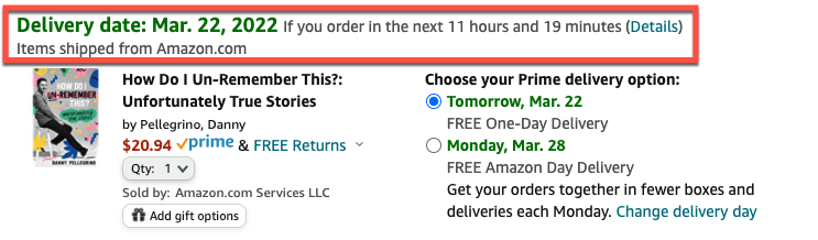
Amazon has tested out a number of different approaches to urgency in their checkout experience. The current approach is a little more subtle than previous tactics and highlights a “guaranteed delivery date” that is specific to the order being placed. Including it within the context of the shipping stage at checkout can help set user expectations and aid in quicker decision-making.
💡 Urgency is more effective when contextualized within the page content.
Key Takeaways
AB testing can be a really effective (and lower risk!) method to improve your website through data-driven optimizations.
We’ve rounded up a few actionable tips below to help get you started, but the beauty of testing is that it’s an iterative process. Test result data will often spark hypotheses for future optimizations to help further refine your digital experience.
- Clearly and immediately answer “What’s in it for me?” to match users’ motivation
- Make your value prop a unique one that’s specific to your business, and focus on benefits, not features to help resonate better with users
- Test out your entire customer journey to help find friction points and identify low-hanging usability fruit
- There are smarter ways to use social proof than just testimonials, like weaving social proof into headlines and other content to generate trust
- Contextualized urgency helps nudge users to act now within the content of the page
Subscribe for more insights, POVs, and strategies:


.png)
.png)