What Happened?
You Can Now Use Google Maps in Data Studio Visuals
On May 1, 2020, Google announced that you now have the ability to add Google Maps to Data Studio reports. They’ve taken the familiar maps interface and made it available to let viewers see your data in a whole new geographic dimension.
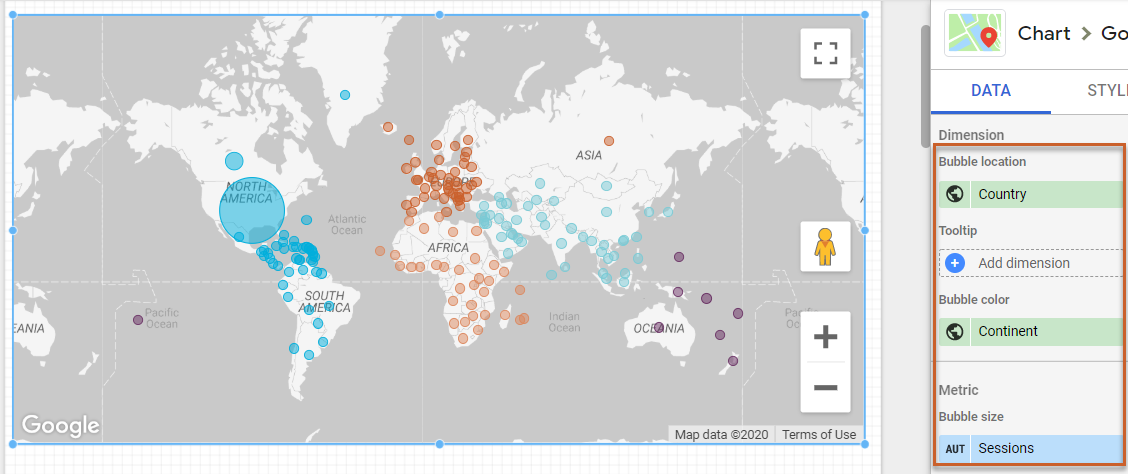
With this new feature you can access a more user friendly map visual, and have access to more features such as Bubble Color, as well as Bubble Size (which aren’t available in Data Studio’s standard Geo Map visual, which only lets you plot a single dimension).
New Google Maps Data Visual:
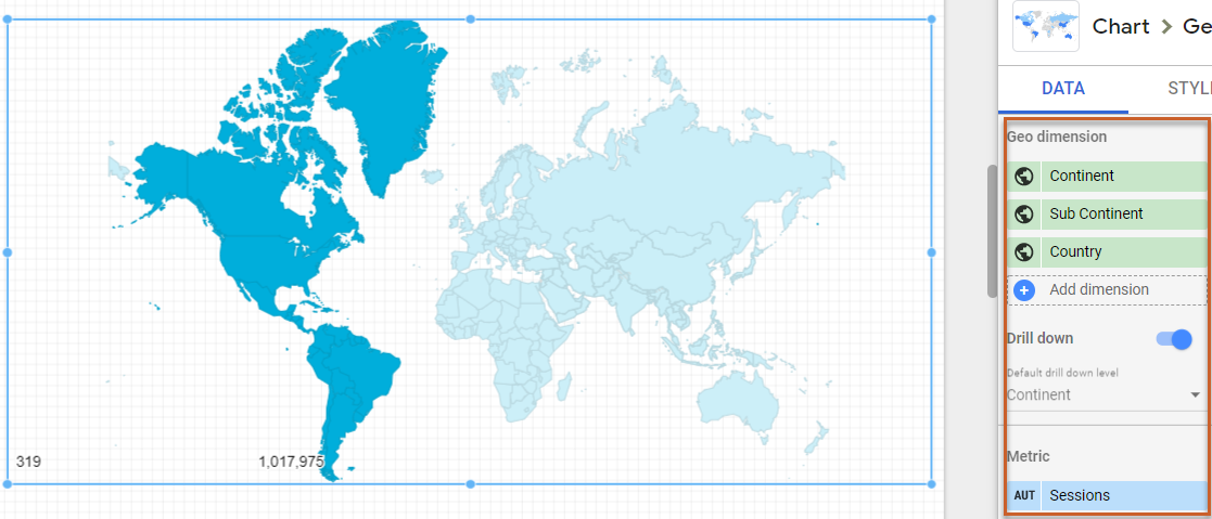
Old Geo Map Data Visual:
Limitations of Google Maps vs. Geo Map
Before you hop into creating one of these, first we want to break down some of the core limitations of this new feature (for the full list, click here) so you can make an informed decision as to how relevant this will be for your use case.
- Data can only be shown as bubbles, as opposed to the shaded regions in Geo Maps (see visual above).
- You can’t interact with Google Maps in Edit mode. You need to switch to View mode.
- There are some data limits you’ll have to contend with:
- 10,000 bubbles for Latitude, Longitude fields.
- 1,000 bubbles for other geographic field types.
- The Tooltip and Bubble color dimensions must have a unique value for each value of the Bubble location dimension.
- You can't enable drill down in Google Maps.
- Google Maps won't appear in embedded reports.
How to Create a Google Maps Visual
To add Google Maps to Data Studio, you'll need a data source with one or more geographic dimensions. Examples of these types of dimensions from Google Analytics include Country, City, Region, Metro Area, etc. You can add a Google Map to any existing report where it’s relevant, or create a new report from scratch.
Here’s how you can use this feature:
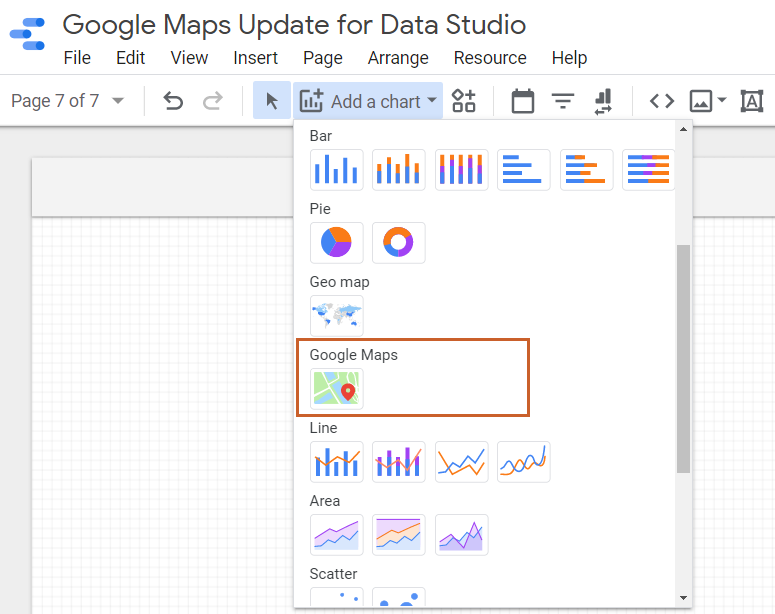
- Navigate to the page where you want to create a Google Map visual
- In the tool bar, click Add a chart.
- Select Google Maps (not Geo Map, which is an older visual).
- Click to add the chart to the report and drag and drop like you would any Data Studio chart.
When to Use Google Maps Visuals
This feature is relevant in any instance where you want an interactive visual for location based data.
Here are some thought starters:
1) Visualize a Key Metric by Location
You can take a simple approach and plot one of your key metrics by location. You can look at global KPI’s or hone in on just the US by using a Country filter. Check out this blog post for more examples.
2: Visualize Multiple Metrics using Size and Color
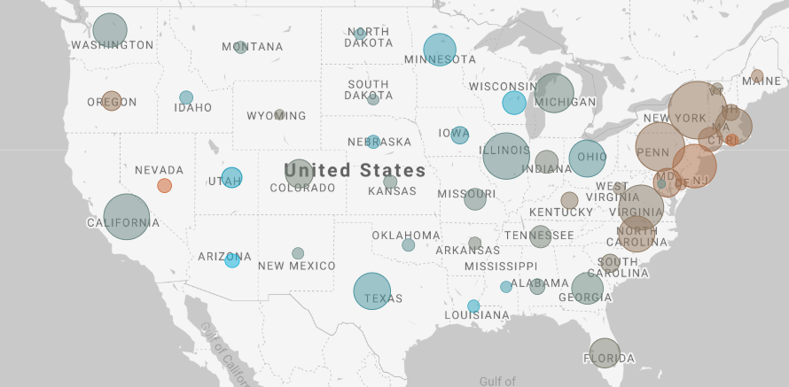
The new Google Maps features can help you take your geo analysis to the next level. You can do what I’ve done below and plot a core metric such as sessions within the US to take a look at where majority of your traffic is coming from and use the bubble size to visualize this easily, but you can then also plot conversion rate as the bubble color. This does two things:
- Allows you to easily scan what drives quantity
- Allows you to narrow down to focus on quality by highlighting what drives disproportionately higher conversions aka these are high value areas. E.g. in this visual, Wisconsin drives a much lower share of traffic but it’s responsible for one of the higher conversion rates on the site.
Now What?
Want to learn more about Data Studio? Refer to our blog posts below:
- Data Studio Template for Monitoring Cross-Channel Regional Trends
- A Beginner’s Guide to Data Studio
- 10 Ways to Use Calculated Fields in Data Studio
- How to Create Case Statements in Data Studio
Sign up for our newsletter for more posts like this - delivered straight to your inbox!