Most of us have used location-based data to analyze performance at one point or another, whether it be using Google Analytics geographic data to see where your top performing cities and states are, or whether it’s using paid search data to look at which regions are driving the highest performance for your campaigns.
Geography is a crucial dimension to look at and consider, but most of us tend to focus on a single data source when doing this type of analysis - this is helpful, but it’s also only the tip of the iceberg in terms of how you can blend and use this information.
I’m going to walk you through how we at Seer analyze location data by combining multiple data sources to get a comprehensive understanding of how each state/city/metro is performing across a host of metrics and data sources.
Before we get started, I want you to take some time to think through all the geography based data sources you have at your disposal.
Some obvious ones are Google Analytics location data and paid search data, but also keep in mind free and available data such as Google Trends, which gives you organic keyword searches by metro, region, state and city. Additionally, as a company, you might have access to internal location data, such as product registration states and cities, or even purchase location.
The beauty of this method lies in combining these data sources so you’re seeing the full picture.
How do I analyze my geographical data?
Let’s start with Google Trends.
For instance - if you sell dog treats (just an example, plus, who doesn’t love dogs?!), you could look at how metros that rank high for searches for general dog treats stacks up against searches for your brand’s dog treats. By joining the two datasets in a data visualization tool like Tableau or PowerBI, you can then easily see where each Metro stands in terms of ranking high for your industry, but not for your brand. Isolating those areas is a quick way to identify markets with potential for growth for your brand.
Another massively helpful data source to layer into this visual is population data. In the following visual, we grabbed population data for each Metro and divided the metros into quartiles of equal population. The first quartile would have the largest (and least number of metros), and the fourth one would have the smallest, but highest number of smaller metros.
What this does is cluster metros from smallest to largest, and by layering in this data you can really see the more impactful opportunity areas.
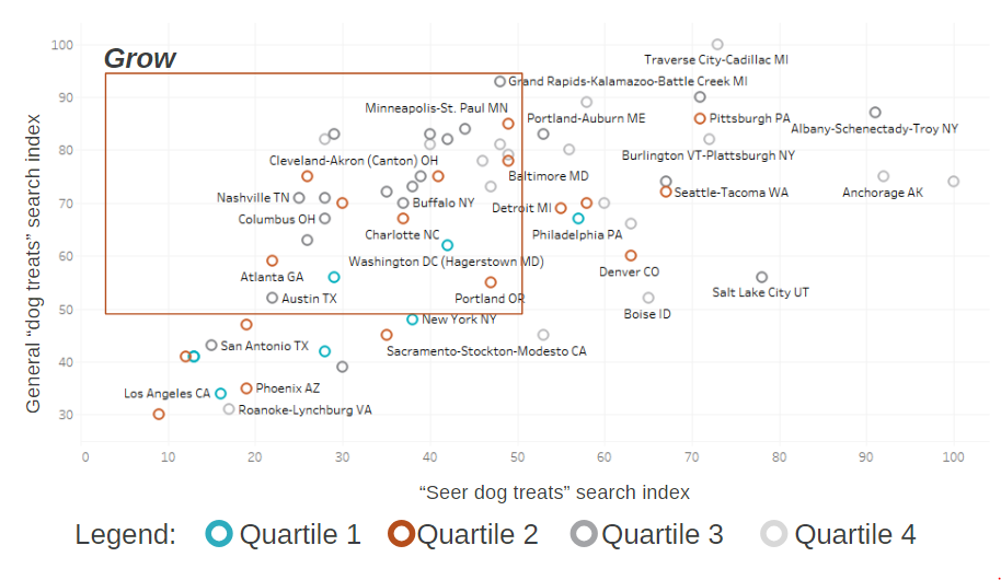
Each metro is color coded by which quartile it falls into - quartile 1 and 2 consist of the largest metros (and possibly more impactful to target). Layering this data in lets you get really contextual about what you’re looking at.
If you look at the “Grow” box, for example, which has metros that rank high for the industry but not your brand, and then layer in high population metros - you can then isolate the areas with the most opportunity. Just by layering in population data you can analyze this information in a completely different way.
This just blew my mind. What else can I do with this type of data?
You can use this method to analyze any data source that has a geographic dimension.
For instance, you can pull Google Analytics data by metro and sessions and goal conversion rates and plot the metros using the above method. This would then allow you to analyze areas that drive high conversion rates but those that may not get a high volume of traffic - making them ripe for targeted paid campaigns. On top of that, you could layer in AdWords data to look at which metros drive high paid search conversion rates but don’t necessarily drive a lot of sessions to the site.
Take a look at the example below which does exactly this. By plotting AdWords conversion rates against sessions you can pinpoint areas that have high potential but aren’t necessarily getting the scale they need.
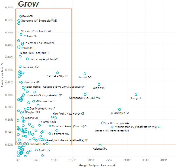
You can make this more impactful even by layering in quartile data, to make sure you’re considering metros that have enough population to be scalable.
By now you have a better idea of how we analyze this type of information and blend data sources to take insights to the next level.
If you’re interested in chatting - give our Analytics team a shout. We’d love to walk you through our approach to analyzing geographical data.