This is part 3 of 5 posts on how integrated teams can build killer assets for your eComm website.
Part 1: Prioritization Part 2: Audience Interviews Part 3: Design & Creation Part 4: Paid Social Part 5: Organic Promotion
-----
The first thing we do before kicking off the detailed design work on any project is a thorough review of the existing audience research. We then combine it with competitive and visual research to get an overarching view of what we need to solve with the design. What are the most important things to our audience, and how can that guide every single design decision we make?
How can we provide real value versus decoration alone, so we can give readers what they need to feel comfortable making a purchase?
How audience pain points translate to design
From the audience research conducted for the Chair Buying Guide, we already knew the key topics we needed to cover and the high-level format in which people were searching.
We also took away key pain points from interviews, including:
- People were really overwhelmed by the process of buying a chair.
- Most people we talked to would be hesitant to buy a chair online without having seen it in person.
So before we even put any pencil to paper, we knew that the feeling of the design had to be clean and airy: lots of white space, no more in the user’s view than what was critical. We had to guide them through each step without distraction. This would also set the guide apart from competitive assets, most of which were shoehorned into an existing template and were littered with ads and irrelevant information.
Since another key concern was not seeing the chair in person, we decided that any images we selected should be large without having to zoom in the browser, extremely clear, and should provide opportunities for users to visualize what it would look like in person—pointing out useful information so at no point would they need to guess at what they were viewing.
The general layout we designed is shown below. We created a single-column layout with no ads, large, readable type, and pull-quote callouts. Plenty of space between elements made the page easy to read and scan.
We also wanted to make sure that users had the ability to start shopping for relevant products. We linked to product and category pages to provide additional detailed information.
Influencer bios were included to let users know more about the subject matter experts who collaborated on the pieces. This served to build trust with readers and show them the research and expertise that guided the recommendations in the article.
Lastly, we included a link to the next article, which allowed users to continue reading the guide.
Custom imagery
We knew that we wanted to outcare the competition and make images that were truly useful and as specific as possible to the text around them.
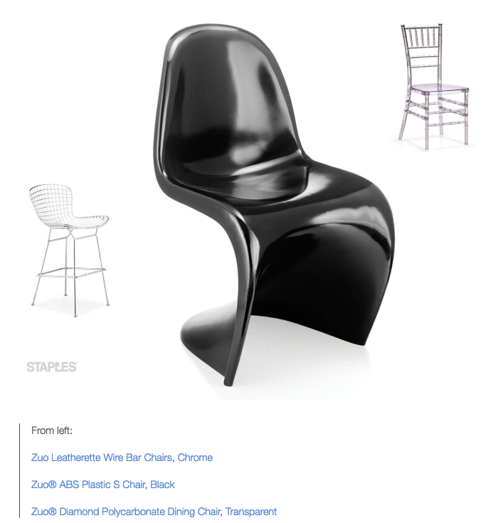
For instance, all product placements were selected specifically to be helpful and relevant within the context of the content. In the dining room chairs article, the interior designer who contributed actually went in and picked out products from the Staples site that he would recommend, and that helped to illustrate the concepts described.
For instance, in this section of the article, Yanic, the designer, discussed that if your dining room gets used a lot, metal or plastic chairs that are lightweight, easy to move, and easy to wipe down are best. By integrating products in this way, we ensured that we weren’t spamming our readers.
Product images were placed into the article at a large size, with lots of white space surrounding them and with links to their respective product pages.
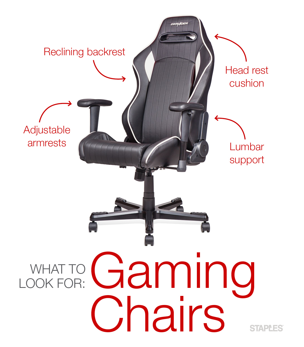
For more complex products, we added annotations to images so readers could get a quick, high-level view of a chair’s features—simulating that experience of being in a store and having a salesperson point them out. These annotations would also make it easier to relate the image back to the more detailed text.
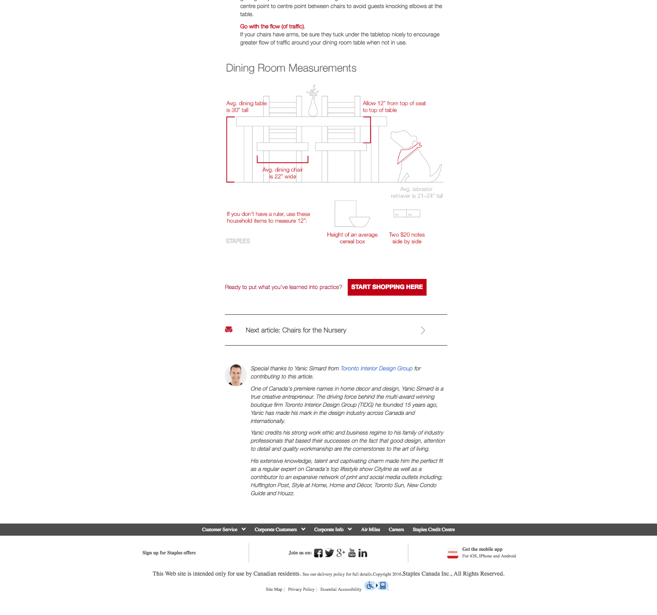
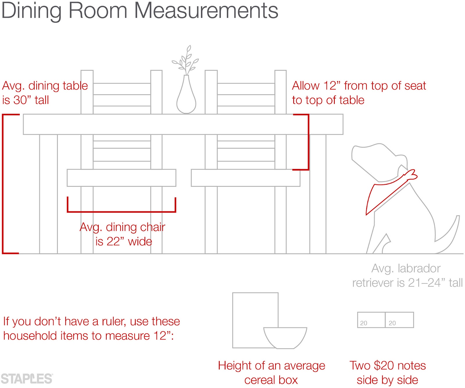
Custom diagrams were also designed to provide measurements and intel critical to buying the right sized chair. In addition to standard measurement, we included household items that could be used to gauge scale, in the event that the reader didn’t have a ruler or tape measure handy.
For instance, the most popular dog breed in Canada is the labrador retriever—so this diagram provides a lab for context and measurement, in an effort to identify more closely with the audience and, again, to help ease that feeling that it’s difficult to visualize certain situations while shopping online.
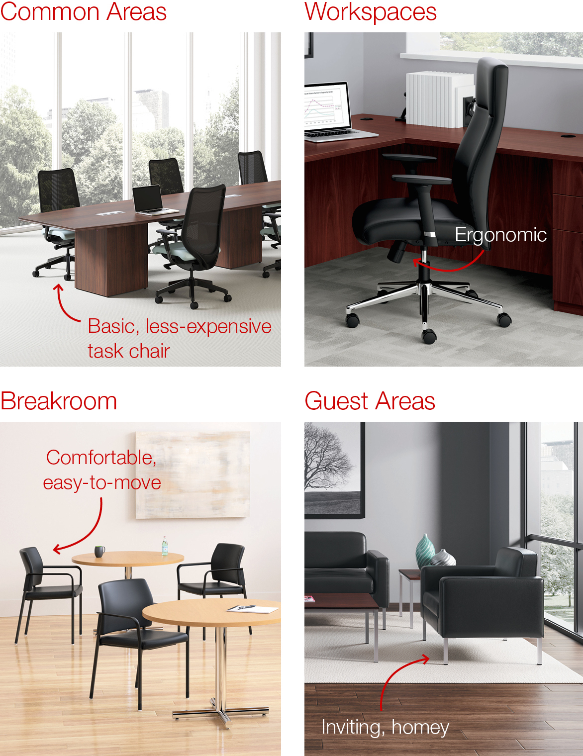
Several articles compared chairs and discussed various use cases for different types of chairs.
In terms of design, we went the extra step to customize product images to make sure the reader would know exactly what they were looking at and could compare different situations like you see here.
When selecting photographs, we considered the age-old saying, “People don’t buy products, they buy better versions of themselves.” We included lifestyle images showing moments involving chairs, to get the reader to imagine the possibilities of their perfect, new chair.

Bottom line: Think about every single design decision that you make, as it relates to your audience, goals, and brand.

.png)