Highlighting absolute change and percent change are likely cornerstones of your reporting. And if you’re reporting on the same data week after week or month after month, you’ve probably felt the headache we did at Seer having to manually calculate these values every. single. time. in Google Data Studio.
You can speed up the process a bit by using a Google Sheet connector, and for a while, we thought this was a pretty clever solution. But if it’s not fully automated, it just ain’t good enough. For years at Seer we asked ourselves, “Why can’t we connect directly to a platform?!”
Oh, but you can.
Blended data, baby. That’s how.
Follow our step-by-step instructions to learn how to build automated sortable change columns with blended data in Google Data Studio.
Step 1: Connect Data Sources to Your Report
If you’re building a dashboard from scratch, you’ll want to connect your data source(s). In this walkthrough, we’ll speak specifically to Google Analytics data. This method can be applied to any data source that has a “date” column formatted in such a way that Google Data Studio can understand it (YYYYMMDD).
Step 2: Blend Your Data
Begin blending your data - under “Resource” in the navigation bar, scroll to “Manage Blended Data”, then “Add a Data View”.

In your new data view, add three identical data sources. The only thing that will differ among these sources is the date range.
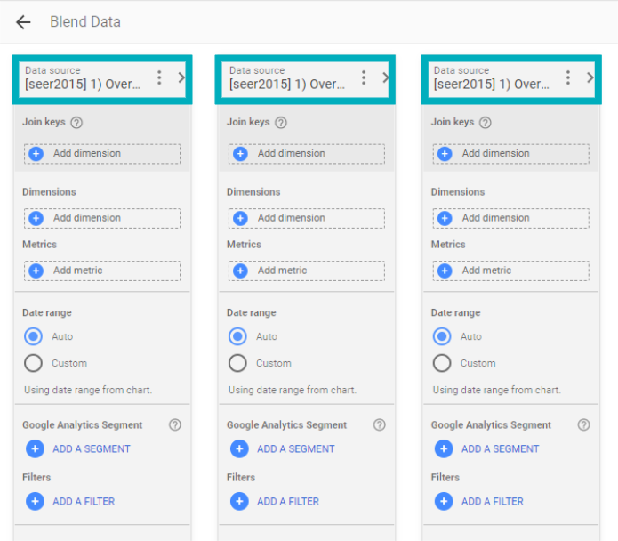
Adding Your Data & Labeling Your Data Sources
Begin by adding your metrics and dimensions from the added data sources.
Keep in mind that join keys will be important to allow the separate data sources to link to one another.
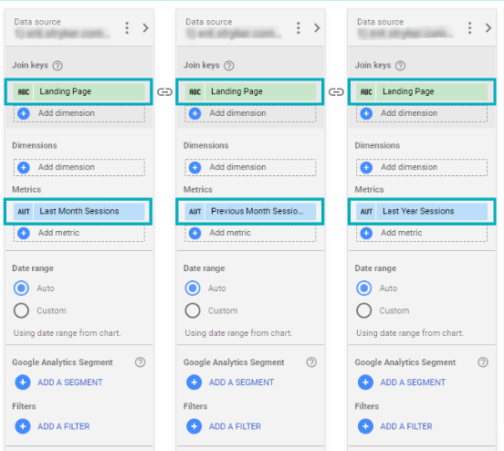
For this example, we just added Landing Page from each as a join key and Sessions as a metric. If you want to add Default Channel Grouping to the final product, add it now as a join key from each of the sources.
We’ll want to rename “Sessions” in each data source to properly denote varying date ranges. In the case of monthly reporting, we’d recommend labeling two as “Last Month” and “Previous Month”, allowing us to compare data Month over Month.
The final data source should be labeled as “Last Year”, enabling us to compare data Year over Year.
If we are reporting on March 2020, for example, March 2020 data should be labeled as “Last Month Sessions”, February 2020 data as “Previous Month Sessions”, and March 2019 data as “Last Year Sessions”.
Adjusting Date Ranges
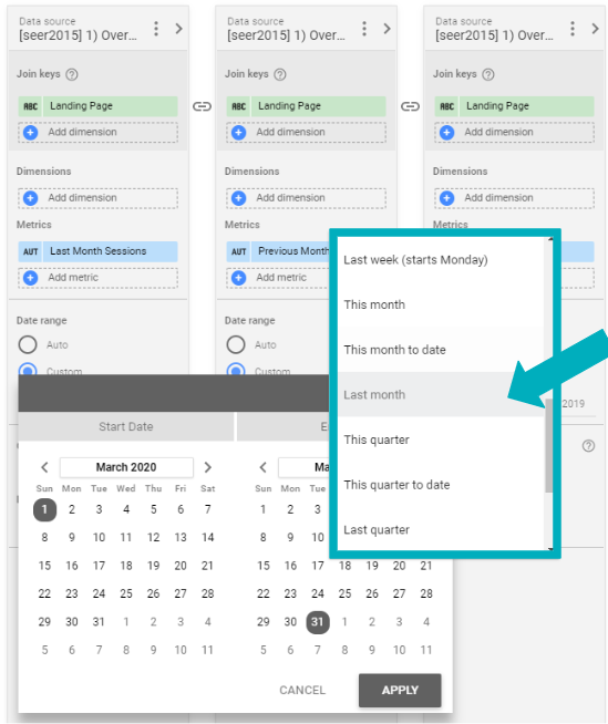
Next, adjust your date ranges to reflect metric labels. For each data source, we’ll want to toggle “Auto” to “Custom”.
In the example of reporting on March 2020 data, the date range for “Last Month Sessions” should then be toggled to “Last Month”.
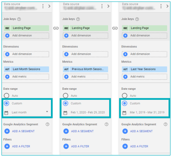
 For “Previous Month Sessions”, we’ll want to use an Advanced Filter. Toggle “Fixed” to “Today” and, counting backward, adjust the number of months and days to accurately capture your preferred time period. Continuing with our example, we’d count backward from “Today” to capture February 2020.

Repeat these steps for our final data source to capture March 2019 data, counting backward from “Today” and adjusting the number of months and days accordingly.

Using these Advanced Filters is what will make the dashboard update each month without any intervention.
Add Filters or Segments as Needed
The final step in building your blended data source is to add any relevant filters or segments. This step is optional and may vary pending on the goals of your report. Adding dimensions such as Source or Medium as join keys from each source will allow you to filter within the final dashboard.
Click “Save” and close out.
Step 3: Visualize Your Data
Next, build a chart to visualize your data. For the purposes of our walkthrough and the goal of analyzing absolute change and percent change, we’ll build a table.
Select the new blended data as your Data Source, Landing Page as your Dimension. Your metrics should include “Last Month Sessions”, “Previous Month Sessions” and “Last Year Sessions” as well.

Step 4: Create Custom Fields
In addition to our three existing Metrics, we’re going to create four new custom fields.
Month over Month Absolute Change
Click “Add a Metric”, then “Create Field”.
Your formula will equate to:
- sum(Last Month Sessions) - sum(Previous Month Sessions)
Leave all other settings as is.
Month over Month Percent Change
Click “Add a Metric”, then “Create Field”.
Your formula will equate to:
- (sum(Last Month Sessions) - sum(Previous Month Sessions))/(sum(Previous Month Sessions))
Leave all other settings as is.
Year over Year Absolute Change
Click “Add a Metric”, then “Create Field”.
Your formula will equate to:
- sum(Last Month Sessions) - sum(Last Year Sessions)
Leave all other settings as is.
Year over Year Percent Change
Click “Add a Metric”, then “Create Field”.
Your formula will equate to:
- (sum(Last Month Sessions) - sum(Last Year Sessions))/(sum(Last Year Sessions))
Leave all other settings as is.
Add these four new Metrics into your table and sort!

And There Ya Have It Folks
At this point you should have a complete table. Here’s an example of ours.

Your reporting has just become that much easier!
Looking for pre-built GDS templates?
Check out these recent plug-and-play templates from our team! Don't forget to sign up for our email newsletter below:

.png)