I was reviewing an analysis years ago, and I got triggered.
The analyst was suggesting that we target San Antonio. Up to that point the client had only targeted major cities (think New York, Chicago, San Francisco) but now the analyst thought that San Antonio would be a great location, even ahead of Dallas. When asking him why he told me that it was because it was one of the top 10 largest cities in the country, and even larger than Dallas.
I was surprised by this.
San Antonio bigger than the Big D? No way.
Now don’t get me wrong, San Antonio is a gorgeous town, but it didn’t strike me as a top 10 in population city. I mean it doesn’t even have an NFL team …

But sure enough, the top 10 cities in the US by population were:
- New York
- Los Angeles
- Chicago
- Houston
- Phoenix
- Philadelphia
- San Antonio
- San Diego
- Dallas
- San Jose
🚩Looking at the wikipedia page, I saw nothing but red flags.🚩
San Antonio was estimated to have 1.5 million people. Dallas? 1.3 million. Impossible. I lived in Dallas before. That city has far more than 1.3 million people. And wait, San Jose in the top 10?
Then it hit me that we were looking at the population of the city itself, NOT the metro area.
After having lived in Pittsburgh before making the move to Philly, I was used to thinking in terms of metro population. Pittsburgh has 130 different self governing municipalities in Allegheny County, by which splits the population into 130 different parts. This is as opposed to, say Philadelphia, which consolidated its city and county in 1854.
Looking at city population in the US as a reason to target for marketing can be a really really bad decision. I mean we might as well do it by the largest cities in the US by land area:
- Sitka, Alaska
- Juneau, Alaska
- Wrangell, Alaska
- Anchorage, Alaska
- Jacksonville, Florida
- Anaconda, Montana
- Butte, Montana
- Oklahoma City, Oklahoma
- Houston, Texas
- Phoenix, Arizona
Okay maybe not.
The main thing I gleaned from that? There is a city called Anaconda, Montana … wouldn’t it be amazing to say, “Hi I’m from Anaconda, Montana”?
Anyways … so what if we look at the top 10 METRO AREAS (i.e. not bound by municipal governments):
- New York City (+Jersey City, Newark, etc)
- Los Angeles (+Long Beach, Anaheim, etc)
- Chicagoland
- Dallas / Fort Worth
- Houston
- Washington DC (+Arlington, Alexandria, etc)
- Miami (+Ft. Lauderdale)
- Philadelphia (+Camden, Wilmington, etc)
- Atlanta
- Boston
San Antonio is ranked 24th wedged between Orlando and Portland Oregon.
By the way, Jacksonville, the biggest american city by land mass outside of Alaska? It’s ranked 40th in metro population.
When we’re doing any kind of geo analysis and we want to compare different regions, we really need to do it by the population of the region, and have that be impactful.
We expect there to be more sessions and conversions to our website from New York City than from Anaconda, Montana, right?
Sometimes this is easy.
But if we’re not looking at metro regions, not considering the different population levels of said regions, then things can easily become wonky. Especially when trying to find impact or opportunities in the “long tail” of the smallest quartile of metro regions.
Okay so how do we do this?
The data we’re sharing in this post can quickly let you see how your work is doing not just by metro, but by per capita population, which is as very different way to look at your performance.
First: Get yourself Power BI
You’re welcome to do this in Tableau or anything else, but I’m gonna walk you through from scratch, and Power BI can handle this really easily, and it’s free. So if you don’t already have it, head over to PowerBI.microsoft.com and Download it.
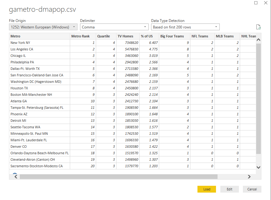
Second: Download This CSV of Geodata
I put together a little CSV [which you can download free].
The sheet takes the metro areas in Google Analytics for the US, and adds a few dimensions. Including:
- Metro Rank
- TV Households (from Nielsen)
- Count of Big 4 sports teams (MLB, NFL, NBA, NHL) per metro [just for fun!]
You can always add other data per metro to your heart’s content, but let's stick with this for now.
Third: Go grab some data from Google Analytics
Head into your Google Analytics account, and go to the Audience > Location report.
Once there navigate down to the US, and then for the Primary Dimension select “Metro”.
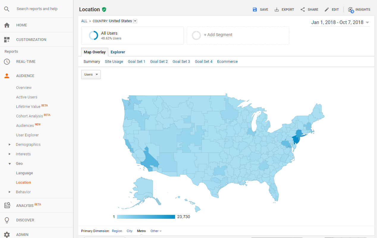
This will give you information on user behavior, and conversions for each metro in the US. Go to the top of that report, and select Export, and download it as a CSV as well.
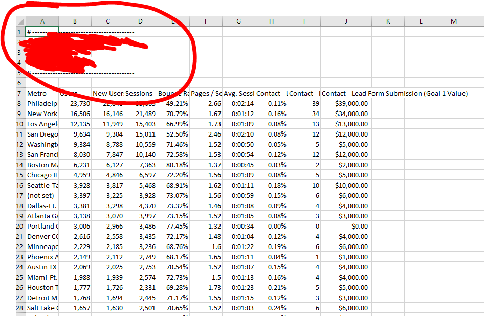
Fourth: Clean That Data
By default the download from Google Analytics is going to have it’s top 6 rows be information about the export. Load up the file, and delete the top 6ish rows of data, so the first row of data are the column headers. Save that file as a CSV and exit out.
Fifth: Boot Up Power BI, and Get The Data
Start up Power BI (or if it’s running start a new project). You’ll be immediately given the choice of what to do, with one being. “Get Data”. Click that!
You’ll get another screen/popup that asks what kind of data and select Text/CSV and then navigate to your Google Analytics data file. It should recognize the headers, and you can just click the yellow “load” button.

Sixth: Make a Scatterplot
It’s pretty easy to start visualizing just this data. You can make a scatterplot by just clicking the scatterplot button (under visualizations it’s the third down, second in from the left) and then checking a couple of the checkboxes on the right.
Check off your Goal Conversion, Sessions, and then drag Metro over to Legend.
Bam scatterplot.
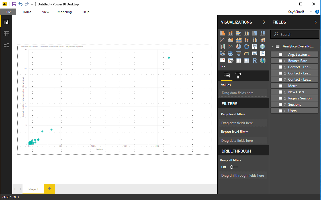
Because you might have a ton of “not set” metro areas in your data, you might need to remove them. Just right click on the not set point on the scatter plot and choose to exclude that, and it will add that filter and filter that data out ongoing.
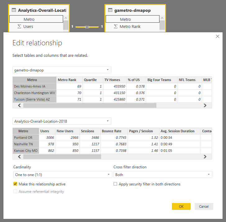
Seventh: Get The Other Data
You’ll now have one dataset connected (the Google Analytics data) but the key here is to connect that to your other Geodata. Click on “home” in the top menu, then click on the “Get Data” button. Repeat the process you did before and find and select the geodata csv we shared above. Load that data.
Now… The cool thing here is that Power BI should automatically recognize that there is a connection. It should see that both your files have a column labeled “Metro” and it will create a relationship between them automatically.
You don’t have to do a thing.
If you want you can click over to look at the data relationships, and see that there is a relationship established with one to one cardinality.
The key thing is that… just loading that data, with the same values and header title? Power BI does that connection for you.
Eighth: Start Analyzing
Want to now look at your conversions by TV Households in a metro? You can do it. For Seer it shows that Philadelphia is WAY overperforming as far as region goes. Makes sense. We were founded in Philadelphia in 2002, and it’s where our headquarters are.
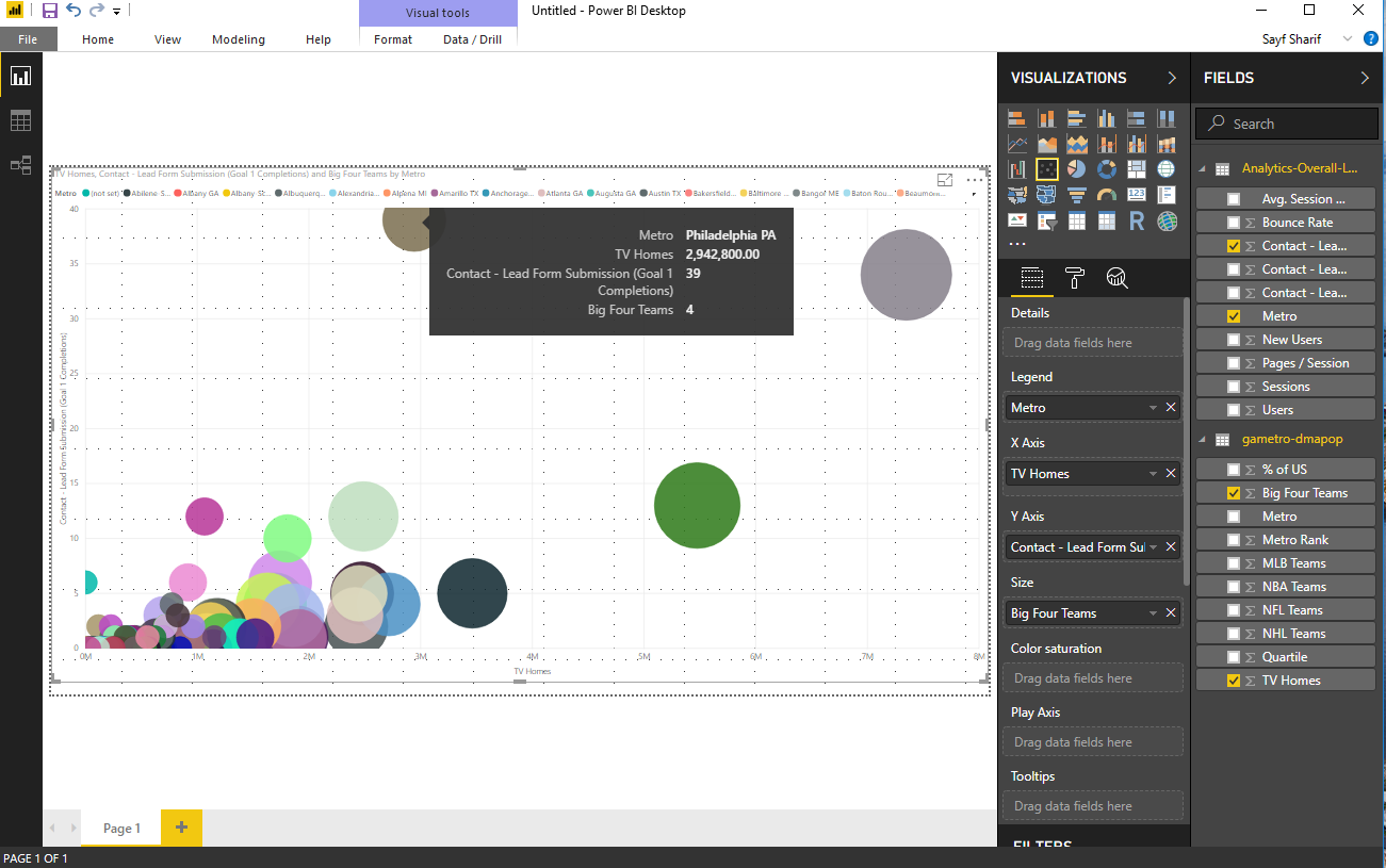
Want to size the points on the plot based on how many Big 4 teams that metro has? Go for it.
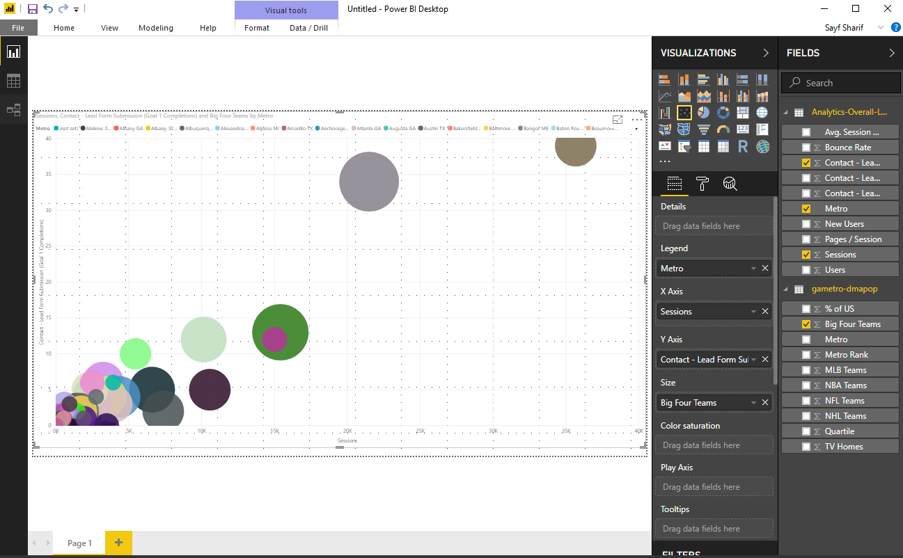
Or you can play around with the charts. Maybe compare your efforts by quartiles (each being 25% of the US population, with the first quartile being the smallest metros, and the fourth being the largest). For us we get much more traffic from the 4th quartile, even though each of those areas has the same amount of population.
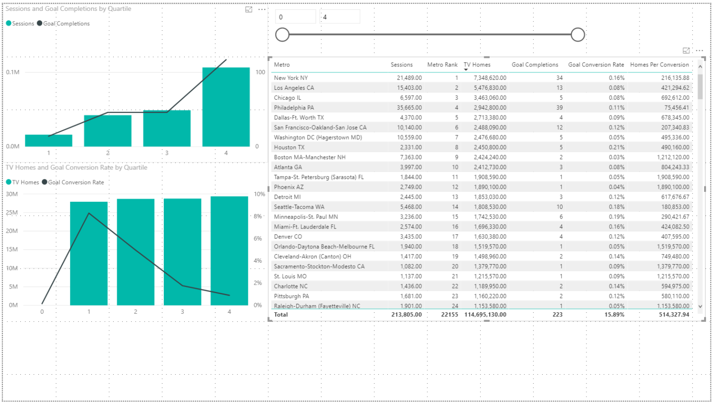
You could add a calculated metric, in this case I made one for Homes per Conversion. The smaller the number the more conversions per home. You could look at where you’re doing worst based on population, like in Tampa where we’re getting only one goal completion per 1.9M households.
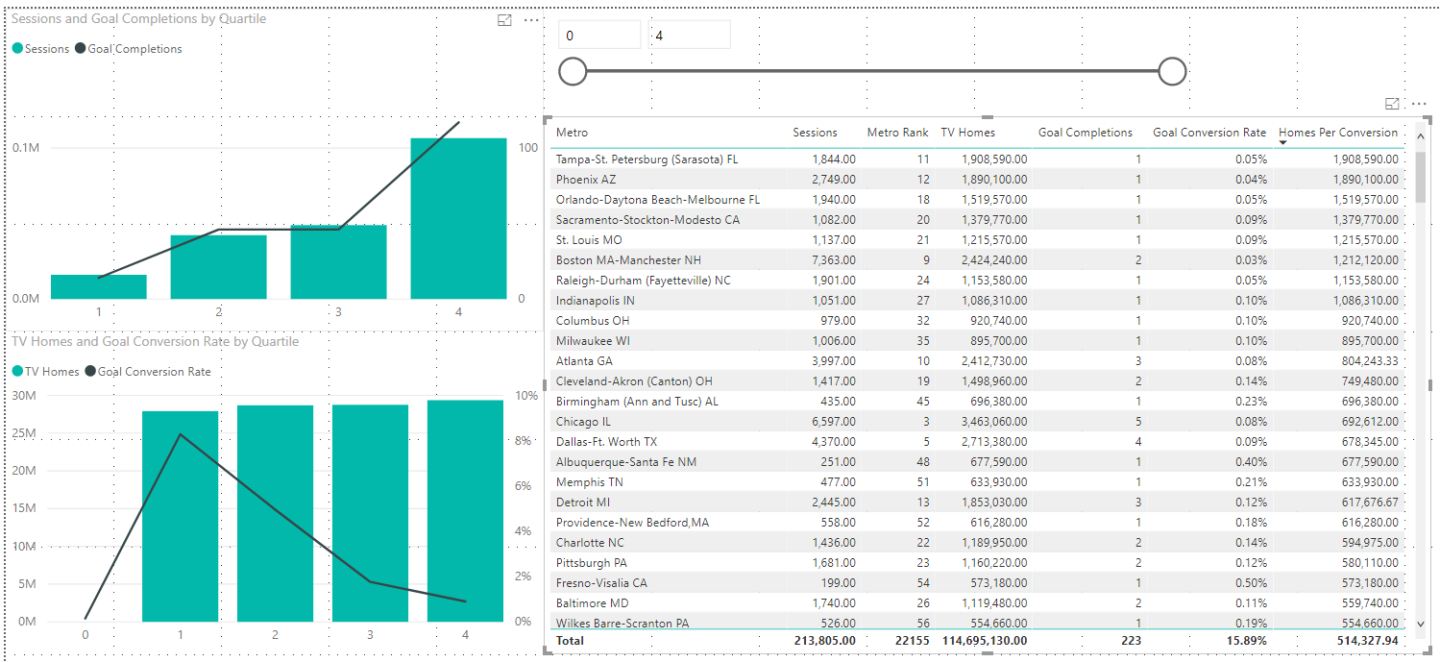
Or you could look at our best metros like Philadelphia and… Wait… Missoula, Montana?

Eh. It’s only two hours from Anaconda, MT. I think we can make that work.
Takeaways
Your data does not exist in a vacuum. It’s all contextual, and that context is often not contained within your base data. Whether it’s synthesizing your PPC and SEO data to look for opportunities, or looking to see how the weather affects your conversion, there is tremendous value in finding the right datasets that you can join to your Google Analytics data to answer your questions.
This can almost immediately help you pay dividends in understanding not only what areas of the country give you high session counts because there are lots of people there, but ones where you are over or underperforming based on that population size.
Get Synthesizing That Data! If you’re looking for more tips and tricks, keep reading Analytics blog posts, and sign up for our newsletter below.


-1.png)