
What is Power BI?
Power BI is a business analytics tool from Microsoft. You can connect multiple datasets and create interactive visualizations for reports and dashboards.
What About Tableau?
Tableau is also an awesome reporting and data visualization tool, so is Data Studio, and plenty of other tools exist with varying strengths and focuses.
We’re focusing on Power BI because a lot of our team members use it and we feel we can give better tips, tricks, and walkthroughs on a platform we regularly use.
What is Big Data?
Big data describes extremely large datasets – especially ones that are too large for a traditional tool (like Excel) to handle.
What are the Advantages of Big Data for Search Marketers?
Some of the biggest benefits of big data are:
Finding Opportunities by Combining Different Types of Data
By combining multiple types of data you can find opportunities you never may have seen before, or would have taken hours to calculate. With a data viz tool, you can combine your paid data and organic data into a single chart and see which terms are converting for paid but not ranking in organic.
You can have discussions across different channels and break down silos.
Create your own best practices vs industry level best practices
You can estimate traffic by creating a click-through-rate curve for YOUR site, not just using the industry average. In short, you can combine all of your important metrics to better find opportunities, prioritize strategies, and estimate ROI.
More Accurate Views for Data-Driven Decisions
Big Data does not always = accuracy, but you can be sure that it’s better to look at more data than less. Google Sheets has a limit of 2 million cells and Excel fails after more than 1,048,576 rows by 16,384 columns. That might sound like a lot – but imagine trying to combine the Adwords data, Google Analytics data, Google Search Console data, and keyword ranking data of an Enterprise company. Those million rows are gonna fill up FAST, forcing you to start trimming down your data, and losing out on insights.
Being Able to Answer More Questions, When They’re Asked
When’s the last time you built out a huge slide deck or Powerpoint presentation, spending hours on formatting and spelling out insights, only to have your client or your boss ask a question that you hadn’t considered?
You probably answered something like “I’m not sure but I’ll get back to you tomorrow!”
If you were presenting an interactive dashboard, you could have said “Let’s find out!”. Being able to explore your data live, and answer questions when they’re asked isn’t just valuable because you’re giving answers, it’s valuable because you’re being transparent about your analysis and your data.
So Why Should You Care?
Marketers are already learning how to use better tools for bigger datasets – you can either stay ahead of the curve or sit on the sidelines.
People are learning how to be better searchers, and because of that their searches are becoming more and more specific, the long-tail is getting longer – and this is going to make your job more difficult because you don’t need to care about 1,000 keywords, you need to care about 1,000,000.
Big data can provide insights to better target your audiences, optimize content and offers, and make fast adjustments to campaigns using data-driven strategies. Testing becomes faster and more effective, ROI is easier to estimate based on cross-divisional insights, and performance can be more accurately tracked and measured by closing the loop between multiple sources.
Can you afford to not care?
Clean and Join Data
How to Clean & Join Your Data in Power BI
The first step of any successful analysis is cleaning your data If you don’t properly clean your data, then you won’t have accurate relationships. If you don’t have accurate relationships, you won’t have a trustworthy output.
You can spend hours building a dashboard that doesn’t actually tell you anything because your data isn’t properly connected.
This is especially important for marketers – when we’re connecting big data from different sources, something as small as a difference in trailing vs non-trailing slashes could completely change your output.
Power BI’s strength is in creating relationships – essentially automated vlookups – that connect two or more tables via one common column. If the data in those columns has duplicates, slight mismatches, or even something as tiny as difference in case (uppercase vs lowercase) your data will not connect.
So, let’s hop into the Query Editor and go through some basics!

Cleaning Your Data
Some basic cleaning steps for any data connection are transformations – these steps can quickly perform actions to help standardize your data.
- Transform > lowercase transforms all of your values into lowercase
- Transform > Trim removes whitespace values from the beginning and end of the text value
- Transform > Clean returns the original text value with non-printable characters removed

So why do you need to perform these transformations? Let’s look at an example of connecting URLs below.
In our example below, one URL is from Google Search Console and one URL is from Google Analytics.
We want to connect these URLs so we can compare impressions, clicks, search terms, sessions, and conversions in a single chart or visual – that means we need to create a relationship between the URL columns, since this the value that both datasets have in common.
| URL from Google Search Console | URL from Google Analytics | Will it join? |
| https://seerinteractive.com/example | seerinteractive.com/example | No – one has protocol and the other doesn’t |
| https://seerinteractive.com/example | http://seerinteractive.com/example | No – the protocols don’t match |
| https://seerinteractive.com/example?m=1 | https://seerinteractive.com/example | No – one has a parameter and the other doesn’t |
| https://seerinteractive.com/example | https://seerinteractive.com/Example | No – one has an uppercased subdirectory and the other doesn’t |
| https://seerinteractive.com/example/ | https://seerinteractive.com/example | No – one has a trailing slash and the other doesn’t |
So we have 5 different examples where our URLs wouldn’t connect because we didn’t properly clean the data. But just think about all of the ways your URLs could change based on where you’re pulling your data from. We included some tips on how to transform with lowercase, trim, and clean here, but read our guide to data cleaning & preparation for URLs to learn more about handling protocol, parameters, trailing slashes and more!
Duplicates In Your Dataset
Sometimes you’ll have duplicates in your datasets – this isn’t necessarily a bad thing but it can cause some issues when connecting two columns. A few reasons why you might have duplicates include:
- Downloading paid data and including Search Keyword or Campaigns may split search terms that are related to different keywords or different campaigns
- A single URL could have multiple ranking keywords
- A single keyword could rank to multiple URLs
Check out our post on Tips for Cleaning & De-duping Your Data in Power BI to learn more about finding duplicates and how to handle them!
Relationships in Power BI
There are two parts of relationships in Power BI – cross filter directions and cardinality – which determine how your tables interact with each other.
The first element is cross filter directions. When creating a relationship you can choose between a “single” cross filter direction or a “both” cross filter direction. With both cross filter direction, when you filter any values in one table, the same filter will apply to values in the other table if they are connected by a relationship—treating all aspects of connected tables as if they are a single table.
Cardinality is the number of elements in a group – when discussing relationships in Power BI there are 3 possible cardinalities:
One to one (1:1)
This means that, for the columns you are connecting between two tables, there is only one instance of each value.
Many to one (*:1)
This means that one column in one table has one instance of each value, but the related column in the other table has multiple instances of a particular value.
Many to many (*:*)
This means that, for the columns you are connecting between two tables, there are multiple instances of values in both columns.
Power BI released the many-to-many feature are part of the composite models capability. In the past you HAD to create a bridge table – a table with a column that contains a singular instance of each unique value, which creates a bridge between your two (or more) many-to-many tables.

However, there may be instances where building a bridge might be preferred because it’s more accurate – we’d recommend testing your data yourself to make sure that Many-Many is giving you accurate results.
Learn more about different relationships in our post on Relationships and Joining Many to Many in Power BI!
How to Join Tables by Building a Bridge
A bridge table is essentially a table containing a single column of unique values that correspond to the Many columns you want to join. Instead of joining Many to Many, you join each Many table to the singular value in the bridge table, “bridging” the two Many-Many tables.

To learn more about relationships, bridge tables, and to see a walkthrough & video on building one – check out our post on how to build a bridge table in Power BI!
Transform Data
In this chapter, we’re going to talk about a few more advanced transformations and how they can help you get the insights you’re looking for by making changes to the tables where your data is held.
Transformations can be as simple as editing column headers or as advanced as pivoting or unpivoting, creating conditional columns to label similar values, or even using custom columns with formulas using Power Query M.
Reference Tables
A reference table is a way to make a “copy” of one table that you can edit without transforming your original table. A query reference will only refer to the result of the query, whereas a duplicate will duplicate the code of the query, creating a new object in the memory.
To create a reference table, simply right-click on your table in the Query pane and select Reference.

Want to combine similar metrics and perform counts or sums over the total of those metrics? Use the groupby function to combine duplicates and either count or sum related metrics.
Warning! Group by will pull your entire table into your group by, so it’s best to make a reference table and use group by on the reference table.
- Right-click the column you’d like to Group By and enter your operation (sum, count, etc…)
- In this example, we have a column for H1s – and each H1 takes up its own row – I’d like to group by H1 so that we can find the total count of each H1 (and find duplicates!)

Conditional Columns
Conditional columns are a great way to quickly label data to create filters & slicers, like adding a branded vs unbranded slicer to your dashboard.
To create a conditional column, select Add Column > Conditional Column and then enter your parameters. To create a branded vs unbranded slicer, you can include words that designate branded terms, like product names or the company name – any keyword containing those words can be labeled as “branded” and any other keywords can be labeled as “unbranded”.

Unpivot
With unpivot, you can turn columns into rows by selecting columns to turn into attribute & value pairs.
- Right-click the column(s) you’d like to unpivot and select one of the following options:
- Unpivot columns
- Unpivot other columns
- Unpivot only selected columns
- In this example we are unpivoting the H2-1 and H2-2 columns – these then become an Attribute column (with rows either H2-1 or H2-2) and a Value column (containing the actual H2s)

Column from Example
You can easily add new columns to your tables using Column from Example by simply providing one or more sample values for your new column.
To create a column from the example, select Add Column > Column from Example and start entering what your final output should look like. Power BI will create a preview of how the column will look based on the transformations it detects. Once the column is correct, select OK.

Split by Delimiter
You can use split by delimiter to clean and customize your data. This transformation is especially handy if you’re cleaning URLs in Power BI.
- Right click the column you’d like to split by delimiter and enter your operation delimiter
- Select if you’d like to split by the left-most delimiter, right-most delimiter, or each instance of the delimiter
- In this example we’re using the delimiter “://” to split URLs so that the protocol is in one column and the rest of the URL is in another

Custom Columns
You can use custom columns to create or write formulas using Power Query M.
To create a custom column, select Add Column > Custom Column. You can either select fields from the list on the right to insert into your formula or write custom formulas using M.
When you type in your formula you’ll see whether any syntax errors have been detected. If everything looks good, you’ll see a green checkmark.

Now that you’ve learned some of the ways you can transform your data in Power BI, you can combine your data in new ways to uncover opportunities.
Data Visualization
How PPC & SEO Can Work Together with Data Visualization
The best way to get different marketing channels to work together and create holistic strategies is by using their data – by combining paid and organic data you can break down silos by finding opportunities that wouldn’t be recognized if you kept that data separate.
Using data visualization tools allows you to connect these big data sources – like a year of paid Google Ads campaign data, a year of Google Search Console queries, and the organic rankings for an entire site from SEMrush. For a large site, there could easily be over a million rows of data for each source – without tools that could handle big data you may have had to run separate analyses or, even worse, tried to remove some data in an attempt to make your files more manageable.
For search marketers, connecting paid data allows you to see which keywords are converting in paid campaigns – using these insights you can identify and optimize strategies to rank for these keywords organically.
You can also quickly identify keywords that you’re ranking for organically but not bidding on – if you’re ranking for organic keywords that are relevant to your site it would be easy to test a paid strategy to find how valuable those keywords are to your business.
These data-driven insights are critical to creating a holistic PPC and SEO strategy. However, joining paid and organic data can be disastrous if you don’t have a thorough understanding of their similarities and differences. When creating relationships between different types of data, like paid and organic, you need to make sure you understand which metrics are comparable.
The Difference Between Paid and Organic Keywords
When talking about paid data, a search keyword is a word or set of words that you create to label an ad group to target your ads; a search term is the exact word or set of words a user enters when searching on Google or another search engine.
That means, when you’re connecting paid and organic data, that a paid search term (not paid keyword) is comparable to an organic keyword.
A paid keyword is more like a tag you’d use to categorize our organic keywords.
How to Create a Relationship Between Your Paid and Organic Data
To join paid and organic data, create a bridge or use the Many to Many Cardinality to connect your organic keywords and your paid search terms.
One word of caution for joining paid data is that certain metrics can cause duplicates in your paid reports. For example, adding search keyword, ad copy, or final URL into your report can cause the report to expand and create duplicate search terms (for example, if one search term has multiple ad copy versions or is under different search keyword categories).
To get around issues with duplicates in your dataset, you can use several methods:
- When downloading your data from Adwords, don’t include dimensions or metrics that will “expand” your search terms
- De-dupe your data in Power BI after uploading
- Use the Groupby function to eliminate duplicates
- Use a Many to Many join or building a bridge table by combining your paid search terms and organic keywords into a single column in a table that bridges your paid and organic data, while keeping all dimensions or metrics associated with duplicates


Analyzing Paid Metrics
Measures are evaluated with every interaction – for example, slicing or cross-filtering visuals – so you’ll want to create a calculated measure for metrics like click-through rate, cost-per-click, conversion rate, etc…
Some common calculated measures include:
Click-Through Rate (CTR) = SUM(‘Table’[Clicks])/SUM(‘Table’[Impressions])
Cost Per Click (CPC) = SUM(‘Table’[Cost])/SUM(‘Table’[Clicks])
Conversion Rate (CVR) = SUM(‘Table’[Conversions])/SUM(‘Table’[Clicks])
Cost Per Acquisition (CPA) = SUM(‘Table’[Cost])/SUM(‘Table’[Conversions])
To make sure your data is properly connected, be sure to clean your data, create a many-to-many bridge to account for search term duplication, and create custom measures to accurately analyze your data.
Questions to Ask When Combining Paid and Organic Data
Some questions you can answer by combining your paid & organic data:
- Where do I rank organically for search terms that convert in paid?
- Which search terms should I prioritize for organic optimization to augment paid spend?
- Are there opportunities for negative keywords or increased/decreased spend?
- Are there converting search terms I’m not sure ranking for organically?
- Are there high-ranking organic keywords that I’m not bidding on in paid?
Analyzing and Insights
Analyzing Data and Finding Insights in Power BI
One of the strengths of data visualization for search marketers is that your clients don’t have to take your word for it – they can look at the data in front of them, ask questions, and find answers almost immediately.
Your presentations stop being limited by what you wrote onto a group of slides and start becoming a collaborative conversation. Your client could tell you a new finding or update and you might be able to incorporate that insight immediately in order to pivot your analysis. If your client asks to dig into a particular finding, you can drill down within your dashboard and discuss the findings together.
Another major strength in data visualization is that looking at data in a visual way (as opposed to looking at data in a table) can help you easily identify outliers that can indicate opportunities.
In our example below, we’ll be looking at a scatterplot with paid & organic data.
- Each bubble represents a paid search term/organic keyword
- The size of the bubble indicates the number of paid conversions for that search term – the larger the bubble, the more conversions
- Organic rank is on the y-axis (left), with highest rank (1) at the bottom and lowest rank (100) at the top (make sure you select don’t summarize for your positions metric or a keyword ranking in positions 5 and 6 for two different URLs becomes 11)
- Paid conversions are on the x-axis (bottom), with lowest conversions to the left and highest conversions to the right

So What Does This Chart Actually Tell Us?
Let’s break our chart into quadrants to talk about how to read this scatterplot comparing organic rankings and paid conversions by keyword.
- The top left quadrant is lower rankings and lower conversions – this could indicate new opportunities and we should dig in deeper to this section
- The top right quadrant is lower rankings and higher conversions – this indicates prime opportunities for new content to target keywords that convert in paid
- The bottom left quadrant is higher rankings and lower conversions – we should also dig in deeper here for opportunities
- The bottom right quadrant is higher rankings and higher conversions – this shows areas where we’re doing well or major opportunities for quick wins from low-hanging fruit

How Do You Find Opportunities?
Now that we have a basic understanding of how to read this scatterplot, let’s walk through how to explore this data and interpret it to find insights and opportunities.

Right off the bat we’re seeing two keywords with a large amount of conversions – these two bubbles are also sitting in position 1. So what does this mean? It means that we’re doing great here! We should continue with this strategy.
To look at the rest of our data, let’s exclude these two bubbles so it’s easier to see the other keyword bubbles.

After excluding those bubbles we can see a few more opportunities – if we focus on anything ranking in positions 11-20 this could indicate the opportunity to target some low-hanging fruit. Because we’re already ranking on page 2, we could theorize that with some optimization we could reach page 1 for keywords that we know convert in paid. This is a great strategy for quick wins.

You could also use a slicer to focus on a specific section by using organic rank or conversions as your value. In the example above, we’re focusing only on keywords that have converted at least once in this time period, and then focusing on keywords ranking in positions 11-20.

Another opportunity we’re seeing are keywords that are converting in paid, but not ranking well in organic search. In the example above, we have a keyword that has contributed 66 paid conversions in the time period we’re analyzing, but we’re only ranking in position 60.
This is a great way to discuss the ROI of creating new content. Because we can see the total of paid conversions that this keyword has contributed, we could easily multiple the conversion value by the number of conversions to create a dollar value for this keyword. Then our question becomes “would the resources required to create net new content to target this keyword be worth the conversion value?”.
Check out our video on finding wasted PPC spend with data visualization on YouTube to learn more about using scatterplots and filters to identify outliers.
Competitive Analysis
A Big Data Driven SEO Competitive Analysis
in Power BI
Picking 5 or 10 competitors to do a deep dive on is no longer sufficient for competitive analysis. Analyzing competitors using bigger datasets often results in 10,000 – 50,000 different competitors ranking in the top 10 for keywords that matter.
We often look at 100,000 – 500,000 unique URLs ranking in the top 20 – let us show you how to use big data (and Power BI) to grow your analysis and let the data tell you who your competitors really are.
How to Analyze Your Competitors at Scale
In this example we’re connecting paid data with a top 20 report from STAT. To create a top 20 report we enter a group of keywords relevant to our client and STAT returns which URLs are ranking in positions 1-20 for each keyword.
An important part of our initial keyword group for STAT is that we included data from multiple sources including paid search terms – once we pull our data into Power BI we’ll be able to connect our STAT export with a paid search query report to join paid metrics (like clicks, conversion, or cost) with the organic ranking data. Combining keywords from different sources also ensures that our analysis isn’t unbalanced based on the tool.
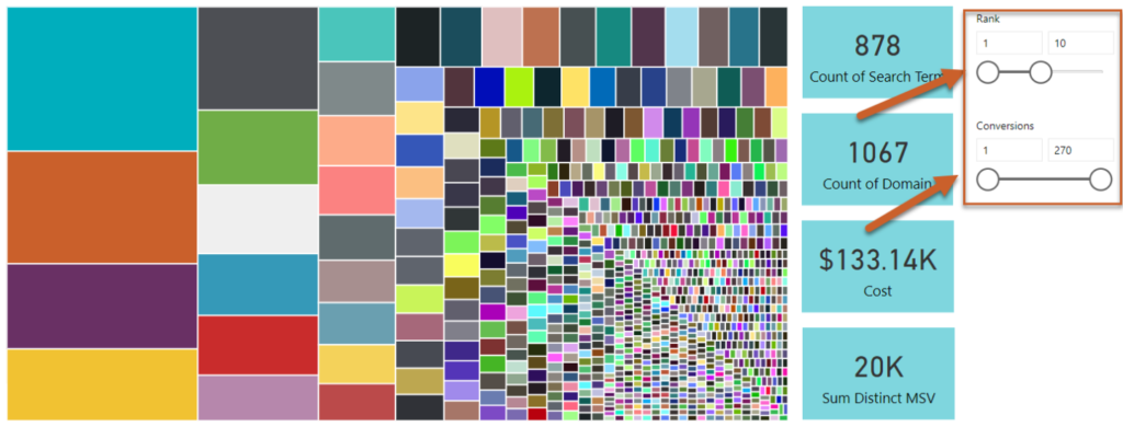
STAT’s output only includes ranking URL, so to find the domains we want, we create a duplicate Ranking URL column and then split that column by delimiter using a forward slash (/) to remove all subfolders from the URL – this way we can analyze keywords on a domain level along with each URL.
We then input our data into Power BI and create a treemap, where we’re grouping by domain and URL and our value is the count of distinct search term (for each domain).

In our example below, we’ll be looking at a treemap with our organic data from STAT.
- Each box represents a domain
- By adding Ranking URL underneath domain in the Group you can use the drilldown option to show all ranking URLs for that specific domain. To use drilldown, right click on the domain box and select “Drill Down”.
- The size of the box indicates the number of distinct keywords ranking on that domain – the larger the box, the more keywords the domain is ranking for

So What Does This Chart Actually Tell Us?
Essentially what we’re looking at is the domains grouped by count of distinct keyword, so the bigger the box, the more keywords that domain is ranking for. These are our major competitors – the first thing we should do is analyze them – are there any surprises or unexpected competitors?
This a great time to discuss the difference between business and search competitors with your clients – the idea that websites can still be a competitor even if they aren’t selling a competing product if they are ranking for keywords that are important to your business – in essence, they’re taking up organic real estate.
By analyzing the types of competitors you have (both business and search competitors) you can create a multi-faceted strategy by seeing what kinds of content each competitor type is ranking for.
But let’s make our data a little more focused and relevant.
- We can use a rank slicer to focus only on domains with keywords ranking on page 1
- We can use a conversion slicer to focus only on keywords that contributed to at least 1 paid conversion in the time period
With these quick filters we focused our competitor group from 37,000 domains to 1,067.
How Do You Find Opportunities?
Now that we have a basic understanding of how to read this treemap, let’s walk through how to find insights and opportunities.
Once we’ve focused our group, we can add a drilldown option to look at the ranking URL for each domain so that we can identify what pages on the domain are performing. If we add a table we can then highlight the URL and see exactly which keywords are ranking for each individual URL to help us with some preliminary keyword research.
You can even highlight URLs from multiple domains about the same topic to understand how keywords vary between results for the same topic.

Questions to Ask When Analyzing Your Competitors:
Some questions you can answer by analyzing your search competitors:
- Who are my competitors?
- Which of my competitors are ranking for the most keywords?
- Which individual URLs are ranking for the most keywords?
- What is the average or the highest number of keywords an individual URL ranks for?
- What organic result types are in the SERPs for each keyword?
- Which competitors rank for the keywords that convert in my paid campaigns?
- hich competitors rank for keywords where my site is ranking in positions 11-20? What can I learn from their ranking content?
Long Tail Keywords
How to Find Which Long Tail Keywords Convert
Long tail keywords are keywords that usually include 3+ words – these terms are often easier to rank for due to low volume and low competition but, because they can indicate a user lower in the funnel with a specified search, they often convert at a higher rate than broader keywords.
Analyzing your long-tail keywords can uncover more insights about your users’ search intent, opportunities for keyword expansion, and can help you uncover synonyms and related terms to optimize for semantic search.
Creating a Long-Tail Keyword Strategy
Let’s look at our conversions by search term word count to understand how “long” the long-tail is for converting keywords in PPC – we can then use this knowledge to build a cross-channel long-tail strategy for both PPC and SEO.
To do this, create a reference table for your paid data. In the reference table, remove all columns except for the column containing your search terms.
Select Add Column > Create Custom Column and use the following formula to create a column that counts each word in the search term column: List.Count(Text.Split([Reference Column], ” “))
Next, deduplicate the reference table and close out of the query editor. Create a relationship between your main table and reference table, joining on the search term.
Create a donut or pie chart, using your new Word Count column as your legend and Conversions as your values. Add Count of Search Term to your Tooltips.
 Create a slicer using a conditional column to analyze your branded and unbranded search terms separately
So What Does This Chart Actually Tell Us?
In this instance, we’re seeing the makeup of conversions by count of word. By looking at each group, we can pull out the following insights:
- 62.15% of branded conversions are from search terms with only 2 words
- 21.96% of branded conversions are from search terms with only 3 words
- So 84.11% of our branded search terms that convert are made up of 2-3 words
When we look at unbranded search terms, we see a different story, with longer search terms making up more conversions than in unbranded.
- 37.28% of unbranded conversions are from search terms with only 2 words
- 23.45% of unbranded conversions are from search terms with 3 words
- 16.85% of unbranded conversions are from search terms with 4 words
- 8.84% of unbranded conversions are from search terms with 5 words
With these insights, we can then add a keyword table and start drilling down by row level, and you can ask yourself the following questions:
- What search terms are making up these conversions by each word count?
- Do my long-tailed converting search terms have any words in common that I could apply as modifiers to other relevant keywords?
- Are there any “new” terms in my long-tailed keywords that showcase the opportunity for keyword expansion?
Other Opportunities for Analysis
We can create donut charts for other groups so we can get a better understanding of our conversion mix including:
- Converting search terms by word count
- Converting search terms by count of clicks
- Converting search terms by cost
Some Questions You Can Answer by Analyzing Your Search Terms by Group:
- Do I get more conversions from broad terms (2-3 words) or long-tail keywords (4+ words)?
- Does this differ when I compare branded vs unbranded searches?
- What is my conversion mix based on cost?
- Can I increase spend to converting search terms in low cost buckets to increase conversions?
Converting Terms by Conversions
For this example we’ll be creating a custom group to look at converting search terms by count of conversions. In this example, we’ve created the following buckets for the count of conversion donut chart:
- 1 conversion
- 2-5 conversions
- 6-10 conversions
- 11-25 conversions
- 26-50 conversions
- 51-100 conversions
- 101-200 conversions
- 201-500 conversions
- 501-1000 conversions
We can then add a tooltip for count of search term to this chart, along with a supplement table so that we can see exactly which search terms are part of each “bucket”.
So What Does This Chart Actually Tell Us?
In this instance, we’re seeing the makeup of conversions by count. By looking at each group, we can pull out the following insights:
- 14.15% of all conversions are from search terms that only convert once
- 42.94% of all conversions are from search terms that only convert between 1-5 times
- 18.91% of conversions are from a single keyword that converted 612 times (in this example, that keyword is the client brand name)

How Do You Find Opportunities?
We can now add a slicer to look only at branded or unbranded search terms to see how this affects our count of conversions. This tells another story. 72.2% of our unbranded search terms only converted between 1-5 times.

We can then create a supplementary table, click on each section, and see exactly which search terms are in each conversion count group.
Data Storytelling
Data Storytelling with Power BI
Storytelling with data isn’t anything new – people want to learn how to communicate effectively and use charts and graphs to tell compelling stories.
We have a few tips on how to tell your story with confidence.
Create a Story Arc
When building out a dashboard or report consider the order in which you present your data and how it helps you tell a story.
Do you have 3 different tabs in your dashboard? Start at the top and work down! Maybe your first tab talks about keyword rankings and recaps all of the wins you’ve made optimizing content and how it’s caused increases in rankings.
Then tab 2 showcases increases in sessions, average session duration, and pages per sessions – showcasing that users aren’t just coming to the pages you optimized, but they’re staying and looking at more content.
Finally, tab 3 shows the increases in conversions to priority pages and, ultimately, your increase in revenue – closing the loop and showcasing the ROI of the work you’ve done.
Build Impactful, Easy to Understand Dashboards
Data visualization tools give you the opportunity to combine multiple visuals and pieces of data to create a report or dashboard that’s dynamic and easy to understand. By using certain tools or visuals when building your reports, you can ensure that your dashboards tell a story that’s compelling and easy to understand.
Customize Your Titles for Context
It’s easy to customize titles for charts and graphs – and titles give you the opportunity to let viewers know exactly what the visual will tell them.
We like using business questions as titles in our charts – this also helps ensure that we’re always keeping that question in mind when we’re diving into an analysis.

To customize your chart title, highlight the visual and click on the Format (paintbrush) icon in the visualizations pane. Scroll down to the title section and make sure Title is turned on “On”. You can then edit your title, the font and font color, text size, and alignment of your title.

Add Cards to Show Overall Metrics
Don’t get lost in visualizations – stay grounded by using cards to show total count of metrics when you’re drilling into data.

Use Slicers to Focus Your Analysis
Because you’re able to use more data, it’s easier to get overwhelmed. Use slicers to get more granular with your dataset.
In the example below we cut out over 1,000 search terms by using our slider to only focus on the search terms that converted.

Exclude Data to Expand Your View
Another way you can focus your visual on a specific section is by excluding data. In the example below, a single outlier made it difficult to focus on the data in the bottom left corner – by excluding the outlier we were able to expand that data to make it easier to see and explore.

Use Visual, Page, and Report Level Filters
Using visual, page, and report level filters allows you to quickly focus your visuals at different levels. You can filter a single, specific chart or apply a filter at the report-level and update all visuals and charts in the dashboard at the same time.
To use filters, drag your metric to the proper filter level and use Basic or Advanced options to filter your data.

Use the Same Data in Different Charts
Put your data into multiple visualizations and charts to capture the full depth of your analysis. Combining a more visual chart like a scatterplot with a table ensures that you’re able to see both the outliers and specific opportunities in the visualization along with row-level data in the table.

Explain Your Data Sources & Charts When Presenting
Sometimes you’re so excited you want to jump right into all of the opportunities you’ve found, but before you start your analysis make sure you’re walking everyone through your data sources, methodologies, and charts.
When talking about a chart, first discuss what data is on which axis is and what that should mean to your viewers. See an example below of how we might describe a scatterplot comparing Impressions vs Clicks by Search Term – don’t forget that we should also be letting the audience know that the size of the bubble denotes cost and the color saturation shows the search term’s CTR.
In short, we’d tell our client that we’re focusing on the top left quadrant because high impressions and low clicks might show us opportunities to improve ad copy or irrelevant search terms, while the lower right quadrant might show us opportunities to increase spend based on performance.

Use Bookmarks
Bookmarks let you save specific views in your reports – including filters or visual states – so you can quickly select the bookmark to return to that view. This is great for presentations because you can quickly drill to the level you want instead of having to go through multiple steps.
To enable the bookmarks pane, select View and toggle the Bookmarks Pane on. Once you create a view you’d like to save, just select Add in the Bookmarks pane and name your view.

Bookmarks save the following elements of a view:
- The current page
- Filters
- Slicers, including slicer type (for example, dropdown or list) and slicer state
- Visual selection state (such as cross-highlight filters)
- Sort order
- Drill location
- Visibility (of an object, using the Selection pane)
- The focus or Spotlight modes of any visible object
You can also easily update, rename, or reorder your bookmarks to help present your findings in a better order.
Create Videos Walking Through Your Dashboards over Screenshare
If you want some time to practice your data storytelling before presenting, or you just want to send a quick update to your client, use screenshare! Tools like Camtasia, SnagIt, Soapbox or Jing allow you to create a video while you’re clicking through your dashboard.
If you’re nervous or make a mistake, you can just reshoot the video! This will also give you a chance to rewatch your video and catch mistakes you make so you can correct them in the future and become more confident with how you present.
Record yourself presenting via screenshare with tools like Camtasia, SnagIt, Soapbox or Jing to send videos to clients or to level up your presentation skills with practice.Share Data with Your Clients
Lastly – share your data with your clients! One of the reasons why we love data visualization is because it allows us to answer questions in real time instead of spending hours building out slide decks just to have the client ask a question that we’d need to do more research to answer.
So stop building slide decks and start walking your clients through your dashboards – make your analyses more collaborative and flexible so that your clients can give you suggestions on how to make your dashboards more valuable for their business.
How to Share Power BI Reports with Others
There’s some considerations and problems you might run into when sharing Power BI files. For PC-users, downloading the desktop app is really easy, but what about Mac users?
If you have a Mac, you can create a Microsoft account (or sign in with your Microsoft account email if you have Microsoft Office, etc…) and you can open PBIX files online at https://app.powerbi.com.

The datasets, reports and dashboards are private to you and your workspace on a free account if you use the online version. The only feature that will make your data public is using the “Publish to Web” feature to display your report online in an iFrame.
Additionally, when you send someone a PBIX file they can review all of the charts but can’t access any of the data in the query editor or export data – this is usually fine for clients, but if you’re sending a dashboard where someone will need access to the data sources you’ll need to send all of your source files and either create a Power BI template or update the data source setting.
To update your data source settings, navigate to File > Options & Settings > Data source settings and change the source of each file to the location on the user’s machine.


To learn how to create a Power BI Template (PBIT file), see our post on How to Create a Power BI Template!
Top 15 Tips
Our Top Power BI Tips & Tricks for Search Marketers
Now that you’ve reached the end of our guide, take some parting words of wisdom while we share the things that took us a while to learn, that will help you hit the ground running.
1. Learn to Fail
Like any new skill, you have to be willing to bake in some time to fail.
Most of the Seer team members who always seem to have the answer to a problem usually know because they’ve made the same mistake or run into the same problem before, figured out how to address it, and now know how to quickly recognize and fix that problem.
2. Give Yourself a Time Limit
A good trick for learning data visualization is to take an analysis or report you’ve created before and teaching yourself how to recreate it in your data viz tool. Give yourself a time limit – “if I can’t figure out how to do this in 2 hours in this new tool, I’ll do it the old way to make sure I still deliver it to my client on time”.
That way, if you’re stuck you can move on without feeling like you’ve dumped hours down the drain. And the next time when you try again, you’ll be starting with a fresh perspective and you won’t be starting from square one, but from where you got stuck last time.
3. Clean Your Data First
Don’t be a chump. Clean your data and clean it BEFORE you start your analysis.
Once you start making references or duplicates of your original tables it can be difficult to go back and re-do transformations, since your transformations can affect other applied steps.
Cleaning your data is not an extra step but an integral part of your analysis – your analysis is only as accurate as the data you input into it.
Want to learn more about how to properly clean your data to create accurate relationships? Check out our blog post on Power BI Data Cleaning Tips!
4. Metrics are Usually Summed by Default
Values are often summed by default – this can work for some metrics like impressions, clicks, or conversions – but for metrics like organic rankings you won’t want them summarized, or a keyword that’s ranking at positions 5 for one URL and 6 for another URL becomes position 11.
There’s a few ways you can change the default summarization:
To change a data field’s default summarization across an entire report, select the data field so that it’s highlighted in the Field pane, then navigate to the modeling ribbon, click Default Summarization and select Don’t summarize.

To change default summarization by chart, click the arrow dropdown under the Visualizations pane once the data field is in the chart’s values, then select Don’t summarize.

5. DON’T AVERAGE AVERAGES
If you’re downloading data from Adwords or a similar platform you may have the option to include a click-through rate or conversion rate – be cautious about using exported data to create an average of a metric.
Instead – create a measure. Measures calculate a result from an expression formula, which means it’s being calculated based on the row or rows you select.
To create a calculated measure, click the ellipses to the right of your table in the Field pane and select New measure, then input your formula into the formula bar.


Some common calculated measures include:
- Click-Through Rate (CTR) = SUM(‘Table’[Clicks])/SUM(‘Table’[Impressions])
- Cost Per Click (CPC) = SUM(‘Table’[Cost])/SUM(‘Table’[Clicks])
- Conversion Rate (CVR) = SUM(‘Table’[Conversions])/SUM(‘Table’[Clicks])
- Cost Per Acquisition (CPA) = SUM(‘Table’[Cost])/SUM(‘Table’[Conversions])
- Sum of Distinct MSV = SUMX(DISTINCT(‘Table'[Keywords]), FIRSTNONBLANK(‘Table'[MSV], 0))
6. Excluding Boxes and Bubbles
Sometimes in certain visualizations, an outlier might by obscuring your ability to recognize other opportunities. You can exclude these outliers by right clicking on the subject bubble or box and selecting “Exclude”.

7. Use Top N to Sort Through Noise
You can also be looking at very large amount of data that can quickly become overwhelming or difficult to manage in certain charts. To focus on only your top data fields, use the Top N filter by scrolling to the Filter section under the Visualization pane, and selecting the dropdown for the data field you want to filter. Add a metric to filter by (our example below is narrowing the top search terms by focusing on the top 20 search terms by conversion), select your Top N #, and click Apply filter.

8. Be EXTRA thorough with data cleaning when connecting URLs
Connecting on URLs creates another level of complexity when building bridges – protocols, mixed case, parameters, and trailing slashes are just a few examples of the issues that could prevent you from properly connecting your data if you aren’t be careful when cleaning.
To learn more about how to handle these complications, see our blog post on Cleaning URLs for Power BI.
9. Make Your Links Clickable by Changing the Data Category
You can create clickable links in your tables and matrices by changing the data category. In order for your URLs to be clickable they must contain a protocol (http:// or https://) in the value.
Select your URL value in the Fields pane so that it’s highlighted with a yellow outline
- Format your column as a link under Modeling > Data Category: Web URL
- When you add that value to a table, it will automatically turn blue and open the URL when clicked
- To preserve space and show the URL icon, select the subject chart to make it active
- Select the paint roller icon to open the Formatting tab
- Expand Values, locate URL icon and turn it to On
10. Dates can be Dumb
Power BI has a few options for dates – but no options for month/year – only month/date/year (if you use month year and sort to date, it will automatically show as mm/01/yyyy. To get around this, you have to be a little scrappy.
If you duplicate your Month column and set the duplicate to a date format, you can then sort your Month column by your Date column. That way, your text-formatted months (which would normally sort alphabetically) are now sorted by date.


11. Custom Sorting Can Be a Pain
Custom sorting is something that is lacking in Power BI, especially for SEOs. It just doesn’t understand that a ranking of 1 is “higher” than a ranking of 10. Custom groups (like if you’d group rankings into Positions 1-10, Positions 11-20, Positions 21-30) can also be problematic because they’ll be sorted alphabetically, which can cause out-of-order charts and graphs.
Luckily, we have a walkthrough on how to modify the legend order in Power BI on the blog!
12. Show Items with No Data
If you’re connecting lots of different data sources, you’ll probably want to create a table looking at all of the metrics related to a single value. One example could be looking at both GA and GSC data on the URL level – you might want to see sessions and conversions from GA and impressions and clicks from GSC by URL. However, your table might exclude URLs that are missing values unless you select Show items with no data.
- Click on the down arrow for the value in your visual and click on Show items with no data
13. Change the Way Charts Filter Based on Interactions
After selecting your subject chart, click on Format > Edit interactions and hover over other charts to see their current interactions with the selected chart, and to change their interactions.
- If it should cross-filter the visualization, select the filter icon

- If it should cross-highlight the visualization, select the highlight icon

- If it should have no impact, select the no impact icon

14. Clean your data first!
Yes, this is in here twice on purpose. We’re serious – clean your data!
15. Don’t forget about online resources while learning!
Don’t estimate the power of Googling a problem or browsing the Power BI community forums – chances are high that other people have already found solutions to your problem already!
There’s also plenty of great resources and walkthroughs on YouTube – below is a list of some of our favorites:
Guy in a Cube to learn all about Microsoft Business Analytics
Curbal’s Videos for Power BI and Excel
150+ Power BI videos with Will Thompson
And if you want to learn more about Power BI for marketers check out our YouTube channel: