TL;DR: Do you want to make more money on your website? By optimizing your site's conversion rate, you'll be able to generate more revenue without having to spend money on driving traffic. This post outlines 10 proven ways to increase conversion rates, which we've seen have real impact on the bottom line. Tactics include creating a sense of urgency, using strikethrough pricing, using free shipping, showing the product in action, and more.
Want to generate more revenue on your website? Welcome to the club. While there’s no magic formula, based on what we know about the relationship between digital marketing and sales, smart marketing means putting your site’s conversion rates, or the percentage of users who take a desired action on your site, under the microscope. Conversion rates and revenue go together like peas and carrots, and increasing conversion rates make up one of the three ways to increase your website’s revenue. Let’s call these The Big Three, which are:
1. Increase the number of visitors to your website
More visitors = more potential customers. SEO and paid search fall under this umbrella, and this is Seer’s bread & butter. Other tactics include more traditional PR, email marketing, and retargeting customers who have previously made a purchase. While effective, strategies in this category usually require an investment.
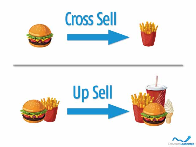
2. Sell smarter, where it makes sense
Motivate the visitors who purchase something on your site to purchase more per visit. These tactics are so commonplace that you may not notice them. Cross-selling, up-selling, and bundling products or services together into packages are all examples of selling smarter, or generating more revenue per order.
3. Increase your conversion rate (the number of users who took a desired action, divided by the number of visitors to your site)
There are countless adjustments that you can make to your website to increase your conversion rate. Ten of which I’ll cover in this post. For even more tips, check out the BigCommerce Blog's ecommerce conversion guide.
Why Focus On Conversions?
By focusing on your conversion rate as opposed to the others in The Big Three, you’ll be able to generate more revenue without having to spend money on driving traffic. Out of the three ways to increase revenue to your site listed above, tweaking your site to improve conversions can have the greatest impact on your bottom line in the shortest amount of time, and with the least amount of effort.
Think of your website as a store at the mall. In an ideal world, everyone who entered your store would buy something or take a desired action. When customers enter your “store”, is it clean and well organized, or does it feel outdated and off-putting? Is your site old and spammy looking, or new and responsive? Is it easy to navigate, or confusing?
Can customers easily find what they’re looking for, and when they do is it easy for them to go to the counter and make a purchase? Is your checkout or conversion process fast and straightforward or slow and confusing?
If customers have questions, can they find helpful answers quickly? Are answers to questions anticipated and laid out clearly on your site? Or do customers have to speak to a customer service representative (womp womp)? When they do, what’s your customer service like?
If a customer wants to quickly reserve an item and then come back to pick it up later, can they? Do you prompt customers to create an account in order to save something to their cart or make a purchase?
Creating the optimal in-store experience for customers in these areas (and countless others) have a major impact on conversions and revenue, and for an online website it’s no different.
10 Quick Ways To Increasing Your Site’s Conversion Rate
Do some digging and you’ll find a lot out there on website tweaks to improve conversion rates. I chose these 10 because our clients have found success with them in the past. They’re also relatively quick and easy to implement, with high potential to drive an increase in revenue.
- Create urgency
- Highlight the benefits of your product in addition to its features
- Add reviews or testimonials
- Use free shipping
- Use strikethrough pricing
- Add a call to action on every page
- Answer questions before they’re asked
- Add related items to a product view
- Show the product in action
- Make it easy to read
1. Create Urgency
It’s marketing 101. Offer limited time promotions to create a sense of urgency. This age old marketing tactic exists for a reason - because it works. Yet you’d be surprised at how many sites out there don’t give their visitors a sense of urgency! Use the following tactics to make sure that buying right now is a motivating factor:
- Give a clear deadline
- Use urgent copy, such as “Limited Time Offer”, “Offer ends soon”, etc.
- Use strikethough pricing
- Give users a clear next step, and funnel them towards making a purchase
- Sweeten the deal - give customers added incentives to purchase your already attractive offer, like free shipping
Here’s a great example from Holt’s Cigar Company:

During Holt’s Weekly Sale Special, there’s a clear deadline to create urgency, they explicitly list the savings by using strikethrough pricing, offer free shipping to sweeten the deal, and funnel customers directly towards making a purchase. Bravo Holt’s.
2. Highlight the benefits of your product instead of its features
A feature is a factual statement about a product or service being promoted. A benefit answers the question "What's in it for me?"
Let’s pretend that I’m selling you air conditioners. Which AC unit would you rather purchase from me?
Air Conditioner 1
Description:
- Quiet condenser fan system
- Factory-installed liquid line filter dryer
- Contactor with lug connections
- Steel louver coil guard
- Heavy-gauge galvanized-steel cabinet
Air Conditioner 2
Description:
- The quietest air conditioning unit on the market - you won’t hear a thing.
- Cools a 50 square foot room from 90℉ to 71℉ in under 12 minutes.
- Built with your electricity bill in mind, this unit was rated the most energy efficient in its class.
- Extremely weather-resistant, built with industrial grade steel for long-lasting durability. Comes with a 10 year warranty.
If you’re not in the AC wholesale business like my friend John at BobsRedTrucks.com, you’d probably rather purchase Air Conditioner 2, even though Air Conditioner 1 and Air Conditioner 2 are the same product. Features aren't what entice customers to buy, benefits are. Make sure that you’re describing the benefits in addition to your product’s features.
3. Add reviews or testimonials
Customers are listening to the word of advertisers less and less, and trusting the customers that purchased before them more and more. Think back to the last few purchases you made online. Did you read reviews before making your purchase decision? Most likely you did. This study published by Marketing Land revealed that 90% of customer buying decisions are influenced by online reviews. Adding reviews and testimonials builds trust, and adds credibility to your site.
Here’s how to use reviews to your advantage:
- Incorporate testimonials on pages throughout your sales funnel.
- Showcase positive customer tweets on your website. I worked for a company that embedded a live Twitter feed of the users Tweeting at them on their checkout page, which worked exceptionally well to increase conversions. It gave a face to the brand and built trust.
- Ask your customers to participate in case studies that you can then feature on your site.
- Create video testimonials that you can embed on your site and in a YouTube channel for your brand.
4. Use free shipping
This is the number one promotion that drives online purchases. Make sure to watch your profit margins, but if you’re able to offer free shipping, it’s proven to entice customers to purchase more than any other tactic on this list.
Also, offering free or discounted shipping can curb shopping cart abandonment rates. According to kissmetrics, 28% of shoppers will abandon their shopping cart if presented with unexpected shipping costs. That’s the number one reason for shopping cart abandonment! It’s also important that if you offer free shipping, you advertise it loud and proud, and that you’re as clear as possible about your free shipping policy. Remember, no one likes unexpecting shipping costs.
5. Use strikethrough pricing
Everyone loves a deal. If customers perceive that they’re able to purchase a product for less than it’s worth (or less than they’re willing to pay for it) on your website, you’ve created demand for that product and proven the value of your site.
Use strikethrough pricing to show customers the value of your offer, and how much they’ll save by purchasing the product from you. Cross out the original price and highlight the sale price. Here’s another example from Holt’s Cigar Company:

Not only show how much customers will save by purchasing the product from your site with strikethrough pricing, but directly compare your cheaper prices to those of your competitors.
6. Add a call to action on every page
On every page of your site, you should be guiding visitors towards a desired action. Think of each page as an opportunity to funnel buyers towards a purchase, lead generation form, event promotion, social share, etc. in order to make more money and/or promote your brand. Persuading site visitors to do what you want is no easy task, but taking time to master the art of the call to action can dramatically improve your bottom line.
Here's a few great examples of creative calls to action. A few best practices include:
- Less is more when it comes to choices. If you give multiple choices, give weight to one choice over another, so customers don’t have to think too hard.
- Give careful consideration to your call to action button colors. Different colors inspire different emotions, and some colors attract more attention than others.
- Large, visible text captures attention, but make it too big and you’ll offput potential customers. Here’s a nice balance from Coin:

- If you offer one main product, give customers a clear way to purchase it right away from the home page. Here’s a nice example from Tep Wireless:

- Keep call to action button text short.
- Movement attracts attention. Adding movement to your site in specific areas can draw visitors towards a call to action.
- Make it stand out. Your call to action button should have sufficient space around it so that it clearly stands out.
- Make your call to action contextually relevant to the content on that page. If you were shopping on BestBuy.com for a new TV and were scrolling through a TV category page, it would be weird if in the sidebar you were prompted to sign up for their camera lens newsletter.
7. Answer questions before they’re asked
People who visit your site have questions, and many want to know the answers before making a purchase. FAQ pages are great, but there’s more you can do to anticipate common questions, and provide contextually relevant information to answer them before they’re asked.
- Figure out what people want to know, and provide the answers within the content of relevant pages. Survey your customers after checkout, after they reach your customer service department, and a few weeks after purchase through email to collect this data.
- If there are too many questions, create multiple FAQ pages with a table of contents linking to each section.
- Don’t make customers click the Contact Us button. It’s frustrating, and will decrease your conversions.
- Continue to create interesting content around your most frequently asked questions. Consider leveraging your blog for this.
ProTip: Check out your top 5 landing pages on Google Analytics, and take an hour to brainstorm questions that customers could possibly ask about the content on those 5 pages. Filter out the questions that might not make sense after your brainstorm, and cross reference the remaining ones with your FAQ page to find gaps. Finally, create content around these questions on your blog or consider adding them to your FAQ page.
If you want to get even fancier, check out the channel breakdown for each of your top 5 landing pages. If most customers come directly to the page, then they’re most likely already aware of your brand/products, and might have less questions than if most of your customers are coming in via referral. If most customers are coming to one of your top landing pages via referral, you may want to spend more time brainstorming questions for that specific landing page.
8. Add related items to a product view
Adding related items to a product view allows customers who already have purchase intent to view products that they may not have considered (and may like more than the one they’re thinking about purchasing). It also allows you as the site owner to up-sell and cross-sell, which can have a dramatic impact on your average order value. If you use an ecommerce platform like Magento, this functionality is already built in.
Here’s an example from Urban Outfitters:

And an example from Fab.com:

9. Show the product in action
One of our clients, Revzilla, does an excellent job of showing their products in action. On their site, it all starts on their category pages, where they clearly label which products have video reviews.

On the individual product pages, Revzilla shows the product in action via these professional video reviews. In addition, they incentivize customers to leave a review, and allow them to upload their own personal photos with the product. It’s a genius way to show the product in action, while also creating added trust and proof of the product’s value.

To show your products in action:
- Leverage your customers for user generated content. Embed this user generated content on your product pages, category pages, and social media accounts.
- Create videos that showcase your products in action. Embed them into your product pages, and transcribe them so that Googlebot can index and crawl the content. Create a YouTube account for additional reach.
- If customers can post reviews on product pages, allow them to upload pictures as well.
10. Make it easy to read
The expression “less is more” should ring true when it comes to the design of your site, and the words that you use in your content. Sites that reduce clutter, have clear calls to action, and beautifully display information in a conversational tone set themselves up to convert visitors.
To make your site easy to read, use the below tactics:
- Use bullets
- Keep sentences and paragraphs short
- Use a conversational tone
- Don’t use too many font sizes
- Don’t use too many typefaces
- When emphasizing text (like, you know, a call to action) consider using a colored background as opposed to bolding, underlining, or italicizing the text
When you’re finished reading this post, play around with the rest of Seer’s site. I’m a little biased, but in my opinion this is something that we do very well.
Cool! Now What?
A/B test! You can test almost anything on your website that will affect the behavior of your visitors. Test variations of these 10 tactics to see what resonates best with your audience. You can find me on Twitter @iJordanFrank if you want to talk conversions!
.png)