It’s finally arrived - conditional formatting in Google Data Studio! Conditional formatting is an important feature that can now be used to highlight interesting data points or emphasize concerning trends. While this new feature is just getting rolled out on GDS, there are a few places within the platform where this can be extremely helpful for your existing reports!
Use conditional formatting on GDS Scorecards to showcase pacing to goals/targets
A common theme for reporting within GDS is showcasing your pacing to goals or targets. While this can be done with a Line or Bar Chart, sometimes you need to be able to digest everything within a comprehensive report from a single slide or Executive Summary.
So how can this be done?
Let’s start by creating a Scorecard and attaching a Data Source that houses the metrics and KPIs that we’re trying to show pacing for. In this instance, we’ll be using Organic Sessions from Google Analytics.
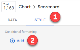
Once you’ve created the Scorecard and connected your Data Source, click on your newly created Scorecard and navigate to the Style tab > and the first section for Conditional Formatting select Add
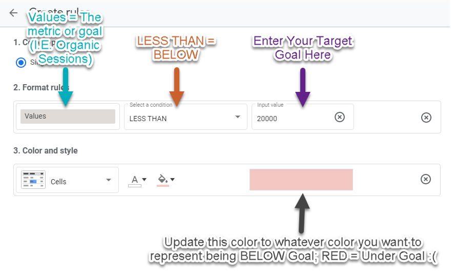
In the new window that appears, this is where you set your conditional formatting rules! Remember, we’re using conditional formatting to show pacing to goals, so we’ll need to create two rules:
- Rule #1: Pacing ABOVE our Organic Session Goal

In my example, our target goal for the month was 20,000 Organic Sessions
- Rule #2: Pacing BELOW our Organic Session Goal
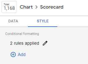
If you navigate back to the Style tab, you should now see two active rules:
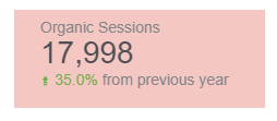
And finally, the finished product! With our example data, this scorecard now shows how we fell below our Target Goal for the month (17,998 vs 20,000), but managed to increase Organic Sessions +35% Year-over-Year.
Use Conditional Formatting rules to Visualize Average Position of Your Keywords
If you want to learn how to make a GDS slide that shows Branded vs Non-Branded Keyword performance, read this post!
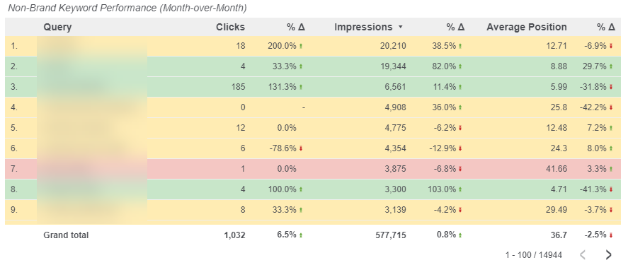
Let's first see what the finished product looks like:
So how did we get there?
In this example, we made 3 rules.
Once you’ve created the table and connected your Data Source, click on your newly created table and navigate to the Style tab > and the first section for Conditional Formatting select Add.
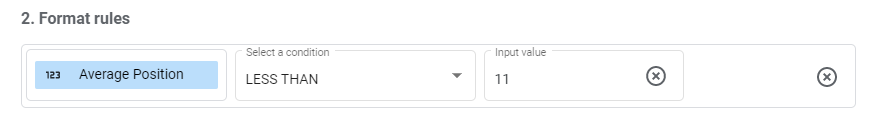
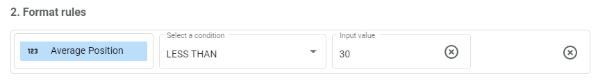
In the new window that appears, this is where you set your conditional formatting rules! For this example, we made 3 rules that showcase Keywords in:
- Positions 1-10 (Page 1)
- Color = Green
- Positions 11-30 (Page 2 and 3; or striking distance keywords)
- Color = Yellow
- Positions 31-50 (Pages 4 and 5; or potentially new keywords that just started ranking)
- Color = Red
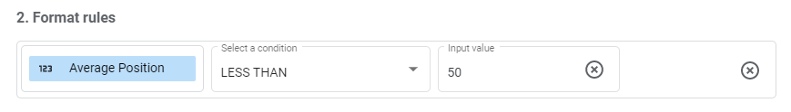
- Value = Average Position
- Condition = LESS THAN
- Input Value = Organic Ranking (in the picture above, we used 50)
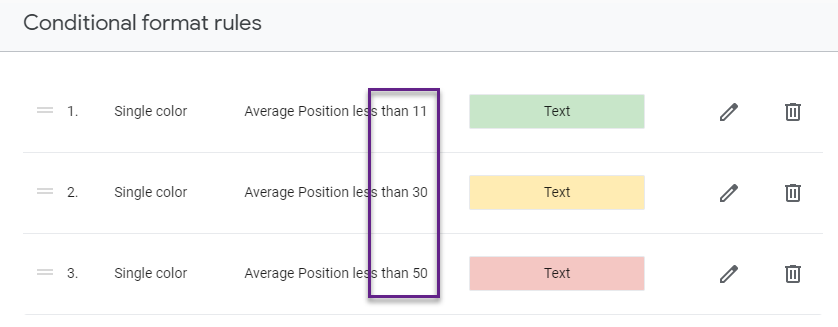
IMPORTANT: The order of your rules matters! After you create your 3 rules, ensure that the rules are ordered highest to lowest:
Correct ordering of rules
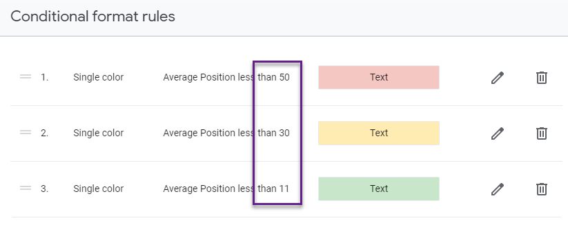
Incorrect ordering of rules
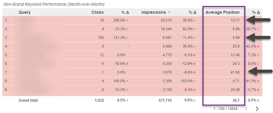
Your table will look something like this if you choose the “Incorrect ordering of rules”
So remember, the order of your rules will matter; start with the biggest values and work your way down. The final product will look something like this
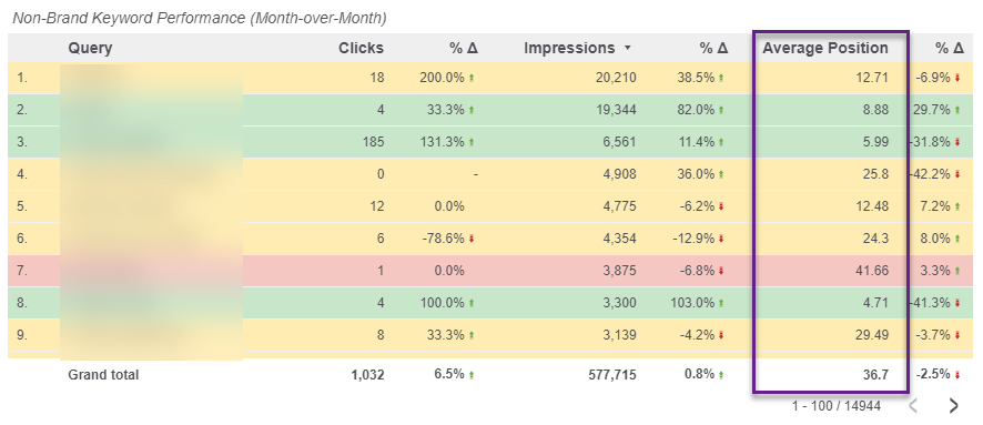
By using conditional formatting on keywords by Average Position, you can now start to see if there are positive or negative click/impression trends. If you start to see a portion of your Page 1 keywords (Green) receiving less clicks, you may want to investigate if other queries that aren’t ranking on Page 1 are now garnering higher engagement, which can indicate that the SERPs or the intent behind the keyword may have changed.
Use Conditional Formatting in Google Data Studio
In summary, conditional formatting in Google Data Studio helps to diagnose performance quickly and efficiently. Create rules on your GDS scorecards to quickly show whether or not you hit a goal for the month or year in Executive Summaries. Also by creating rules based on the position of your keywords, the addition of those colors can help you uncover different click and impression trends depending on the pages those keywords are ranking on.
This was first reported by Michael Howe-Ely, a great Google Data Studio expert, who wrote a post on How to use Conditional Formatting in Google Data Studio. He does into even better detail on how to use conditional formatting when using multiple rules from different metrics or dimensions in Google Analytics - check out his work!
Learn more about GSD best practices and let us know about your own experience with Google Data Studio!

.png)