Google recently unveiled a completely redesigned Google Analytics Mobile App. Besides receiving a major makeover, the app now includes more powerful real-time data, segmentation, and the ability to easily create and save a mobile dashboard for later use.
One report that really stuck out to the Seer Analytics Team was the heatmap feature, which users can use to visualize selected metrics over time, such as users or revenue.

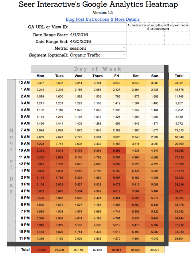
Unfortunately, this report isn’t available in the standard Google Analytics reporting interface as of today. To fill this void, our analytics team built this Google sheet, which allows you to heatmap certain metrics to identify growing or hot trends over time. (You’ll need to copy the Google Sheet so you can edit it!) Here's a sample of what it looks like below:

Need additional help from a Google Analytics Certified Partner, drop us a line here!
With the use of the heatmap, you’ll immediately be able to see trends backed by data. In the example above we can see that pageviews spike during the workweek and are highest in the 11-12PM hour. But it’s important to remember the story doesn’t stop here; for instance, you can dig deeper to learn why there are more pageviews on Tuesdays afternoons.
Why Use a Google Analytics Heatmap?
You may be thinking - this is cool, but what business decisions can this help me make? Or what insights can this help me form? Both are great questions, here are a few use cases:
- Use Case: Understand when users are finding your site organically to help pinpoint the best time to publish or promote content.
- Bonus: You could use this data to inform day-parting PPC bid strategies, too.
- Use Case: Let's drill into this a bit further - when are organic visitors converting the most on your website? Conversions can capture any type of segment you've created - contact us forms, lead forms, email sign-ups, etc.

- Use Case: If you work for an ecommerce company, you may be less focused on conversions - and more interested in transaction revenue. When is the best time to launch a new sale or product? This heat map can help you identify the best time of day to launch a new product release or new CTA for a product that could use an extra increase in purchases.

Instructions on How to Use Seer's Heatmap
To use this heatmap you’ll need two things:
- The Google Analytics Spreadsheet Add-on installed (it’s simple and takes thirty seconds to install if you don’t have it already!). Note: If you’ve never used the Add-on, I highly recommend checking out Kevin Rutter’s blog post - Automation Innovation: Beginners Guide to Google Sheets’ GA API Integration to learn how.
- The View ID you want to query will need appropriate permissions. This is different than the Property ID we’re accustomed to placing on websites or in Google Tag Manager. This can be found in your view settings:

Once you’ve got all the necessary equipment, you’re ready to start cooking!
The sheet is designed to be easy to use – here’s how to get started:
- Copy the sheet
- Enter your View ID just as it appears in your View settings
- Type or select start and end dates from the dropdown menus
- Type or select a metric from the dropdown menu
- Type or select any desired segment
- Run the add-on, and your data will load - that’s it!
As a reference, the color scheme goes from white (low) to red (high). This can easily be adjusted in the conditional formatting settings if you’d like.
Did you find an interesting use for this sheet? Do you have a way to improve the sheet? We’d love to hear your feedback in the comments below or on twitter - @Jaycohh!
Want to learn more about getting the most out of your digital marketing analytics? Sign up for our newsletter for the latest tips.