Wasted spend is no joke - Google generated ~$116 Billion on ads alone in 2018 (*Source).
We mined through millions of data points across 30 paid search accounts. On average, we found that companies were wasting 15% of their budget on irrelevant keywords. If this holds true across the industry, that means there’s a $17.4 billion business built on irrelevant search terms.
You can learn more about our PPC Efficiency Audit services here.
On the Hunt for Wasted PPC Spend
Your greatest enemy in your SEM campaigns is a bad match.
Which Search Terms are Irrelevant?
A search keyword is a word or set of words that you create to label an ad group to target your ads. A search term is the exact word or set of words a user enters when searching on Google or another search engine. A paid search term is similar, in principle, to an organic keyword (i.e. the exact words entered into a search engine).
This distinction is important because you may have a search keyword that seems relevant to your users, but depending on your match type, you may be spending money on irrelevant terms.
Let’s say you own a webstore that sells plants and plant supplies. You might use the search keyword “pots” because you want to bid on search terms like “terra cotta pots” or “black ceramic pots”. But if you use a broad match type and don’t have any negative search terms, you could also be showing up for “pots & pans”. If you manage a large account with millions of search terms it's unlikely that you can review every single search term - you could be paying for irrelevant terms without even knowing it!
Enter data visualization - data visualization tools are incredibly valuable for visualizing data - making it easier for you to identify outliers, which can indicate major opportunities or, in this case, major problems.
Visualizing Wasted PPC Spend
Step 1: Download Your Data
Head to Google Ads and create a custom report. I recommend downloading 12 months of data with the following columns:
- Search keyword
- Match type
- Search term
- Impressions
- Clicks
- Conversions
- Cost
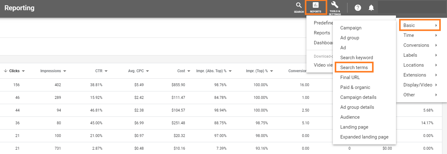
Step 2: Upload Your Data
Import your CSV file into your preferred data visualization tool. We recommend using Power BI as I'll be using that in this example. However, there are tons of other great tools out there for analysis -- use whatever you feel most comfortable with!
Step 3: Build a Power BI Dashboard
- Add a table to your dashboard with search keyword, match type, impressions, clicks, conversions, and cost.
- You can add slicers to your dashboard with values like clicks or conversions to focus on search terms with a specific number of clicks or conversions.
- You can also add a text filter so that you can filter to search terms with common words or n-grams.
- Add some scorecards if you want to quickly see the total clicks, cost, or conversions, and count of distinct search terms.
- Create a scatterplot with impressions on the y-axis and clicks on the x-axis, by search keyword and search term. Set the size of the bubble by cost. See the example below:
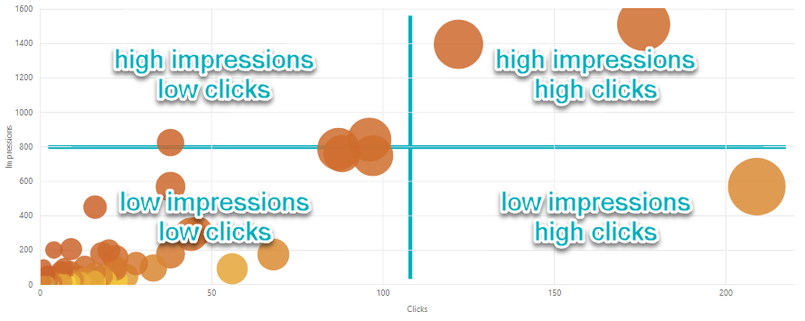
- The bottom left quadrant shows low impressions and low clicks.
- The bottom right quadrant shows low impressions and high clicks.
- The top right quadrant shows high impressions and high clicks.
- And the top left quadrant shows high impressions but low clicks.
Analyzing the Data
Focus on the top left quadrant first - this section shows high impressions, but low clicks. This can indicate non-relevant search terms since they have a lot of visibility, but users aren’t clicking. You could also have the opportunity to test ad copy - maybe the headlines and descriptions just aren’t resonating with users if the terms are relevant.
Make sure you focus on bigger bubbles - the bigger the bubble the more you’re paying for it!
Right-click the bubble to drill down into the search terms that make up the search keyword; it’s good to review both the specific search terms and the keyword together - it may give you insights into how search terms matched to a particular keyword so you can add negative keywords or re-evaluate keyword match types.
If you added a clicks slicer, slide the slicer to 0 clicks - you haven’t paid for any of these terms (yet) but you might be able to identify some future wasted spend!
You can also right-click on a blank space on the scatterplot to drill down to the next level - then your search term (and not the keyword) becomes the bubble.
Taking Things Up a Notch
At Seer we join our paid and organic data together to find more insights using tools like GetStat or AuthorityLabs. There are plenty of tools out there for SEO and PPC research. Get a list here.
Focusing on paid search terms that had 0 conversions but also aren’t ranking organically to your site can be a flag that the term isn’t relevant. If you didn’t convert for it and you’re not ranking organically - dig in deeper to determine why!
Check out our Guide to Power BI for Digital Marketers for a walkthrough on how you can join your paid and organic data together to mine for irrelevant terms and optimize your SEM campaigns.
Want to Perform this Analysis at Scale?
At Seer, we use a tool we call Saving Benjamin to identify wasted PPC spend quickly and at-scale. To date, PPC Efficiency Audits that leverage this tool have helped us save clients more than $1.1M a year.
But we don’t want to just save money for our clients - we want to help anyone who wants to build better campaigns and we want to create a better experience for all users - no one likes clicking on irrelevant ads. That’s why we built Saving Benjamin Lite - it’s a free public tool to help you save money and create better search experiences for everyone.
Interested in more ways to save wasted ad spend? Sign up for our newsletter below for more tips and tricks.


.png)