Telling a Story with Data
As mentioned in my previous blog post, Data Storytelling is becoming a necessary skill in an analyst’s repertoire. As companies invest more time and money into data, they want to see the return on their investment. In other words, they want useful insights! But, more importantly, insights they understand and can use to enhance their business.
You may be a great analyst, but if you can’t convey your findings in a way that makes sense to your audience - then your analysis is worthless. To avoid allowing an incredible insight go to waste, here are some tips for getting to the point by treating your reports like billboards.
Why Convert An Analytics Report Into A Billboard?

Picture this. You’re driving down the highway at 65 MPH, you’re paying attention to the road in front of you, but out of the corner of your eye you catch a glimpse of a billboard. It’s an aerial shot of surf and sand (where the ocean meets the shore), filled with rich, vibrant colors. Just below this glorious shot is the tagline “shot on iPhone”. It took you all of 3 seconds to view the ad, but the message immediately sinks in. This is how you should approach every page of your reporting.
If you haven’t figured it out, the driver, in this metaphor, is the person viewing your report. They are hurdling down the road at exuberant speed, trying to pay attention to the (business) conditions in front of them. They have precious time to waste looking elsewhere, but you have something very important to tell them. What should you do, should you bury your insight in a messy mountain of text and charts, or should you surface that insight, put it right in their face, so they get it and remember it? Hopefully you agree that the latter is better.
How Can You Convert an Analytics Report into a Billboard?
To boil it down, Billboards are made up of a tagline, a visual to reinforce the tagline, and the fineprint. So all we have to do, is transform the information in our reports to match that schema.
THE REPORT TAGLINE
The tagline is the most important point of your report page (hopefully an insight); make it stand out, put it at the top, make sure that it can be the only thing someone sees on the page yet they still understand what you want them to know.
THE DATA VISUALIZATION
The visual reinforces your tagline. In most cases, this is a data viz or infographic that proves your insight, but feel free to get creative with something like a web heatmap or session recording.
THE ANALYSIS FINEPRINT
The fineprint is all your other supporting analysis and/or sources. This is the part of the report, as an analyst, that you probably cherish the most (because it’s all your hard work!!), but your audience needs the least. Let your fineprint blend into the background and don’t let it compete with your tagline - it’s going to be hard, I know from experience, but it really has a positive impact on your reporting.
Use Cases for Treating Reports Like Billboards
It’s easy to talk about what this might look like, but it’s more helpful to show you an example. Below is a recreation of a type of report that I used to put together (BEFORE) and an example of what it look likes after applying the principles discussed above (AFTER).
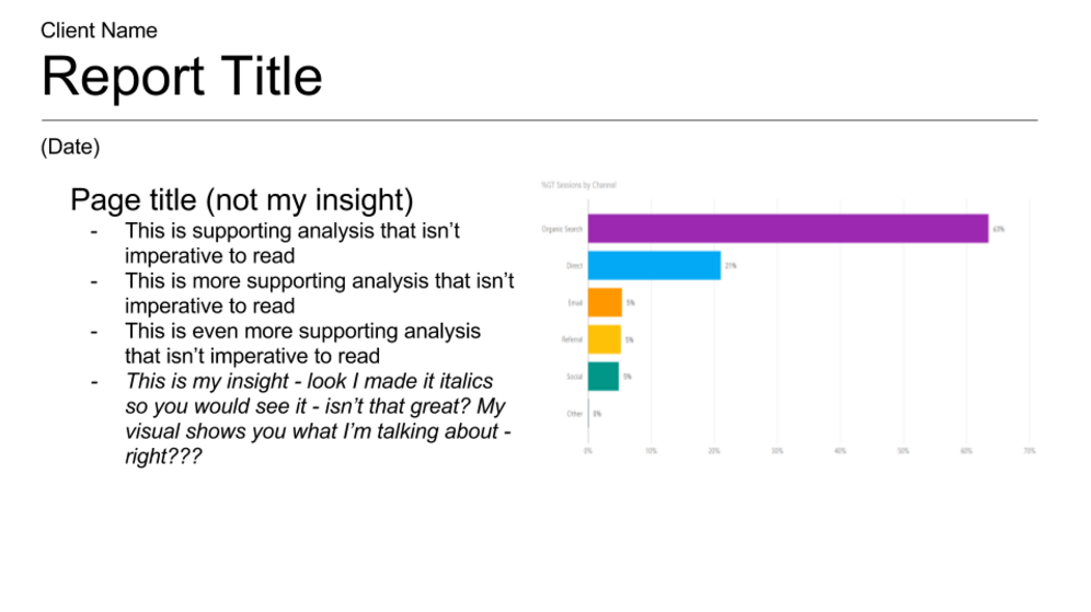
BEFORE
AFTER
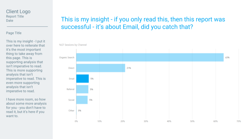
Your final output might differ from mine even if you follow the same “Billboard” concepts. I’ll be the first to admit that I’m not a designer. There are probably some things that can be further tweaked to make it even more digestible, but I think many would agree that the “AFTER” report is far superior to the “BEFORE” report.
Hopefully, you can take what you’ve learned here and apply it to some of your own reports, so that fewer of your insights are passed by at 65 MPH. Did you try any of the techniques above to tell a better story with data? Let us know in the comments below.