
The Yellow Box of Death.
![]()
Ok. Death is a little extreme. Really, this is just a Google Analytics alert that this report is based on sampled data.
But anytime I decide I’m going to do some deep analysis in Google Analytics (add a second dimension, add an advanced segment, etc.) and this little box appears, I get a little sad.


Step 1: Get as much data as you can.
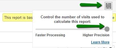
First, tell Google you want higher precision. Click the symbol above the yellow box and drag that little circle all the way to the right. GA defaults in the middle, so make sure you always update this. (If you're using the API, set the new samplingLevel parameter to HIGHER_PRECISION.)
Step 2: Export smaller data sets to Excel.
The two instances in which you hit report sampling according to Google are described here:
- 1,000,000 maximum unique dimension combinations for any type of query.
- 500,000 maximum sessions for special queries where the data is not already stored.
It’s the first type that we’re able to avoid with this method. Note in their example, a 60 day report you could get 16,000 URLs (1,000,000/60), but a 30 day report you could get 30,000 unique URLs (1,000,000/30). So, shorten your time frame to 14 days, 10 days, 5 days, 2 days, and you’ll increase the number of unique URLs (or any dimension) you can get in your report without hitting report sampling.
So, let’s select shorter date ranges. Say, Aug 1-10, Aug 11-20, and Aug 21-31.
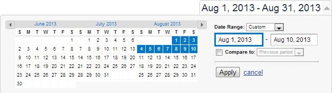
It doesn’t matter if you pull 1, 2, 5, 7 days at a time, just make sure you aren’t overlapping and you cover the full time range you want to report on. I prefer to export as CSV, but you can export as CSV, TSV, TSV for Excel, or Excel (XLSX).
If you’re hitting sampled data looking at a single day, you may be stuck with report sampling, at least for that view (profile).
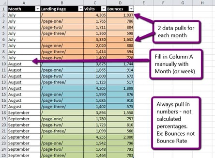
Note: You can use export almost any metric you like, as long as it’s a number, not a calculated percentage. For example, pull Bounces not Bounce Rate. More on this later.
Step 3: Create a data table & add data points.
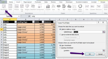
Take all of your exports and add them to a clean Excel sheet in column B, creating a combined data table. Add to column A the month, week, or whatever you want the combined time frame to be in your ultimate report.
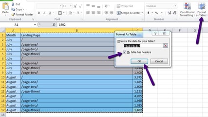
Select the data and click “Format as Table.” And keep “My table has headers” checked.
Step 4: Create a pivot table.
Now that you have all your data in table, time to merge it. Select any cell in your pivot table, then click Insert > PivotTable from the menu. Select where you want the pivot table, I usually just use a New Worksheet, and click OK.
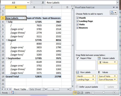
Now, it’s super easy to manipulate the data, by dragging fields into Row Labels & Values.
Step 5: Dance!
Oh yeah, and get to work analyzing.
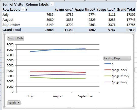
Now you can quickly look at your unsampled data in a variety of ways just by rearranging the fields. Here’s the same data made into a Pivot Chart:
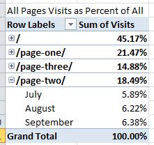
And as a Pivot Table with visits listed as a percent of all.
There’s plenty more you can do with Pivot Tables once you have the data pulled. I’d suggest the Mr Excel Pivot Tables playlist to learn more.
Bonus Tip:
Metrics like Visits and Pageviews are easy, you can just use sum of values. But if you want to get a Bounce Rate or Exit Rate, you can’t sum or average. Here’s why:
Month 1: 30 bounces / 100 visits = 30% bounce rate Month 2: 40 bounces / 200 visits = 20% bounce rate Incorrectly calculated average of Month 1 & Month 2 bounce rate: 25% bounce rate Correctly calculated bounce rate: 70 bounces / 300 visits = 23% bounce rate
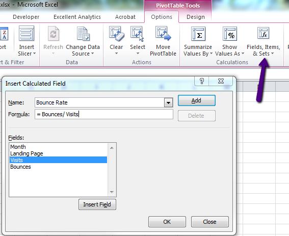
One great way to deal with this is the calculated field option. Within PivotTable Tools select Options > Fields, Items, & Sets > Insert Calculated Field. In the dialogue, name the field, and create your formula.
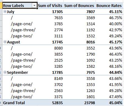
Now you can view your calculated field in the Pivot Table:
Happy Analyzing!