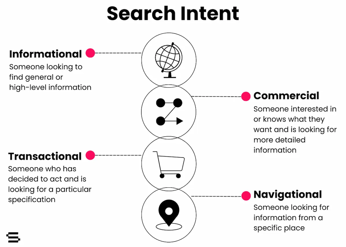
If you’re still championing that 2016 is “the year of mobile,” we’ve got a not-so-big surprise in store for you. Mobile has already weighed anchor, stormed the shores, and been crowned king in the domain of search. Long live mobile. But, what about other promising trends prompted by this change? A new dawn is rising with the influx of “near me” searches on mobile -- AKA, local marketing. So, how do marketers rise to the occasion and build their own empires with a mobile and local SEO strategy? To help answer this question, Seer Interactive’s “Get Mobile & Local Right” event featured three industry experts in the SEO industry:
- John Shehata
- Cori Shirk
- Cindy Krum
For this event, we explored mobile SEO tips and tricks, reaching an on-the-go audience with mobile and local, and how to optimize for mobile user experience. As a whole, Seer’s event emphasized the importance of understanding your audience on mobile and using the full arsenal of tools to up your SEO game. In case you missed out on this event, check out the recap highlighting our special guest speakers below and which charity they chose to send event funds to!
John Shehata
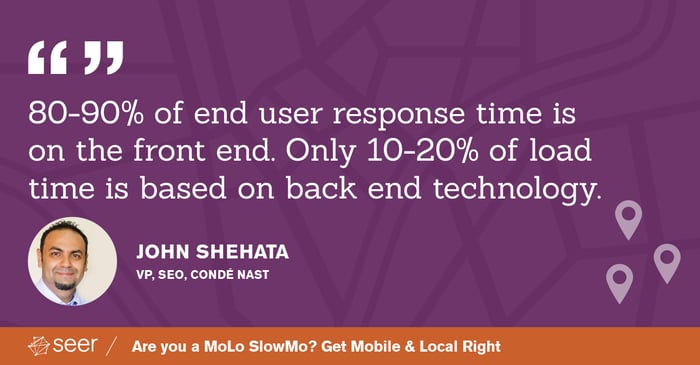 Charity: UNICEF Refugee Crisis Currently the Vice President of SEO at Condé Nast, John Shehata has more than 14 years’ experience in Search Engine Marketing, and 8 years in Social Media Marketing working for top national brands and fortune 500 companies for over 14 years. He has contributed to Moz Annual Ranking Factors and Local U/Get Listed Local Ranking Factors and has a strong technical knowledge, development background, e-commerce SEO and is a power Web Analytics user.
Advanced SEO - Tips & Tricks of How to Make Mobile Work For You
As of May 2016, Google has boosted the mobile-friendly ranking signal, which means Google is telling folks point-blank that they favor pages that are relevant and mobile-friendly. So, how do you ensure your SEO approach is shaped with a mobile-minded strategy? Lucky for us, John Shehata shared three technical takeaways to ensure that your site is on BFF status with mobile friendliness for users and search engines alike!
- Choose your site structure wisely. There are major pros and cons to picking a Responsive, Dedicated, and Dynamic Serving web design, so it’s important to consider your site’s capabilities and size.
- Responsive Web Design - Best for small to medium sites with 1 URL, same Content/HTML, and uses CSS to render pages. While Google recommends Responsive implementations, John notes they will likely treat all mobile subdomains, Dynamic Serving, and Responsive Web Designs (RWD) implementations the same from a ranking perspective. For Bing, John recommends using a responsive design over a separate mobile site to ensure a great user experience. As a word of warning, he notes that Responsive is the slowest of the 3 and/or may not be suitable for your site/industry yet!
- Dedicated Serving - Best for sites with separate mobile and desktop URLs (ex. example.com/m/ OR m.example.com). This is definitely a better mobile experience, but comes at a higher cost to maintain and is crawled multiple times with different user agents.
- Dynamic Serving - Best for large and complex sites with 1 URL, different HTML (and CSS) depending on user agent (desktop or mobile device). This site structure is slow, comes at a high cost to maintain, but has a complex technical implementation compared to Dedicated Serving.
- Avoid common mobile errors. By dodging these errors, users engage with your site fully and helps searchers find what they're looking for faster.
- Mobile Faulty Redirects - Are you using separate mobile URLs? If so, you have to redirect mobile users on each desktop URL to the appropriate mobile URL! Be sure to check Google Webmaster Tools Crawl Errors, debug using the example URLs, configure your server correctly, and use the desktop page if there’s no mobile equivalent.
- Broken Content - This includes all of those buggy things like pop-ups, sideways scrolling, tiny font and buttons, and slooo-ow pages. For your unplayable videos, remember that HTML5 is preferred, so be sure to verify that no flash is used for site navigation, videos, or other elements. As for blocked JavaScript, CSS, and images, use "Fetch as Google" feature in Google Search Console, check and test your robots.txt, and always test your mobile pages with the Mobile-Friendly Test. In the case that you’re using dedicated mobile URLs, fetch desktop pages with mobile crawlers, and confirm that the redirects are recognized and crawlable.
- Interstitials - Avoid ‘em along with overlays that partially or completely cover the contents of the page the user is visiting. Pages with interstitials lose mobile friendly tag and according to a Google+ study, 69% of visits abandoned the page!
- Utilize analytics & tools - Don’t forget to analyze your performance using a variety of tools to ensure that users and search engines are responding positively to your site. To do so, John recommends employing tools such as:
- SEMRush for an analysis on competitor performance.
- Analytics Events to track full-site links.
- Screaming Frog to check site redirects.
- User Agent Switcher to see what your site looks like when accessed from a different user agent.
- Google PageSpeed APIs to measure your page speed.
Cori Shirk
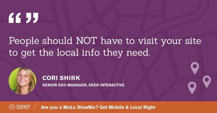 Charity: Spark As a longtime SEO Seer superhero, Cori Shirk works with clients to craft and drive strategies that support their companies’ overall business goals. In addition to managing and executing more traditional SEO efforts, Cori specializes in local search optimization for single location and enterprise clients. Cori holds a degree in music from Ithaca College where she also minored in communication management and design in the Park School of Communications.
Mobile + Local + SEO = Capturing the On-The-Go Audience
According to a Think with Google study, the phrase “Near Me” has comprised 80% of searches. (Yes, this includes those late night queries of “pizza near me.” We ain’t judgin’.) With this statistic, we understand that the “near me” searcher is looking for immediacy and proximity. “The primary objective for capturing the attention of this on-the-go user is making things as easy as possible to get your business’s information and be able to navigate to your business,” Cori asserts. In order to fulfill this objective, it’s key to apply Cori’s two essential takeaways below to your mobile local SEO strategy.
- Make it easy for an on-the-go user to find you. Listings should offer all of the necessary information for this on-the-go searcher. Remember people are getting your information from other pages, so stop thinking of your website as a destination. So, what’s the best way to communicate this information in your website listing? Answer who, what, when, where, why and how.
- Who you are – Your brand identity. Your NAP and logo, photos would fall into this bucket too. Anything that showcases your personality.
- What you offer – Your categories.
- Where you are – And not just your address, but where people can find you. Your geocoordinates, your neighborhood, if you’re located in any shopping centers or containment stores. Anything that will help people find you easily.
- When you’re open – Your store hours.
- Why they should come visit you – Your business description. Please do yourself a favor and don’t leave this blank! Get creative with this.
- How they can interact with you – A call to action with contact info.
- Make use of the tools available. When building websites for local businesses, it’s imperative to check off the following to create a mobile and local optimized website:
- Make sure good location pages are easy to crawl. Have each locations or Branch’s information accessible on separate webpages.
- Information should be presented in an easy-to understand format.
- Optimize for smartphone devices.
- Use schema.org structured data markup.
- Check out Google’s developer guide for a strong resource in building the best local website.
- Mark up your NAP with the highlights below. Be sure to get specific, particularly since Google is moving toward JSON-LD.
- @type
- productontology.org
- “hasMap”: (be sure to link to your actual Google My Business listing),
- “openingHours”:
- “potentialAction”:
- “geo”: (specify lat/long)
- “sameAs”: (link social profiles in your Knowledge panel).
Cindy Krum
Charity: Girls Who Code
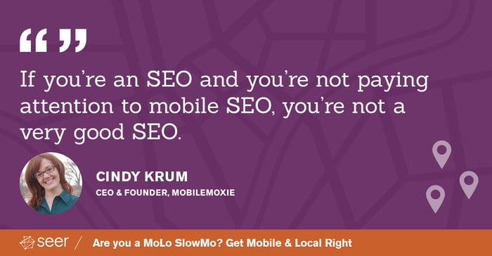
Known for her unmistakable fiery red hair and technical expertise, Cindy is a thought leader in the search industry and the author of Mobile Marketing: Finding Your Customers No Matter Where They Are, which gets 4.5 stars on Amazon. Cindy Krum is the CEO and Founder of MobileMoxie, where she has been doing mobile marketing long before the iPhone even existed (you remember WAP browsers, right?).
Understanding Mobile SEO UX
In terms of mobile and local marketing, knowing how your audience uses their smartphones and how they value location is everything. It’s important to know their motivations and pain points because that’s what helps you craft a strong, memorable experience that ultimately impacts your business in a positive way. To address this, Cindy put together five methods to ensure user experience is smooth sailing from the first interaction and onward.
- Easy to Interact.
- First of all, is your website readable and clickable? Will users be cursing their giant fingers for pressing the wrong button or desperately attempting to zoom in on itty-bitty text? Ensure that your viewport and font size is specified and voila – a beautiful, mobile optimized page! Add a form that’s quick to complete (bonus points for allowing users to “Autocomplete” or offering a 1-click checkout!) along with clear error messaging that tells users why a page isn’t loading, and you’re on the road to easing user frustration on mobile devices.
- Personalized and Localized.
- "A rose by any other name would smell as sweet" doesn’t quite apply when you’re receiving an email that addresses you by the wrong name. (My bad, Shakespeare.) It’s still important for folks to feel like their emails are personal – even if it’s in an email blast! Additionally, the creation of location-specific landing pages in the dawn of local, mobile marketing; this directly impacts website and Google search user experience. Just be sure to specify your custom explainer text if your iOS app requests access to a user’s location. (In other words, don’t be creepy).
- Cross Device.
- Your email content (i.e. name, subject line, preview text) is able to be viewed within a user’s inbox. Cindy recommends that your email’s name should be the actual brand to build legitimacy and to also take the time to define your custom preview text (shoutout to personalizing and using people’s names). Lastly, to avoid Interstitials, employ App Install Banners, namely with the iOS “Smart App Banner” or Chrome’s “Native App Banners.”.
- Deep Linked & Indexed.
- Historically, app discovery and app content discovery have been problematic for Google indexing – app discovery has been locked until this year! It’s vital to ensure your deep links go to an app store, rather than to an app pack. App packs land you on a page full of apps versus the legitimate store.
- Fast.
- Mobile users expect to get what they want and FAST. According to Cindy, they will likely abandon your website if it takes more than 3 seconds to load and abandon a transaction if the shopping cart isn’t optimized for mobile.
- AMP (Accelerated Mobile Pages Project) is an “open source initiative that embodies the vision that publishers can create mobile optimized content once and have it load instantly everywhere,” Cindy clarifies. It addresses the many problems of code by limiting its reliance and standardizing common site features like HTML, CSS, and JavaScript. As for cons, it requires efficient caching and compression, adds intelligent runtime and pre-render, and operates on a strict pass/fail system.
Seer Interactive would like to give a hearty thank you to our attendees and our featured guest speakers who created and shared these insightful presentations!