I was extremely lazy about holiday shopping this year. Don’t get me wrong, I’m always lazy about holiday shopping but this year I had an unusual number of gifts to ship which meant that by the time I got around to thinking about shopping (December 17th), I had very few purchasing options.
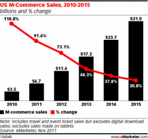
I became one of the hoards of shoppers who needed to do everything online. It’s almost cliché to point out that mobile shopping, or m-commerce, is becoming larger and larger. The research site eMarkerter has a great graph that shows exactly HOW large m-commerce is getting, projecting $11.6 billion in spend for 2012, up 73.1% over 2011.
So as I sat there eagerly ready to contribute my portion of those billions I ran into the same problem over and over again--- subpar website experiences.
They were creative, they were good, but they were not optimal for viewing on a mobile device.
Since SEM is well, my job, I saw a great opportunity to dig in further to something that is already affecting search.
Google announced late last year that mobile site optimization would become a factor in quality scores for campaigns that were targeting mobile devices. It makes sense! If a consumer is just going to get frustrated by your website anyway, why would Google reward you with a top spot in the paid search results?
Google put together the site www.howtogomo.com which has a lot of ways you can test your website for mobile usability, design tips, and even build your own. For now, I zeroed in on five of their ten mobile top practices!
- 1. Keep It Quick
This is for the impatient among us - which is all of us. Personally, if my little status bar takes more than three seconds I’m already hitting the back button and going to another site.
The Tip to Implement: compress images, use bullet points, and make it easy for your page to load
- 2. Simplify Navigation
Your mobile site is the place for your most succinct writing. Only put on the page what you really feel is important because here people will get lost in the details.
The Tip to Implement: Google’s recommendation is 7 links or fewer so make them count! Adding a search box for a complex site is ideal!
- 3. Be Thumb Friendly
Two words: Fat fingers. High on the list of annoying things about mobile sites is clicking a too small link and ending up somewhere I didn’t want to go because my fingers were too large!
Tip to Implement: Use large centered buttons and pad them!
- 4. Design for Visibility
SEER doesn’t give design tips. We won’t tell you what colors to use or which general images work best, but we can let you know that how you use your space is important for conversions. Do make use of size and color for the button that leads to your call to action. Don’t ask people to fill out long forms, mobile is not the place to get their entire consumer profile, and Do make sure that they are not having to surf it, scroll it, pause it, click it (Technologic!) in order to read your page. They may leave first!

Tip to Implement: Make it easy for your customers to read and eliminate the need to pinch and zoom to view content.
- 5. Make it Easy to Convert
This is important for all websites but where could it be more important than PPC? If someone comes to your site through a PPC ad tell them what you need them to do and allow them to complete this step in as few actions as possible. You can make it even easier on your customer by trying a function like click to call!
Tip to Implement: Make it as easy as possible for consumers to complete your desired call to action.
Now that you have some of our tips here is a great example from Einstein Healthcare Network in Philadelphia that has all of these tips in action:

- In just three lines of text you know the benefits of FastCare.
- There is a clear call to action (Call now for Hours Directions or services!)
- There is only one large button to press, and you know exactly where it will take you!
This page was created in less than 30 minutes using Google’s Mobile Landing Page site templates (http://www.google.com/sites/help/intl/en/mobile-landing-pages/mlpb.html) and has seen a 30% call rate since implementation.
With so many tips and tools it doesn’t have to be time intensive to revamp your mobile site for success. When you are all done fixing it up, learn about Creating a Mobile Profile in Google Analytics.