Do you use Google Optimize for website testing? If so, you’ve come to the right place - we have the scoop on Google’s most recent updates to the Optimize reporting interface.
Haven't used Google Optimize yet? Read my Google Optimize guide for proper background context on the platform first!
Optimize’s reporting interface has previously been a relative pain point in an otherwise strong A/B testing tool. I’ve mainly recommended for people to go directly to Google Analytics to analyze data, and I’m glad to see Google taking steps to improve the Optimize reporting interface to make it easier to understand and actionable for users to leverage.
Let’s dig into what’s changed this month.
How to Access 'Updated Reporting'
When viewing a test in Optimize (either completed or running, it just needs to be a test with data), there is now a Try updated reporting button in the bottom right.
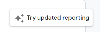
Toggling this button loads the new reporting experience, although you can toggle back to the old experience at any time.
What’s New
Some of the exciting features that this update offers are as follows:
Split Stats: GA Observed Data vs Optimize Analysis
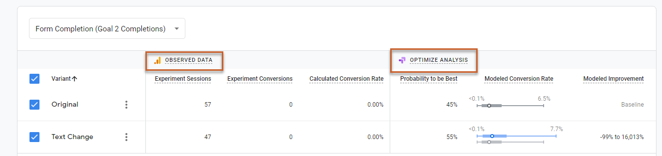
This is arguably the biggest update overall for reporting, and while a simple change, it’s a powerful one. For reference, let’s see how the previous interface would show these results:
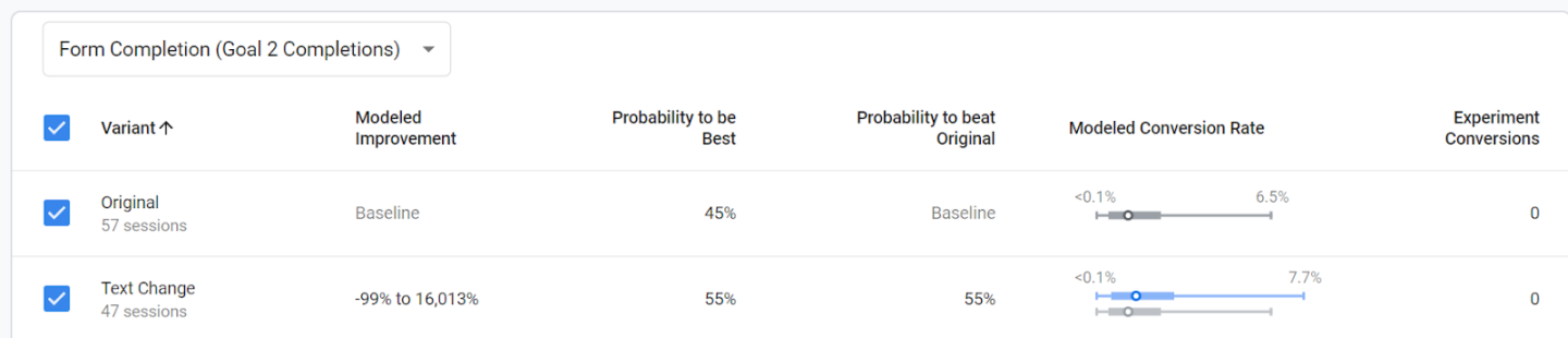
No separation of GA vs. Optimize metrics, no delineation of what’s true user behavior vs. what’s going on in the background with Optimize’s tool mechanics. It’s a huge improvement for pure user understanding between the two areas.
As a reminder, you can toggle over the Modeled Conversion Rate section for the key of the boxplot design, and you can also toggle over each of the headers for definitions as well.
I like this update as it really helps users who are new to the tool to be able to understand their results clearly, and I believe that will help encourage repeat usage as well as more users acting on Optimize test results.
Data Discrepancies = Explained
A classic question that most analysts get is …
Why is GA data different than Optimize data?
The Optimize icon below now provides guidance on the differences in GA vs Optimize data. This updated reporting feature makes it easier for users to understand and explain discrepancies in data collected by platform. Which is simple, yes, but very powerful! 
Take Action on Variants: Create Personalization or GA Segment
Optimize now gives you the ability to left-click on variants (3 dots to the right) and create GA segments or new personalization tests.
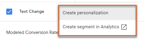
This update allows you to quickly jump into GA to use this information as a segment (yay for cross-tool collaboration!), while the previous process would have required you to go to the GA Dimension & Metric explorer and drill down into available Content Experiment dimensions and metrics.
Not something that newer users are likely to do, or I’d argue should even be expected to do. But even more exciting than segment usage is the personalization quick start - this allows you to create a personalization test in Optimize quickly based on this variant.
For more information on personalization read our post here, but this is a huge deal and it makes it super easy to act on personalization.
Turn on Toggling: Analyze Impact on Test vs Non-Test Conversions
Gives you the ability to toggle between non-test conversions. For example see below:
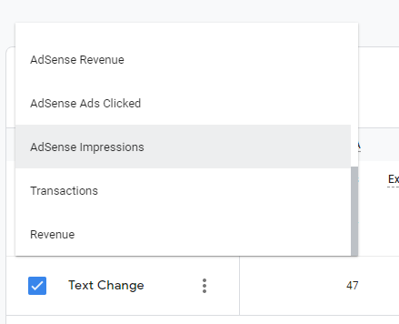
The top of the test allows you to toggle between other conversions (even those which you didn’t select for the test objective itself). This was available previously, but now being able to leverage this with the GA vs. Optimize metrics split makes it much more powerful.
Clearer Test Recommendations & Conclusions
Provides guidance on how long a test should run (at least two weeks).
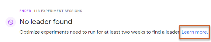
Another area of Optimize that has needed some improvement is clarification on statistical significance for new users, and this aspect at the top of the test helps, with quick links for user reference.
Here are a few more examples of Updated Reporting messages:


Again, I think although this is a minor update, this is great for a new user to clearly understand what they should do next with their A/B test (that’s either active or ended).
Next Steps for Optimize Users
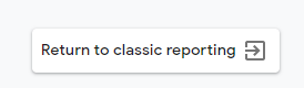
Definitely check out these updates on your end, and reminder that they are not permanent (at least for now), so feel free to toggle between the two views as you are looking at data.
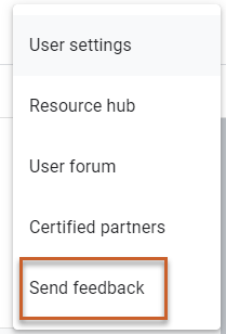
As you are using this information, a reminder that you can utilize Google’s three-button drop-down up top to send feedback on the tool.
Wrapping it Up
In conclusion, I think these updates to reporting are definitely a step in the right direction for Google Optimize and incentivize new users to more easily understand and act on data --- that’s a massive win in and of itself.
PSSSTT: Seer is an Optimize 360 reseller, so if your company is interested in exploring the enterprise version of Optimize - contact us today!
Sign up for our newsletter for more posts like this - delivered straight to your inbox!