Do you find it hard to keep track of all of your SEO recommendations after they’re implemented? Do you want to show the value of your SEO recommendations to clients? Well, it's easier than ever now with Data Blending in Google Data Studio.
Today I’m going to walk you through five steps on how to build a Data Studio dashboard to track SEO recommendations.
What is Data Blending in Google Data Studio?
Data blending allows you to connect and compare data from separate sources to find common values and patterns. With this feature, you can combine multiple data sources into a single visual, like a chart or graph.
As stated by Google, “Blending can reveal valuable relationships between your data sets. Creating blended charts directly in Data Studio removes the need to manipulate your data in other applications first, saving you time and effort.”
Data Sources
Before we dive into building the dashboard, it's important to make sure we have the correct data. Here’s what we need to get started:
- Google Sheet:
- Column 1 - Type:
- Specify the deliverable if necessary. For example: Content Outline, Content Audit, Keyword Matrix, etc. This helps determine which tactic is associated with each page.
- Column 2 - Date Implementation:
- Write out the date the changes were made.
- Column 3 - URL:
- Specify the page where updates were made.
- Column 1 - Type:
- Google Analytics Profile:
- Add whatever data you need from Google Analytics, but for now, we will focus specifically on Organic Sessions and Conversions
- Google Data Studio - Don’t forget to sign up for Data Studio - it’s free!
How to Build an SEO Recommendation Google Data Studio Dashboard
Ok, you have the data, now let’s talk about how to build your dashboard.
Step 1. Connect Your Data Sources
The first step is to connect both your data sources into Google Data Studio. We need to connect your Google Analytics profile and the Google Sheet that has a full list of your SEO recommendations.
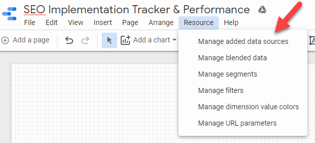
Resources > Manage Added Data Sources > Add New Data Source
Step 2: Blend your Google Analytics & Google Sheets Data
Now, this is where the magic happens. Let’s blend your data together! For the Blended Feature to work the data sets need to have something in common to join them. In this case, we will have the Page URL as the common identifier to join Google Analytics & Google Sheets.
*Pro Tip: Make sure your URLs in your Google Sheet match up exactly how it's listed in Google Analytics.
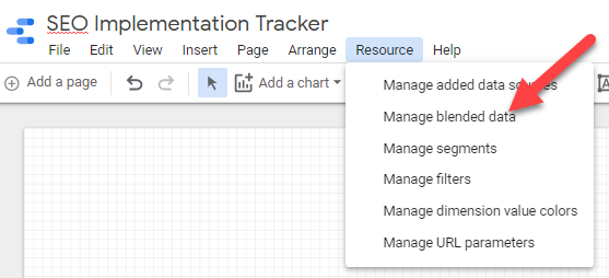
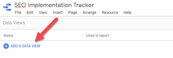
To blend your data, click on Resources > Manage Blended Data > Add a Data View > Pop in your Google Analytics Data Source & Google Sheet Data Source
Here’s the breakdown of your data source connections:
- Google Sheets:
- Join Key:
- URL
- Dimensions:
- Type
- Date of Implementation
- Join Key:
- Google Analytics:
- Join Key: Landing Page
- Dimensions:
- Month of Year
- Metrics:
- Sessions
- Your Conversion
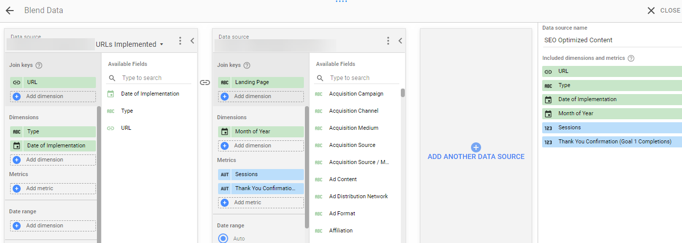
Click Save & close! Congrats, you’ve completed the data blending process! Now it’s time to create your visuals.
Step 3: Create Your Visuals
I typically create two different visuals. The first visual is a table. I like to build tables so I can sort and/or export if necessary. The second visual is a line graph to see changes/trends over time.
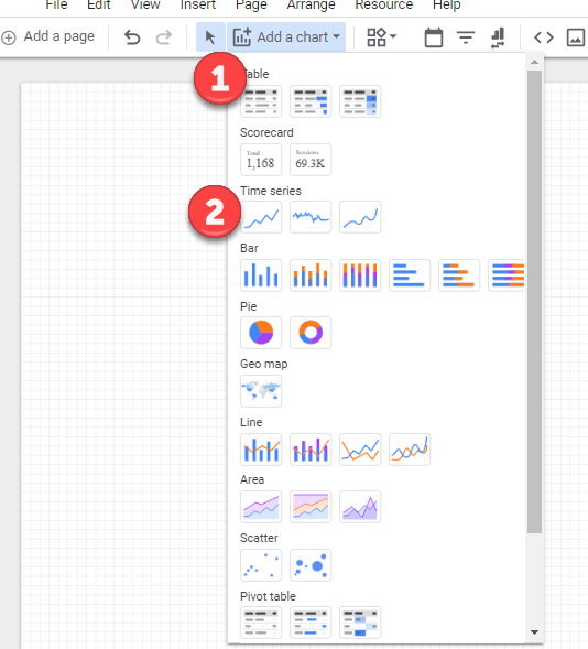
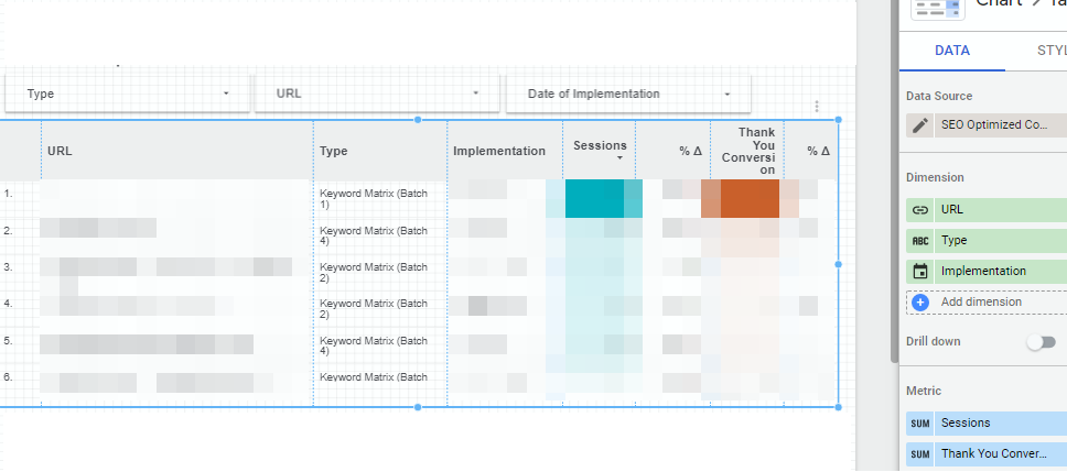
Table: Click on Add Chart > Table > Add Data
The data source is the Blended Data. The dimensions should include URL, Type, Implementation and the Metrics are Sessions and Conversions. You can pick your date ranges and even include month-over-month or year-over-year changes.
Important: For both the chart and table, scroll to the bottom of the Data column. Click on Interactions and check off Apply Filter. Filters refine or reduce the data shown to report viewers. This is useful when we click on a specific URL to see the trendline.
Note that filters do not transform your data in any way. They simply reduce the amount of data displayed in the report.
*Pro Tip: For your charts click on the Style option and apply heat mapping for your columns to see which pages drive the most conversions/sessions.
Line Graph: Click on Add Chart > Time Series > Add Data
You will have to create two separate graphs, one for sessions and one for conversions. All you need to do is swap out the metric.
The data source is the Blended Data. The dimensions should include Month of Year and Sessions. You can pick your date ranges. Don’t forget to check off the Apply Filter!
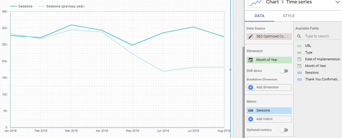
To analyze one specific URL, click the URL in the table & the line chart will only show that specific URL change. That’s why we applied the Filters!
Step 5: Set Up Your Filter Controls
This step isn’t mandatory but it does help me filter by Type, URL or Date Implemented. All you have to do is set up a Filter Control. 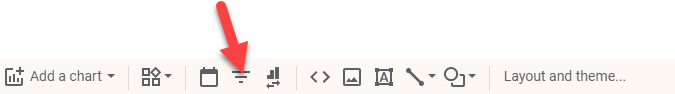
Click the Filter Control. Your data source is your Google Sheet and you can pick a specific Dimension. In this case, I am showing you Type, URL and Date Implemented.
You can repeat the above step for each filter you want to create. The output should look like this.

A World Of Possibilities
Congrats! Your dashboard is complete. Now you can accurately track your SEO recommendations.
What I’ve explained is just the start. There are so many opportunities to combine data sources into one dashboard with blended data. We’d love to hear how you use the blended data option to report on SEO performance.
If you haven’t jumped on the Google Data Studio bandwagon, now is the time. I recommend you start with this awesome beginners tutorial of Google Data Studio. If you’ve already dabble in Google Data Studio, check out some other quick win tips for SEO reporting here.
Sign up for the Seer newsletter for more blog posts and updates from our team!