3 Steps Every Digital Marketer with a Dynamic Serving or Mobile Site Needs to Take
Remind me: What is this Mobile First Index all about, again?
In October 2016, Gary Illyes announced that Google will be creating a new mobile index that will become their primary index. (source: Search Engine Land) While this is a step towards a more mobile-friendly internet and designed to improve user experience, at its core, this is a technical change to Google’s indexation process.
This update is focused on Mobile, but the repercussions have the potential to impact all organic search visibility through Google. Ultimately, we could see a shake up of all Google rankings across Desktop and Mobile.
Here’s Google’s official description of the problem:
“Google’s ranking systems still typically look at the desktop version of a page’s content to evaluate its relevance to the user. This can cause issues when the mobile page has less content than the desktop page because our algorithms are not evaluating the actual page that is seen by a mobile searcher.”
Here’s Google’s official description of the solution:
“... our algorithms will eventually primarily use the mobile version of a site’s content to rank pages from that site, to understand structured data, and to show snippets from those pages in our results.”
Still lost? Here’s an example:
Product category pages on ExampleSite.com have a couple of paragraphs of copy. It satisfies user needs and helps with our organic search visibility.
ExampleSite.com leverages a non-responsive mobile site (m. or dynamic serving), which means we show a different experience depending on device. Desktop users can see the copy, but mobile users can’t. The mobile experience is lighter, faster, and more visual. With this new update, Google’s algorithm will now primarily use the mobile experience to rank our content. ExampleSite.com won’t get credit for that keyword-rich content on the desktop experience and, as a result, could drop in rankings for targeted queries across all devices.
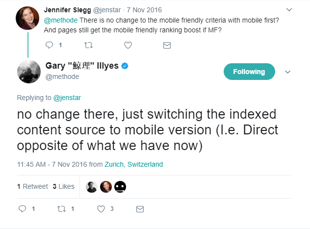
By contrast, a responsive site will not be affected by this update because it simply resizes the existing content from the desktop to the mobile. There is no difference in SEO elements between mobile and desktop versions. And if you learn best by Tweets, this one by Gary Illyes sums it up pretty well:
So, what’s new?
First, and most obviously: It hasn’t happened yet. The update that was expected to launch as early as Q1 2017 is now expected to roll out sometime in 2018. (source: Search Engine Land)
A recent announcement (and some insights from John Mueller and Gary Illyes) has led to more discussion and speculation.
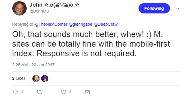
“Google said in a recent “webmaster office hours” video (at the 25:16 mark) that if you are planning at some point to migrate your m-dot domain to a fully responsive website, then you should do it before this mobile-first index goes live.”
The full article and description of Mueller and Illyes’ comments are worth a read, but the one we’re most focused on is the concept that to maintain current visibility in search, your mobile content and structured markup should be equivalent to your desktop content.
What if I have an m. site or dynamic serving site, but the content and markup is equivalent across mobile and desktop. Will I be negatively impacted?
No. Google’s Webmaster Central Blog post explicitly states that you shouldn’t have anything to worry about. John Mueller reiterated this recently (source):
However, as we all know, it’s rare for an m. site or a dynamic serving site to have the same content and markup as a primary site.
What if I have an m. site or dynamic serving site, and the content and markup is different across mobile and desktop. Will I be negatively impacted?
In theory, yes. Sites with less content and structured data on their mobile experience will now be ranked with that consideration and may decline in rankings, impacting your traffic and revenue earned through Google organic search.
Keep in mind that you’re only as weak as your strongest competitor. If you and your competitive set are all operating with an m. site or dynamically serving an experience with less content on mobile devices, then you should expect little to no impact.
Alternatively, if your competitors have responsive websites and you don’t, you could be at risk to give up significant visibility to them.
Okay, I think I’m going to be negatively impacted. What should I do about it?
If your mobile experience has less content or structured data than your primary site, you’re going to want to brace for impact and prioritize changes today. We highly recommend working with your SEO partner to come up with an action plan. Here’s what that plan might look like.
Step 1: Assess the anticipated level of risk.
- Evaluate the differences between your mobile and desktop experience, as well as how the two are linked together. Review a handful of pages (ideally a segment that is representative of all types of pages) and input the data into a simple matrix. At Seer, we’ll be scaling these data pulls for our clients by aggregating Screaming Frog crawl data. To evaluate pages on a one-off basis, you can try this handy tool from Merkle. Some metrics / factors to evaluate:
- Meta Title & Description
- H1, H2s, H3s, etc
- Word count
- Optimized images
- Structured data (specific to the page type)
- Hreflang tags (if relevant)
- Canonicalization
- Alternate Tags
- Evaluate your competitive set to get an idea of who may win from this update. Add these inputs to your matrix.
- SEMrush gives a good, objective view of your 3-5 main competitors in organic search
- Within that competitive set, repeat the process listed above
- You should now have a matrix that looks something like this. Review it and assess how you may be impacted.
- If your competition is in a position to benefit from this update, this may be the ammo you need to get your leadership team to prioritize changes.
- Alternatively, if you and your main competition in organic search appear to be equally unprepared for this update, consider this an opportunity to seize a competitive edge against them.
- Lastly, remember that this dataset is not static. Even if your competitors aren’t prepared today, they may be prioritizing changes to prepare for this update as we speak.
- Grab your most recent report on organic search or put one together now. You’ll want to have a few metrics on hand to be prepared to speak to the impact Google organic search has to the business
- What % of traffic and revenue is driven by Google organic search?
- How important is Google organic search in your customer’s journey (check Assisted Conversions)
- If you were to lose this visibility, how much more would you need to invest in PPC to offset the business impact?
Step 2: Gather all stakeholders.
- Now that you’ve done the research on how this may impact the business and (hopefully) made a case to do something about it, consider who needs to have a seat at the table:
- Your internal SEO team and/or agency
- Your internal Dev team and/or agency should be present to speak to what’s realistic to execute and by when
- Your internal Content team and/or agency should be present to offer considerations for the content strategy. For dynamic serving sites, if more content is needed, do we want to duplicate what’s currently on the desktop experience, or create net new content?
- Your internal Analytics team and/or agency should be present to offer insight into how mobile users behave compared to desktop users. These insights can help guide the content strategy
- Your internal User Experience team and/or agency should be present to collaborate with all teams in planning how you’ll be measuring the impact to engagement these changes may have on your audience
- Lastly, consider who owns what. Who has the authority to squash this entire project? Get them a seat at the table from Day 1 to avoid potential delays later.
- If you start to lose the room and implementing a change in time is deemed impossible, be prepared to point to your SEO metrics. Everyone should walk away from this initial meeting with an idea of what the cost of inaction is.
Step 3: Consider your execution strategy.
- Can you successfully implement a responsive design? This is likely only going to be an option if it’s already on your development timeline and can be prioritized to begin sooner. Important: A poorly executed responsive design can end up putting you worse off than you started. If you don’t have time to execute this the right way, avoid it.
- If a responsive design is off the table, consider what changes can be made to the m. site or how we can modify the experience we’re delivering with dynamic serving.
- Remember, we’re still optimizing primarily for users, and the amount of content present on a desktop experience may be useful to mobile users but need to be presented differently. Gary Illyes confirmed that content hidden in accordions is a good way to deliver the best of both worlds to your user (source).
- If we were to update those experiences with the same content and structured data as the primary site, how might user experience and pagespeed be impacted?
- Test with your staging site and consider a small-scale rollout to see how users engage with this new experience.
- Lastly, consider the 80/20 rule. If we can’t address all or even most of the pages putting us at risk, prioritize the 20% of the pages that are driving 80% of your traffic and revenue.
This sounds like a lot of work. How do we know this isn’t a repeat of Mobile-geddon, when everyone freaked out and it ended up being nothing?
We don’t. That’s possible. We always bet on the fact that Google is going to do what’s best for users. While we understand Google’s intent behind this decision, we aren’t convinced it will end up providing the best experience for all users, so it’s possible the full roll out won’t be majorly impactful.
That said, we can think of a few reasons Google would want to rid the internet of slow, subpar m. experiences as part of its quest to make the internet faster and better, so this may be Google reaching for the stick after the carrot approach failed.
Anything else I need to know?
- If you’re wondering where Google’s AMP Project plays into this conversation, we are too. There are a handful of situations we could think of where AMP could be a solution to this problem. Discuss with your dev and SEO teams.
- Before you crack a beer to celebrate the fact that you’ve already implemented a responsive design and have nothing to worry about, double check the SERPs to see if you still have any legacy m. sites indexed.
- The roll out won’t be akin to the flip of a switch. We expect more updates and announcements to come from Google directly as we near closer to the launch date, so stay tuned for more information and speculation from Seer.
Additional Resources
One of our favorite ways to get insight into what Google is up to is to go straight to the source. In particular, Gary Illyes and John Mueller are invaluable resources. Pay attention to those guys!
Important: We would never recommend making a critical decision based on a Googler’s tweet, no matter who that Googler is. These threads are just food for thought.
Here are a few we found interesting:
- Gary Illyes on mobile image optimization
- John Mueller on mobile image optimization
- Gary Illyes on directives / redirects to check
- Gary Illyes on separate indexes for mobile and desktop
- John Mueller on separate mobile URLs
- Gary Illyes on the location of breadcrumb markup on mobile
And more helpful resources from around the web:
- Understanding Mobile-First Indexing by Cindy Krum
- Merkle’s Mobile-First Index Prep Tool & Additional Resources
- Google Webmaster Central Blog post on Mobile-First Indexing