Contrary to what you might have heard, optimizing average positions does not always mean gunning for the top spot. Optimal positions will greatly vary among clients, industries, goals and engines.
Now you might be wondering how to determine what average position is most profitable for your account. We’ve got you covered! A couple summers ago PPC Hero blogged about Average Position sweet spots and how to find them using pivot tables. Its something that I've found a lot of value in over the years at SEER so below I’ll walk you through the simple analysis to get you on the right track.
First, know your goals! Are you managing your account to achieve a desired CPC, CPA, ROAS goal? Or maybe, optimizing click-through rates are most important to you? Once you’ve determined the most important metric, you will be able to start analyzing data.
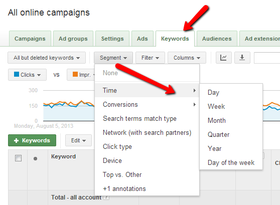
Start by pulling a Keyword Level Report, making sure Average Position column is included! A good rule of thumb is to review at least 3 months of data but of course that can vary depending on account size, seasonality, etc. When creating the report you’ll want to segment the data by time depending on how often bids are changed. For this example we’ll use week.
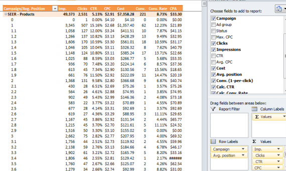
Once you have the data downloaded in Excel, pivot the report by campaign, or ad groups depending on how granular you want to go. Be sure to create calculated fields when you are including metrics like click-through rates, conversion rates, cost per click and cost per conversion in your pivot table.
Your pivot table should now look something like this:
The next step is very important. In order to condense all of the average positions for easy review and optimization you will need to “group” them. To do this right click on one of the average position cells and select “Group” from the drop down.
You should have a pop up that looks like this:
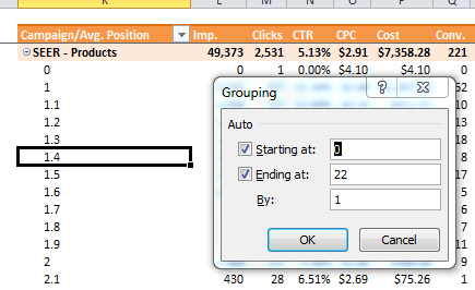
In most cases you will only want to review the top 10 positions so we recommend changing the value in “Ending at:” to 10. Your pivot table should now resemble my example below and you are ready to analyze!
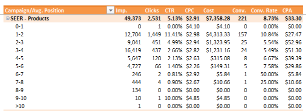
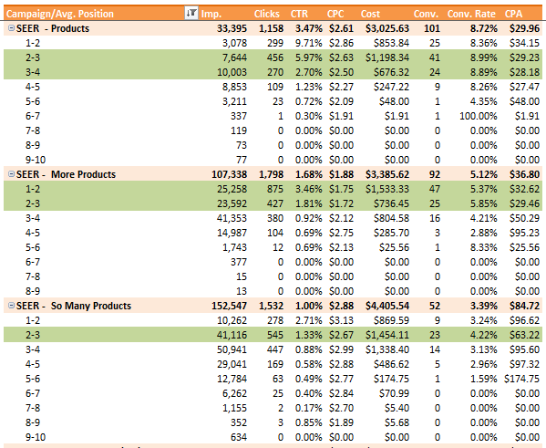
Keeping your goals in mind, review the data to find your sweet spot. Below is an example of an analysis we put together for a client optimizing cost per conversions. You can see that the top position was not always the most profitable or highest converting. (Side note: this is also a good way to find positions that are not profitable.)
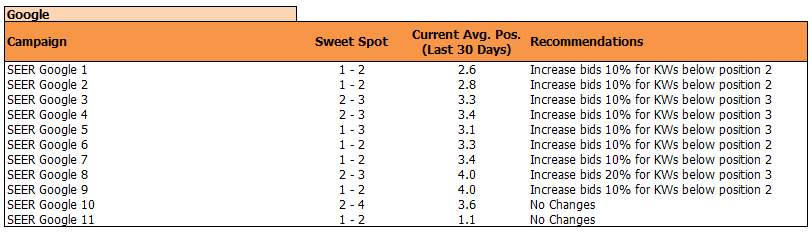
Now that you've reviewed the data, it's time to present your findings. For those of you with strict budgets be sure to keep that in mind when recommending significant bid increases. Here’s an example of how we presented the data and recommendations to our client:
We’d recommend using Google’s ACE testing tool to split traffic between bids as they are now and the new bids aiming for your sweet spot position. You can evaluate before/after on Bing. Once you’ve had time to accumulate enough data you should evaluate to see if aiming for the sweet spot yields performance improvement.
Overall, from testing this with various clients, we’ve found the experimental bids usually exhibited superior conversion volume, higher conversion rates, and lower CPAs.
Maybe it’s the giving spirit of the Holidays still lingering inside of me, but I’ve uploaded the template you can use to get started! Just add your data on the Raw Data tabs and refresh the Pivot Tables - the pivot columns and fields are all set for you!
SEER - Average Position Sweet Spot Analysis Template
So, what are you waiting for?! Get started and let us know what you find!